The network for creativity
Join 1.25M professional creatives like you
Connect with clients, get discovered, and run your business 100% commission-free
Creatives on Contra have earned over $150M and we are just getting started
Back to feedPost
The Services page in STUDIO HRSE reads more like a manifesto than a list, numbered, editorial, no stock icons pretending to mean something.
If you're positioning a studio or agency, how this page reads matters as much as what it says.
Free template, live on Framer.
https://www.framer.com/marketplace/templates/studio-hrse/


The numbered structure gives the page a confident editorial rhythm, and the manifesto tone makes the services feel like a point of view rather than a menu. Strong use of typography to carry the story.

Thanks man, that's right!

Excellent
Thanks!

Numbered instead of bulleted is such a small typographic choice but it completely changes how someone reads the page, less checklist and more sequence. Was the editorial tone something the client asked for, or did you have to sell them on ditching the usual stock icon layout?
Thank you, and that’s a great question!
Actually, I like using numbered lists; I think they do a good job of outlining the services. It gives the user a sense of the process from start to finish and makes scrolling more immersive.
In fact, since this is a template for Framer, I chose to go this route to make the layout stand out.

Thanks!
The network for creativity
Join 1.25M professional creatives like you
Connect with clients, get discovered, and run your business 100% commission-free
Creatives on Contra have earned over $150M and we are just getting started











Related posts

Absolute positioning can be really useful in Framer.
For example, when an element needs to overlap another element or sit on top of other stack. (1st clip)
It's also useful when an element needs to stay in a specific position instead of following the normal layout. (2nd clip)
These are just a few cases where absolute positioning makes sense.

Great breakdown! Absolute positioning is so underrated in Framer for those overlap cases. Love how you explained the 2 use-cases - stacking and fixed position vs normal flow. Super helpful tip!

Built this in Framer as a concept project. Goal was to make it feel run by ex-journalists. Choices: editorial serif (Libre Baskerville), a dark photo with one color accent, and copy that positions against blast-style PR.
Where I’m unsure: text legibility over the photo and whether the two CTAs compete. What would you change?

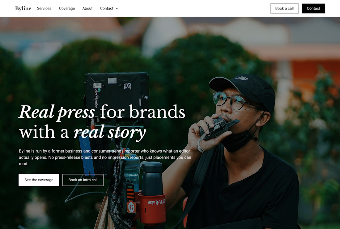

That's great design it feels professional I like how the background mixed with interface ❤️❤️
Great job Cheree🎉🎉

The only glow on the Kestra page is the reflective strip on the jacket. It comes from the image itself, so the Framer layers on top stay flat: grey, white and mono text, no glow effects on buttons or headings. That keeps the page easy to edit, because nothing in the UI depends on one lighting setup. If you swap the photo, the glow goes with it. Would you add a glow effect in Framer or keep it in the image?

wow, nothing but top notch