The network for creativity
Join 1.25M professional creatives like you
Connect with clients, get discovered, and run your business 100% commission-free
Creatives on Contra have earned over $150M and we are just getting started
Back to feedPost

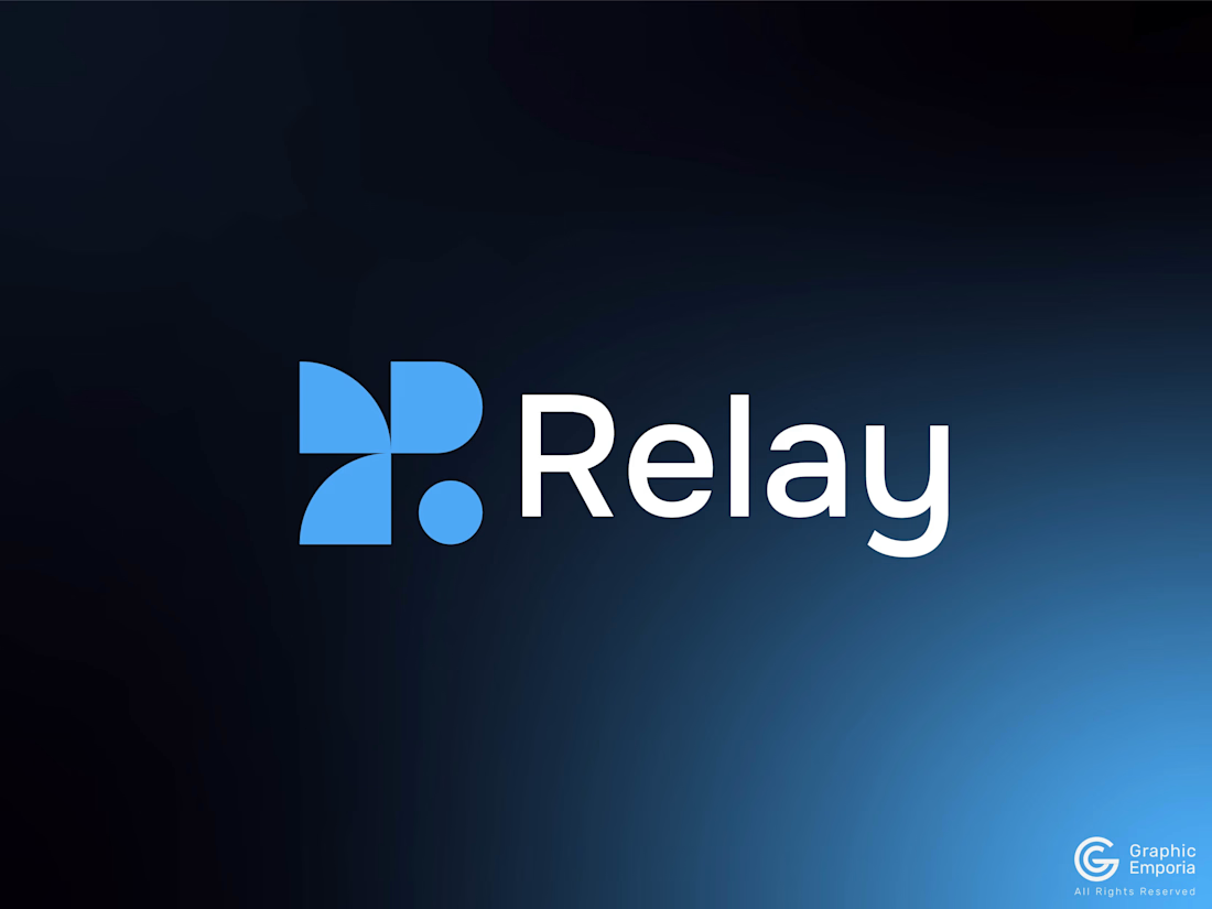
Relay- Full Logo Reveal, A SaaS Brand Identity
Here is the full logo reveal of the R Letter Geometric SaaS Logo. Relay is where it all comes together.
It started as two petals reaching toward each other, a circle, and one small dot marking the moment they meet. Then it found its color: sky blue, for a message that actually lands.
Now, here it is: the full logo with the mark and the wordmark, side by side.
The type is Onest. The same calm, rounded voice I used for Yond. It felt right here too: Relay isn't about power or precision, it's about ease. A loop that closes without friction.
I tested the full lockup on navy, with a soft gradient to give the brand a little warmth and depth. This is the first for this logofolio, and it felt right for a brand built on human feedback, not just data.
This closes out the fourth identity in my SaaS and tech logofolio. Bexel was one shape holding everything together. Yond was two shapes meeting in balance. Arclo was growth that wasn't even. Relay is a loop: something that goes out and comes back.
Full Visual Identity coming soon. Stay tuned!

The network for creativity
Join 1.25M professional creatives like you
Connect with clients, get discovered, and run your business 100% commission-free
Creatives on Contra have earned over $150M and we are just getting started





Related posts

Winder is a bold brand identity built around a geometric W-inspired symbol, combining sharp angles and forward movement to represent progress, speed, and direction.
The identity uses a striking red and deep burgundy palette, supported by clean typography and a consistent visual system across brand guidelines, digital applications, and product mockups.
Progress in Motion.




Great logo it feels it really has an identity 🎉🎉

Which hero visual feels right for this brand?
While working on the homepage for Halfspace, a website design and SEO agency, I explored two different hero visuals for the same headline and layout. Same message, same structure, just a different visual metaphor and mood.
Option 1 - Rocket Launch. Bold, literal, and energetic, visually reinforcing the "launch your business" message with motion and fire.
Option 2 - Glass Cube. Abstract, sleek, and premium, giving a more refined, tech-forward feel without relying on a literal metaphor.
Would love your honest UX/UI take, which direction feels more impactful, memorable, and aligned with a web design/SEO brand, and why?
11 voted
41%
16 voted
59%
27 votes
Closed

Both design are great; it's hard to choose one


Rejected logo concepts 2026 - Which one did you like the most?
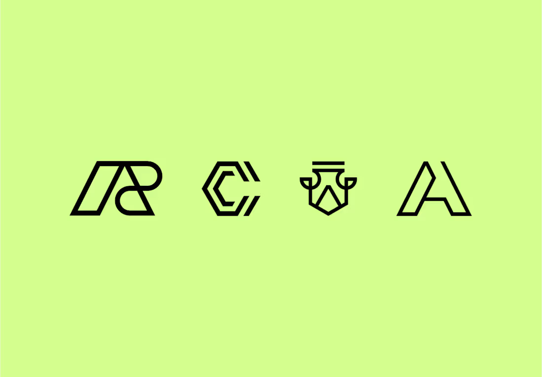

The C-shaped mark is my pick. The notched outline stays readable even when it gets small. Did the rejections come down to concept, or to how they held up at tiny sizes?