The network for creativity
Join 1.25M professional creatives like you
Connect with clients, get discovered, and run your business 100% commission-free
Creatives on Contra have earned over $150M and we are just getting started
Back to feedPost
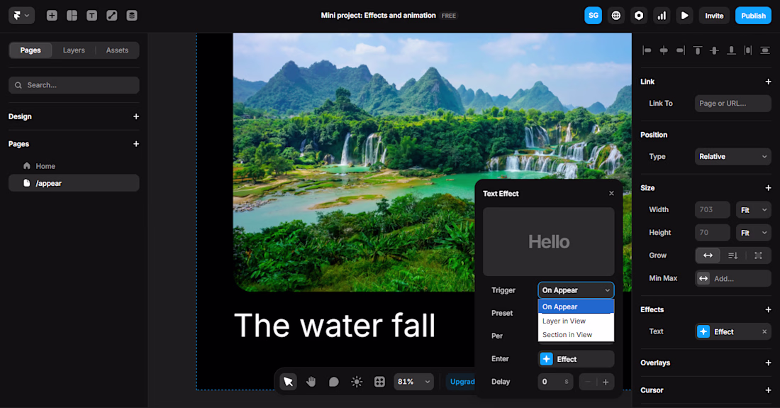
Everyone's obsessed with making websites "interactive" right now. Scroll animations, parallax everything, hover effects on hover effects.
Most of it is hurting conversions, not helping them.
I've opened client sites recently where I had to wait for three separate scroll-triggered animations to finish before I could even read the headline. By the time the content "arrived," I'd already lost interest.
Here's my take: animation should clarify, not perform. If a transition doesn't help someone understand where they are or what to do next, it's decoration; and decoration that slows down your page is a cost, not a feature.
In Framer, I see this constantly. The tools make it so easy to add motion that people add motion just because they can. The best Framer sites I've worked on use animation sparingly: a subtle fade-in, a smooth state change, something that feels native rather than "look what I built."
Fast, clear, and a little restrained will outperform flashy almost every time; especially for businesses where the goal is leads, not awards.
Curious where others land on this. Are scroll animations actually converting for you, or are they just fun to build?
#Framer #WebDesign #UXDesign
The network for creativity
Join 1.25M professional creatives like you
Connect with clients, get discovered, and run your business 100% commission-free
Creatives on Contra have earned over $150M and we are just getting started
Related posts
SKOK FACE DROPS
Experimenting with visual language in digital - it can be cool, fun, and engaging.
It's constantly amazing to me what results can be achieved when you have an idea whose implementation is supported by agents within Framer.
Unofficial project - not affiliated with the artist
Visuals by: skok.group
Nice 👍
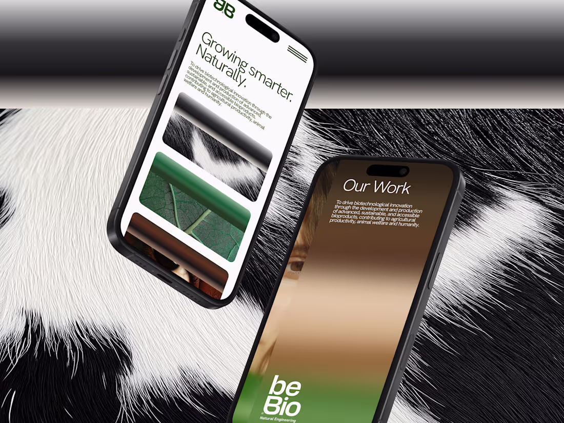
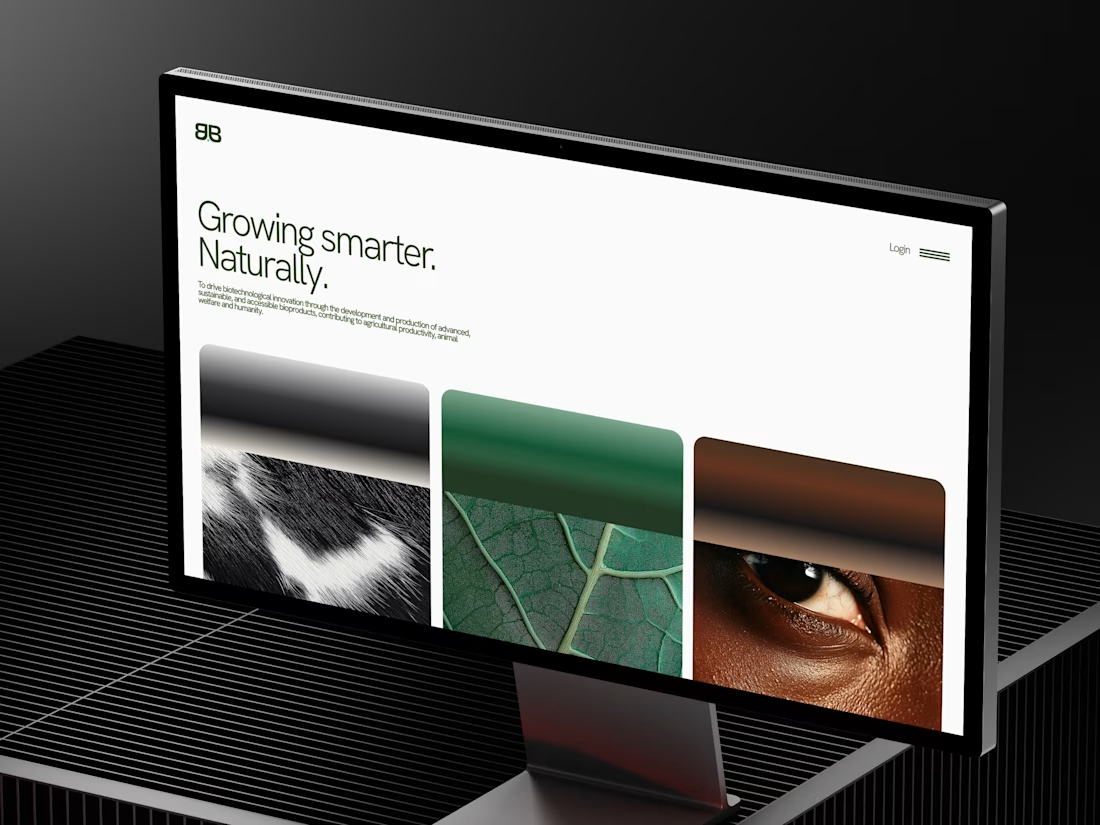
beBIO · Web Design
We designed beBIO's site in a founder's sprint, a launch platform ready to put in front of investors.
The hero fans three sectors into a curved arc, so the whole company lands before a scroll. From there, one job: turn a curious visitor into a conversation, self-select, build trust, reach out. All of it extends the identity, clinical-organic tension, structure softened by organic motion, greens opening into air.
Built on Framer, live now at bebio.life
Incredible attention to detail.
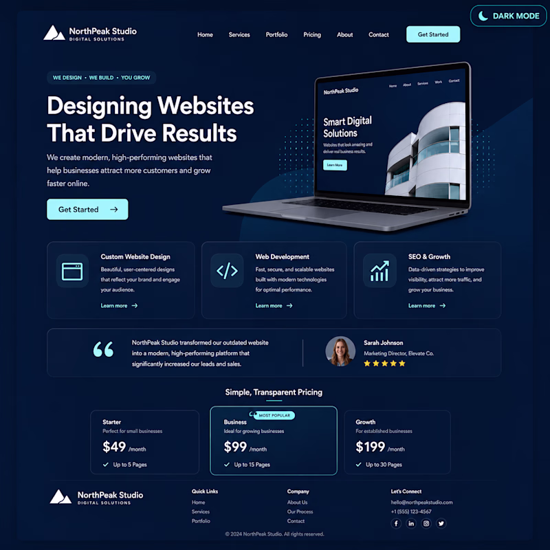
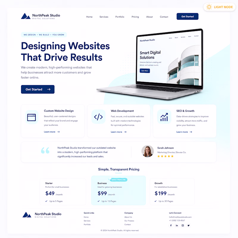
Light Mode vs Dark Mode
👀 Quick Design Vote!
Same website.
Same content.
Different style.
🅰️ Light Mode
🅱️ Dark Mode
Which one feels more premium?
👇 Vote below!
#UIDesign #WebsiteDesign #CreativeCommunity #UXDesign #WebDesign #Figma #Contra
10 voted
43%
13 voted
57%
23 votes
Closed
Dark mode
Challenges
View allTrending
Claude
Claude has entered the design space. How are you using Claude Design?
Contra University
Learn from expert creatives how to earn more using next-gen AI tools.
fifaworldcup2026
The World Cup is here and the whole world's watching. How are you designing for the world stage?
creativeaiflow
Creative AI workflows are evolving. What tools do you use, and what are their strengths and weaknesses?
freelancerlife
Freelancer life is wins, pivots, and everything in between. What’s yours right now?