The network for creativity
Join 1.25M professional creatives like you
Connect with clients, get discovered, and run your business 100% commission-free
Creatives on Contra have earned over $150M and we are just getting started
Back to feedPost

Let me walk you through one UX decision we made on this crypto SaaS dashboard.
When someone opens a finance product like this, they are not exploring.
They are checking.
Am I up or down.
How much do I have.
Do I need to act right now.
That is why the first thing you see is not charts or transactions.
It is the current balance and portfolio overview.
Once users understand their position, everything else becomes supportive.
The chart shows movement, not pressure.
Transactions feel reassuring, not overwhelming.
This is a small UX choice, but it changes behavior.
People feel in control faster.
And when people feel in control, they trust the product.
That is how I think about UX.
Not how it looks, but how quickly it helps someone feel oriented.

The network for creativity
Join 1.25M professional creatives like you
Connect with clients, get discovered, and run your business 100% commission-free
Creatives on Contra have earned over $150M and we are just getting started

Challenges
View all


Related posts


“Or similar” leaves a lot to the imagination.
A few billboard designs I made for Sync as part of the rebrand. The campaign centres on a simple promise: the car you see is the car you drive.
I kept that message big and direct, with the cars up close and enough pink to make you look twice.
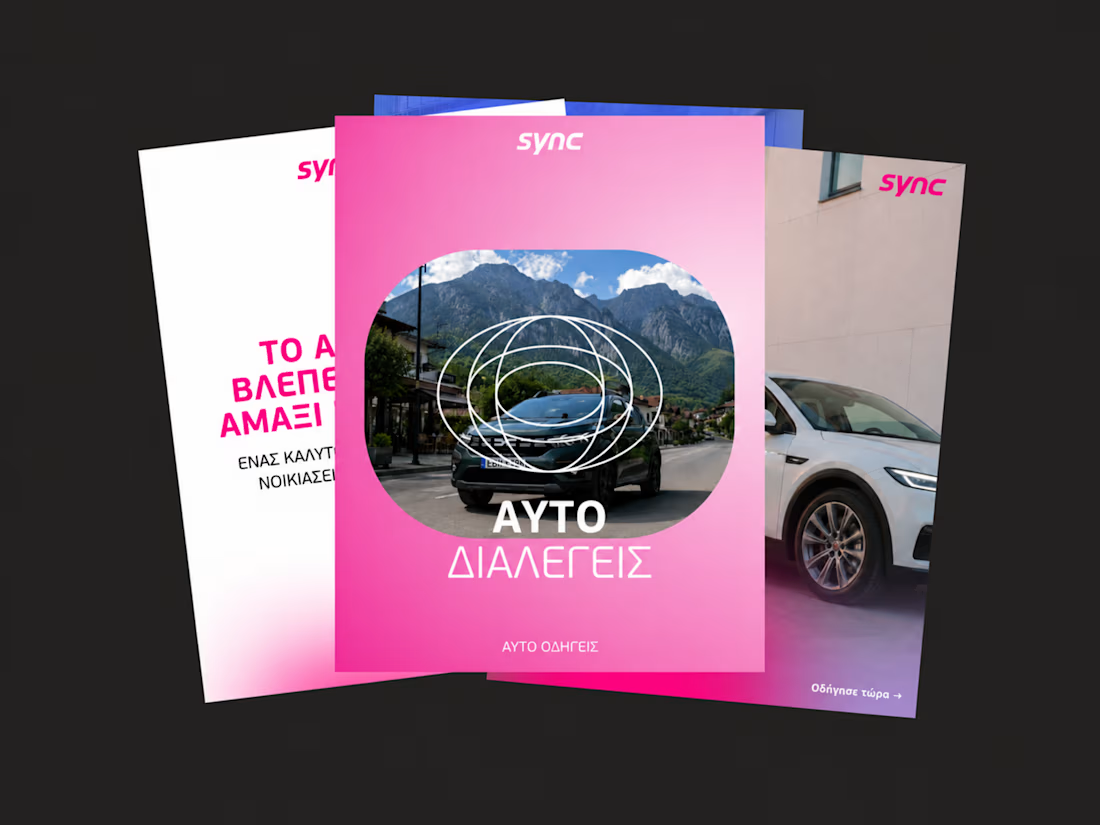
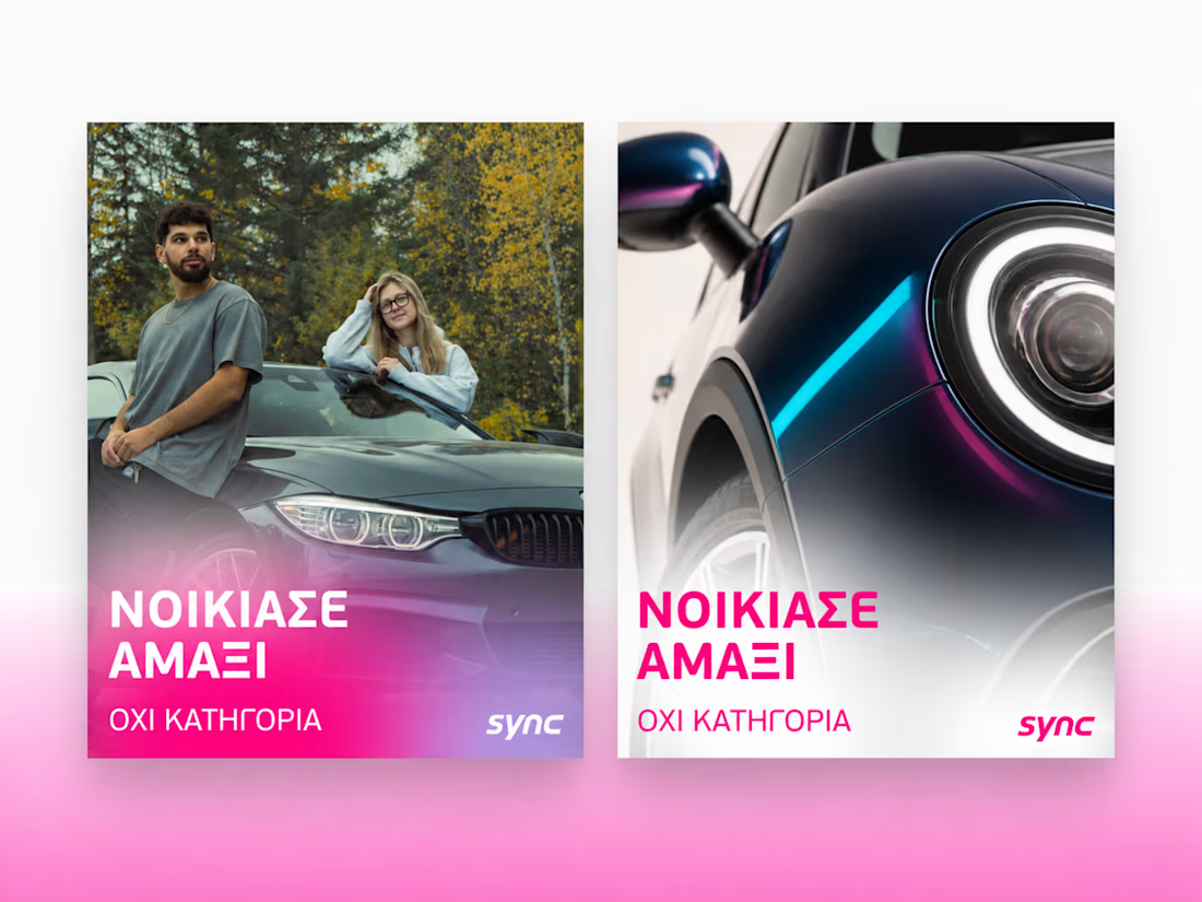
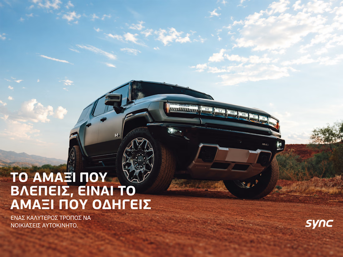
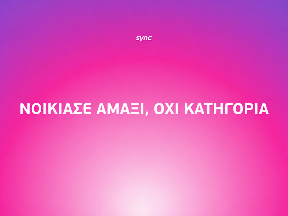

The way the oversized promise carries through the pink palette is really effective—the close-up crops make the car feel immediate without losing the campaign idea.


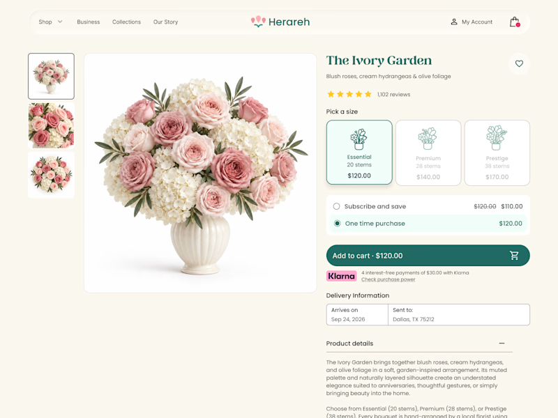
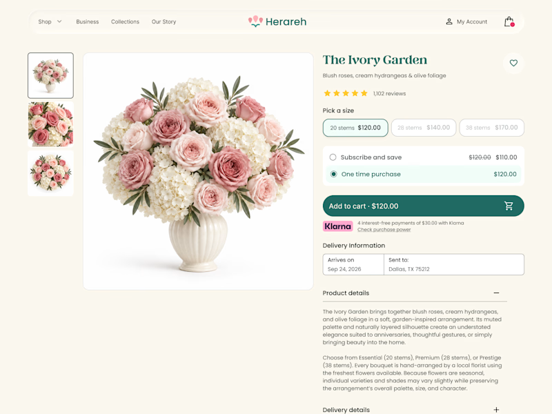

Icon cards for me, bouquets are such a visual purchase that a scannable icon beats reading "small/medium/large" every time. Did the compact chips version convert worse in testing, or are you still gathering data on that?

When your landing Page is so goated that you no longer need a launch video.


Thats what a landing page do for you hahahaah