The network for creativity
Join 1.25M professional creatives like you
Connect with clients, get discovered, and run your business 100% commission-free
Creatives on Contra have earned over $150M and we are just getting started
Back to feedPost
Have you ever gone this hard on a 404? It's your one chance to turn a frustrating situation around for the better 🪩
Try it: https://jjettas.com/404


PRO Design 😍


Eyy thanks!

This is an engaging 404 page really awesome
🙏

The playful 404 concept has a great balance of clarity and personality—the oversized type and restrained palette make the page feel intentional rather than an afterthought. Nice work on turning a dead end into a branded moment.
The 404 is treated like a real product moment here—great use of motion and visual texture to turn a dead end into something memorable.
You said it!


This is really awesome


the purple 404 page looks so good

The oversized 404 doubling as the background texture is a nice touch, most error pages just apologize and bail. Did the route suggestions come from actual analytics on what people mistype, or gut feel?

great design...


This is a great example of turning a usually boring page into a memorable experience. Small details like this can really improve how users feel about a brand.

Seeing such posts, I finally decided to add an 404 page instead of the practical send to Home action that I was doing previously for the project I manage

Out of hundreds of 404 screens ive seen on Contra, this one is the best. Clearly shows its an error page. Keeps it interesting, has a clear navigation.

Clean!!!! This really stands out

"Your Route Is Wrong" is such a good copy choice for a sports site. Most 404s are a dead end, this one actually redirects with personality. Big fan of how it fits the brand.

Dude this is so sick. Love me some JJ. Well executed my man!
Thanks man!


Fantastic work👏🔥🔥

A 404 that makes you forget you got lost 😍🔥. This Great.


Great work, Cameron

a 404 this good almost makes me wanna get lost on purpose lol. turning a dead end into a moment is such a nice touch, the your route is wrong line is perfect

The full nav stays in the left rail, so the 404 is still a navigation surface — and "Your Route Is Wrong" borrows the site's own football vocabulary instead of apologising in generic copy.

This 404 page is amazing

cool af 🔥

A 404 is a good place for personality, as long as the way back stays obvious. Do you track where visitors go next from it? That would be an interesting measure of whether the experience helps them recover.

It's captivating and engaging, love it.

Really awesome 💯

wow


This is how you turn a dead end into a highlight.

wow, probably I wouldn't like to change the page🙌
The network for creativity
Join 1.25M professional creatives like you
Connect with clients, get discovered, and run your business 100% commission-free
Creatives on Contra have earned over $150M and we are just getting started





Related posts


Twenty-five years of credits, finally on a website that looks the part.
Just take a look at what kind of web we create ✨👇
Reflection of the brand history with taste, precision, and premium branding.
Scroll responsibly: https://productionportugal.com 😉🔥


Wow! Nice setup 🎥

Talorify requested a high-converting landing page. Guess what?
Delivered the full design and development.
A high-converting landing page has one primary job, And this one is basically saying:
“Please get me from the store.” 🔥
Don’t overload your landing page with buttons that confuse your users. Give them one clear direction and make it easy to take action.
Check it out and tell me:
Would you call this design premium?
Hi, I’m Emmanuel Bliss, Product Designer (UI/UX).I bring clarity to what already exists and what is yet to exist.
Checkout the Live HERE

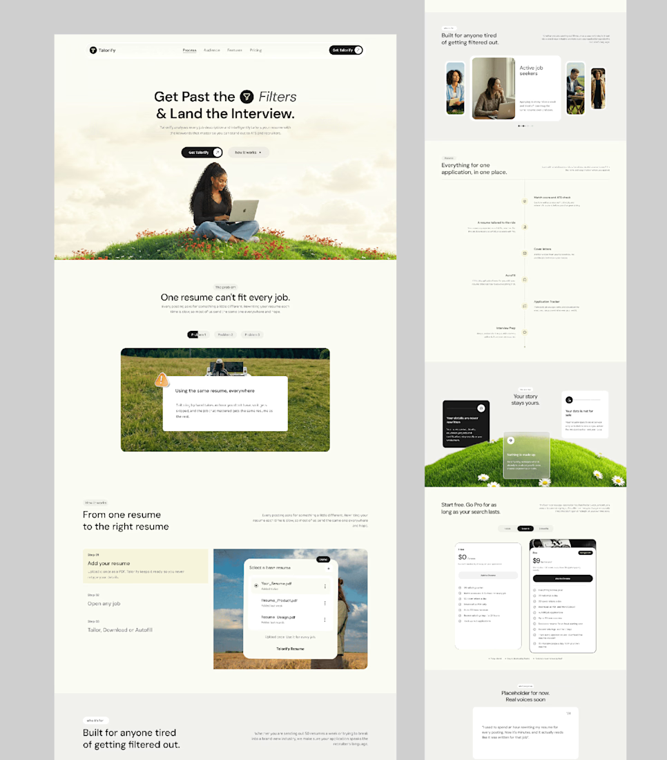

Definitely premium. Did they measure if this new design actually brought in more sign-ups and conversions compared to before?

Just created a cursor that transforms the content beneath it. It follows your pointer with a subtle delay, then settles precisely on it when you stop.
There are 9 effects: Invert, Monochrome, Fisheye, Duotone, Cyanotype, Embossed Paper, Solarized, Infrared, and Chromatic


This is the type of detail that shows the taste of the designer, well done!!