The network for creativity
Join 1.25M professional creatives like you
Connect with clients, get discovered, and run your business 100% commission-free
Creatives on Contra have earned over $150M and we are just getting started
Back to feedPost

Project Description
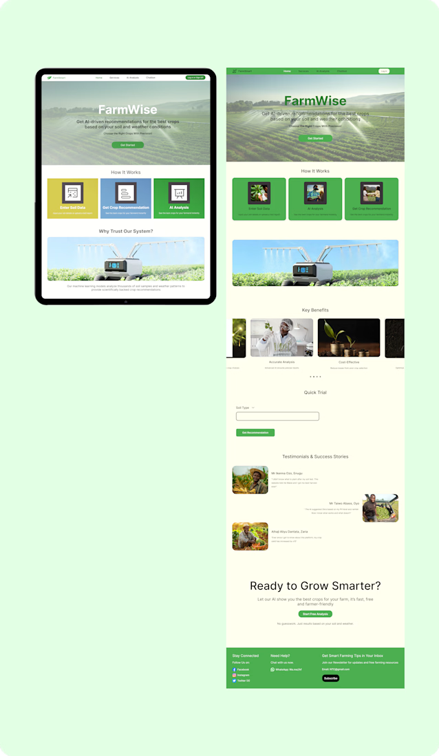
Farmwise is an AI driven machine learning platform that helps farmers make informed crop selection decisions by analyzing soil data and weather conditions to recommend optimal planting choices. The goal was to design a simple, intuitive interface that converts complex ML insights into clear, actionable guidance to improve productivity and sustainability.
Breakdown of this design
Hero Section: Clearly states the value proposition"Get AI-driven recommendations. based on your soil and weather conditions".
Social Proof: Dedicated sections for "Why Trust Our System?" and testimonials were added to reduce skepticism regarding AI usage in agriculture.
How it Works: A simplified 3-step process (Enter Data -> Get Recommendation -> AI Analysis) breaks the mental barrier of entry.

The network for creativity
Join 1.25M professional creatives like you
Connect with clients, get discovered, and run your business 100% commission-free
Creatives on Contra have earned over $150M and we are just getting started








Related posts


Gorgeous 😍


Your Hero Section Has One Job: Be Clear.
You don’t need huge headlines or long explanations. You need the right image + short headline + clear offer.
For the first version, we worked on the branding, the image and the copy together, so at first glance it’s clear: this is a makeup course, and here’s what you’ll get.
The second version is still beautiful and still feels like beauty. But what are you actually getting? A makeup course? Products? A store? That’s the problem with a Hero that looks good but isn’t thought through.
Your first screen doesn’t need to say everything. It just needs to say the right thing.

22 voted
61%

14 voted
39%

36 votes
Closed


Hourfield is a 16-second 16:9 launch film for products that organise people's time: calendars, schedulers, booking and reservation apps, planners. Retype a few short lines, drop in your logo and rename the calendar's days and tiles (meetings, table bookings, classes, shifts): the week re-plans itself on screen and the film lands on your logo lockup. Our second version, Maréva, a fictional table-booking app, turns the working week into an evening of reservations on the same animation and timing.
Built end-to-end through the SVGator MCP server. The calendar that re-plans its own week, the orbit that swirls into a single dot and the lines centred by their real letter shapes (fonts measured, not eyeballed) were computed in Python and written straight into a live SVGator project as 780 editable keyframes; I directed every note and finished it in the canvas. Maréva was made the same way, on the same timeline. Everything stays a real layer: 50 live text layers, named elements (headline, logo, product-name, tagline) and one logo image animated in two moments.
Yes, there is a lot to edit: every line of the story, a whole week of calendar tiles, a palette in nine roles. A full rebrand takes longer than five minutes, and that is the honest trade: it shows how much a single SVGator file can carry, and how MCP makes a detailed, story-driven film practical to re-make, not just to watch.
Links:
▶ Template (SVGator)
▶ Demo video, A → B


Love the smooth flow and the text animation! Good luck!