The network for creativity
Join 1.25M professional creatives like you
Connect with clients, get discovered, and run your business 100% commission-free
Creatives on Contra have earned over $150M and we are just getting started
Back to feedPost

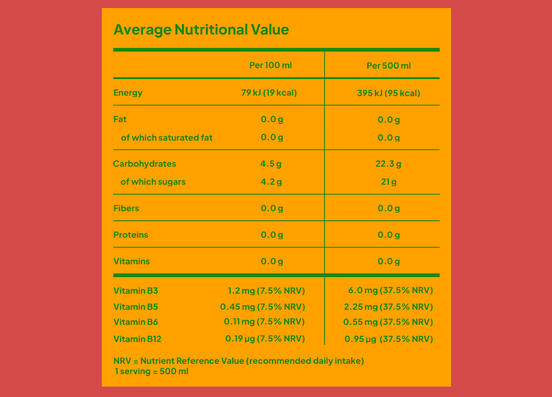
For lovers of typography and hierarchy, this one is for you.
After one of my usual weekly runs, while sipping an isotonic drink, I had the idea to reinterpret classic information graphics through a minimalist typographic approach.


The network for creativity
Join 1.25M professional creatives like you
Connect with clients, get discovered, and run your business 100% commission-free
Creatives on Contra have earned over $150M and we are just getting started








Related posts

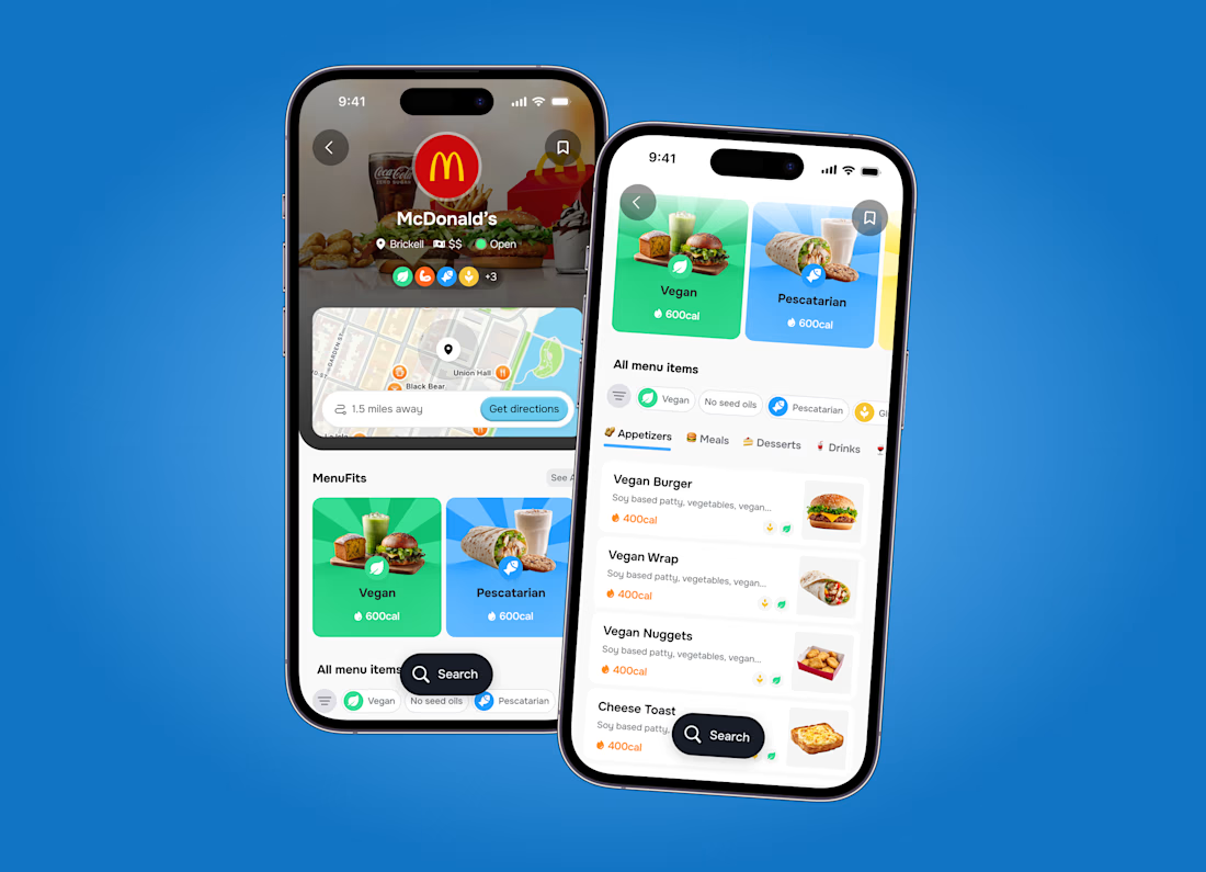

Super clean work!

Feel Calm, Feel Focused — ADHD Support App
A simple and supportive platform for parents & practitioners to help children with ADHD build healthier daily habits.
Turning clinical framework into calm, friendly UX.
Focus on: Daily focus, mood check-in, routine tracking, parent insights.
The image grid does the explaining
Tool: Figma, Framer, Jitter
Built for calm, not chaos.

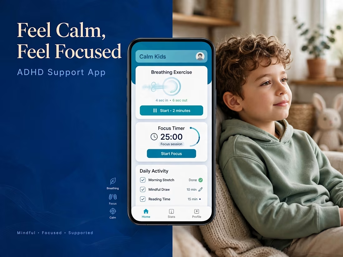
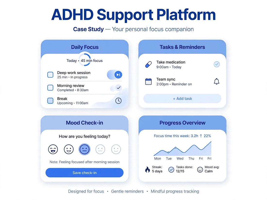

For the focus timer, I'd store the finish time so it doesn't drift when the app goes into the background. Should a session keep running when someone switches apps, or pause?


Professional work. Keep it up.