The network for creativity
Join 1.25M professional creatives like you
Connect with clients, get discovered, and run your business 100% commission-free
Creatives on Contra have earned over $150M and we are just getting started
Back to feedPost

OTO — Hearing Dose Monitor | Brand Identity
A brand identity and digital product experience for OTO, a hearing-dose monitoring concept designed to help people understand their daily sound exposure.
I created a bold visual system that combines a dark interface, electric lime, digital teal, and pixel-inspired graphics to make complex hearing data feel simple, modern, and approachable.
The identity was extended across the mobile app, website, packaging, social presence, and product visuals, creating a consistent ecosystem across both digital and physical touch points.
The goal was to move hearing health away from a clinical aesthetic and create something that feels like a modern technology product people would actually want to use.


The network for creativity
Join 1.25M professional creatives like you
Connect with clients, get discovered, and run your business 100% commission-free
Creatives on Contra have earned over $150M and we are just getting started





Related posts

Just shipped the BALEEN site — a marine salvage brand's home isn't a brochure, it's a registry.
A draggable archive of hyperrealistic specimen stamps as the hero. A live ledger of recovered objects. A vessel section with working depth and call sign.
Every object catalogued, never sold as treasure. 🐋⚓️

100% brochure, from layout, typography, sections, color palete and the description 100% AI generated. I use AI as well, but it seems like you did not put any human output anywhere.

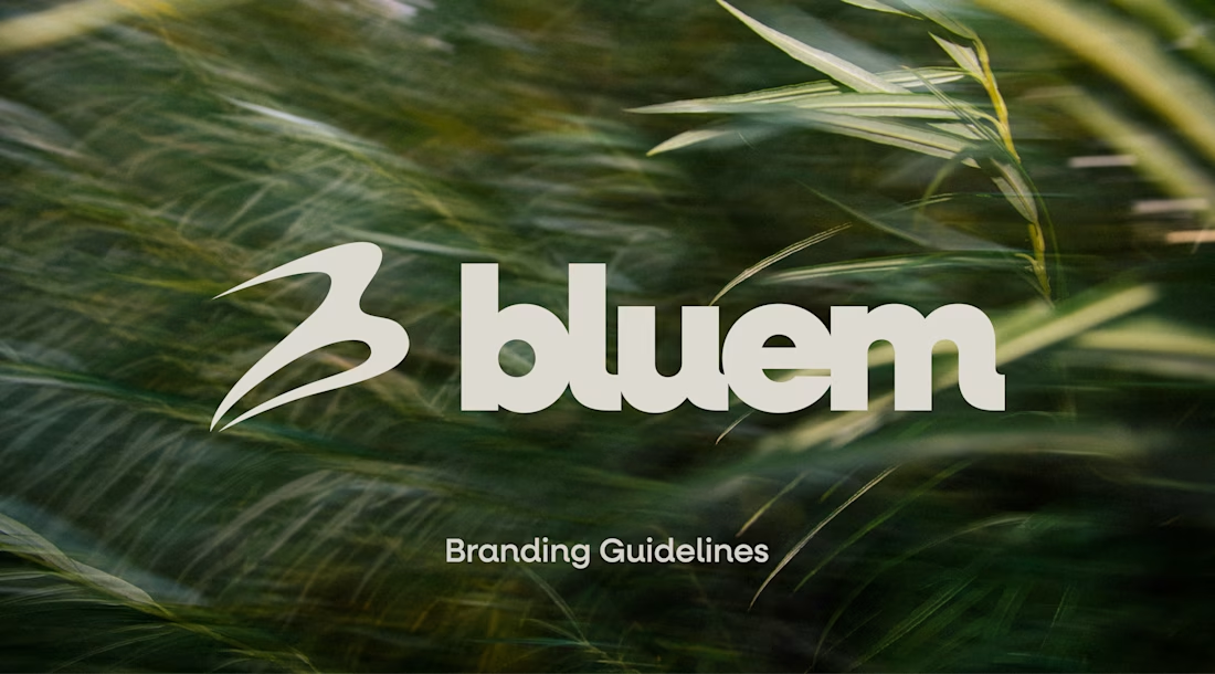
Check it out, I just uploaded a case study on a brand project for Bluem, an activewear brand from Vancouver, CA.
Look through the case study to see some of my thoughts, and the project in full, worth the time!


Nice design language. Can you spare a minute giving me some advice for my logo design philosophy? Do I need some changes.

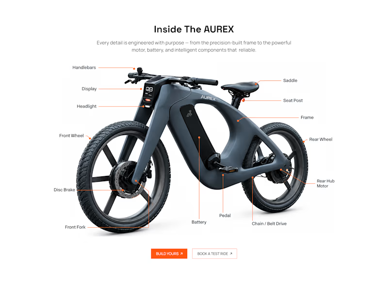
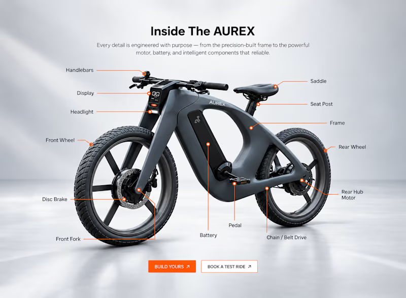
Light or refined - which E-Bike product breakdown section design would you choose?
Two concepts for the same AUREX e-bike. Same product, same components, two different presentation styles:
A - Soft Studio: subtle gray depth, larger product focus, and a more premium visual feel.
B - Clean Minimal: bright white background, tighter spacing, and a more technical editorial layout.
Which direction feels stronger for a premium e-bike brand and why?

5 voted
31%
11 voted
69%
16 votes
Closed

A feels more premium to me. The soft gray depth and bigger product focus make the bike feel like something special. B is great for specs, but A sells the feeling