The network for creativity
Join 1.25M professional creatives like you
Connect with clients, get discovered, and run your business 100% commission-free
Creatives on Contra have earned over $150M and we are just getting started
Back to feedPost

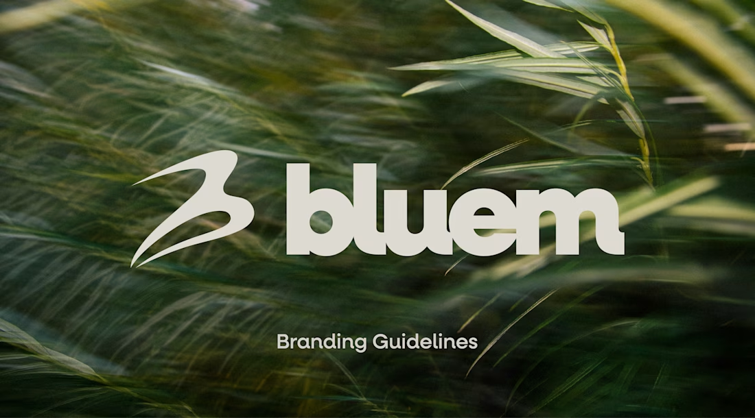
Check it out, I just uploaded a case study on a brand project for Bluem, an activewear brand from Vancouver, CA.
Look through the case study to see some of my thoughts, and the project in full, worth the time!


Great work!!

I like your logo design nice job 🎉🎉

That windblown grass hero behind the Bluem wordmark instantly says movement and outdoors, perfect for activewear. Posting the full case study with your thinking, not just the pretty shots, is what makes it actually useful to other designers. Worth the read.

That B mark has a nice little swoosh of motion in it without screaming "sports brand". Curious whether Bluem came to you wanting to stand apart from the big activewear names or lean into that world a bit.

Love this! 🥂

Fine like a ship 🚀

Great work on the Bluem case study! The attention to brand consistency and the thinking behind the visual direction really makes a project like this stand out. Looking forward to checking out the full process.

Nice design language. Can you spare a minute giving me some advice for my logo design philosophy? Do I need some changes.
I like your work! All you can do is keep creating and improving!
Thank you for kind remarks. It means a lot to me !
The network for creativity
Join 1.25M professional creatives like you
Connect with clients, get discovered, and run your business 100% commission-free
Creatives on Contra have earned over $150M and we are just getting started

Related posts

A little more about the inspiration behind Tindara.
I wanted the identity to have a connection to Tindari, Sicily. The Madonna di Tindari statue was the starting point for the symbol, while Sicilian decorative patterns inspired the graphics around it.
For the colors, I chose mustard yellow, deep green, and burgundy, balanced with cream. I wanted to bring some of that warmth and richness into the packaging, while keeping the different elements comfortable together.
For me, these references are what give the project its character and sense of place.



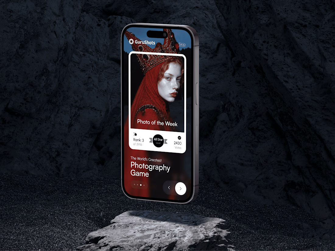
A new day, a new design to share! 📸
This time it is a photography challenge app that brings creativity and competition together through contests, voting, and gamification. What do you think of this one? ✨



Two warm ups today, both might become full case studies:
Parlata: an audio-postcard service that records and archives local dialects. Every recording becomes a small printed card with a QR link.
MODULO: an Industrial IoT brand. Olive, navy, one wobbly blob.
One is warm and human. One is technical and playful. Which would you want to see go all the way?
31 voted
63%
18 voted
37%
49 votes
Closed

Love it