The network for creativity
Join 1.25M professional creatives like you
Connect with clients, get discovered, and run your business 100% commission-free
Creatives on Contra have earned over $150M and we are just getting started
Back to feedPost

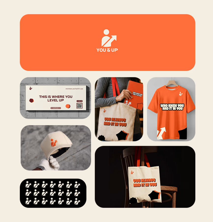
YOU&UP — A Brand Built to Move People
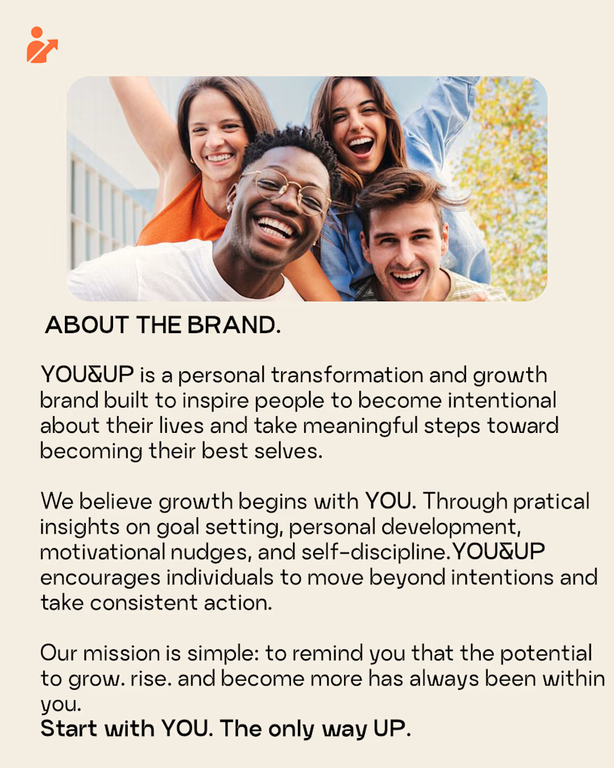
YOU&UP is a personal-growth brand focused on goals, discipline, self-improvement, and taking meaningful action.
For this project, I didn't want to create another motivational brand built around generic quotes. I approached the identity from the idea that inspiration should lead to action.
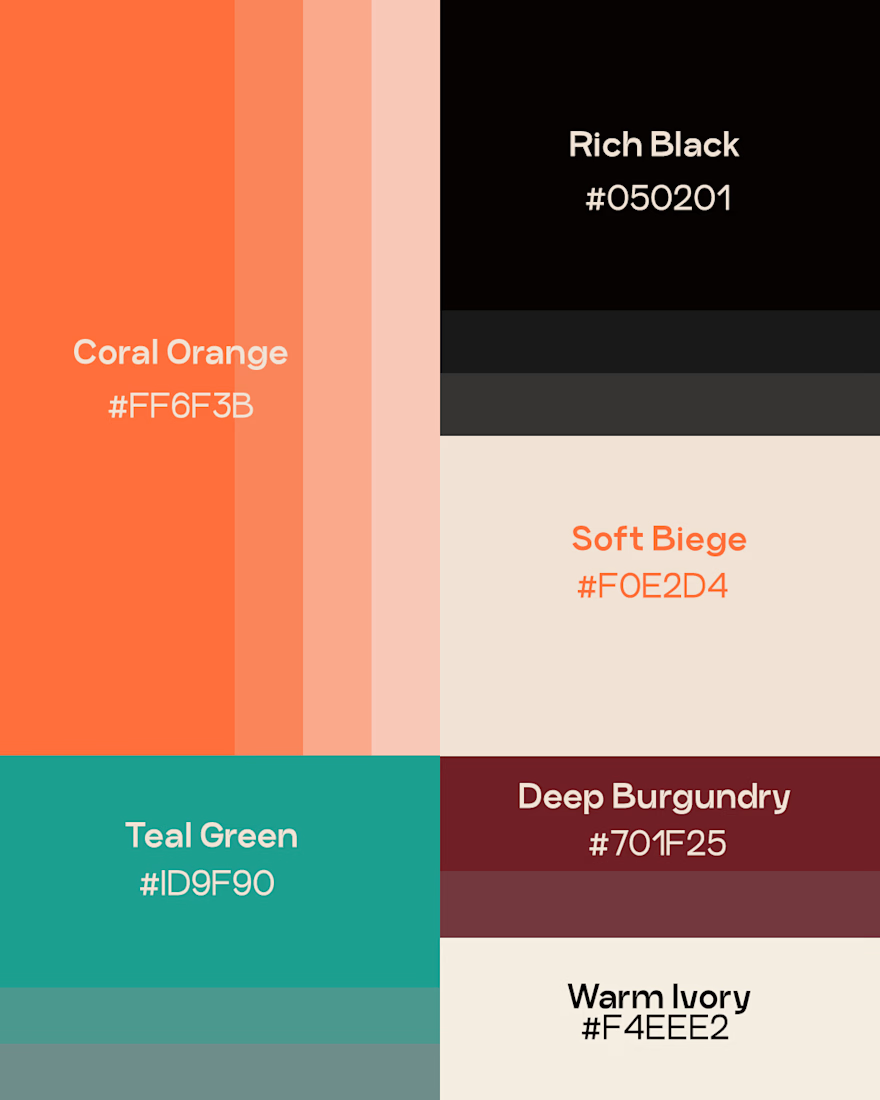
I developed a visual direction that feels energetic, approachable, and progressive, while creating a content system built around six strategic pillars:
Mindset & Perspective — changing how people think.
Discipline & Consistency — building sustainable habits.
Goals & Progress — turning ambitions into achievable steps.
Action & Nudges — encouraging immediate action.
Real-Life Growth — connecting with everyday experiences.
Community — creating participation and belonging.
The goal was to make the visuals more than individual social media designs. They needed to work together as a recognizable and scalable brand system.
From the visual identity to the content structure, every decision was made to keep YOU&UP's message clear and consistent:
Don't just want growth. Move towards it.
This project reflects how I approach brand identity: strategy first, design second.




Six content pillars is a lot to keep distinct in a feed. How do you signal which pillar a post belongs to at a glance, through colour, layout or just the copy? That seems like the piece that keeps a system like this recognizable after the first month.
The network for creativity
Join 1.25M professional creatives like you
Connect with clients, get discovered, and run your business 100% commission-free
Creatives on Contra have earned over $150M and we are just getting started






Related posts

New Day - New Case Study
Developed a visual identity for SuperMatics, a Berkeley-based technology company combining physics and AI to discover new superconducting materials.

Amazing work!!

Out of Order® — Brand Identity & Label Design
Out of Order is a fictional streetwear brand created for the @designerbriefs weekly challenge (Brief 185): clothing for people inspired by the fear of being average.
What do you think about the aesthetic?
Full case study on my web: notvidrio.com
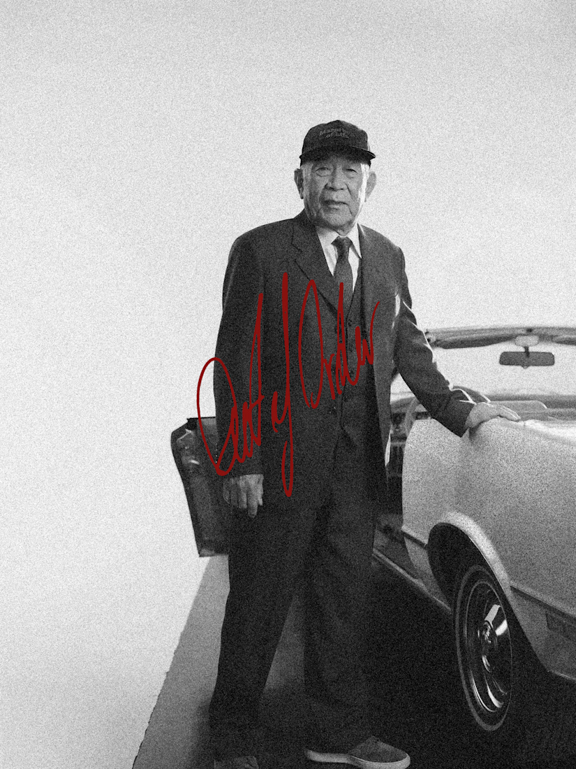
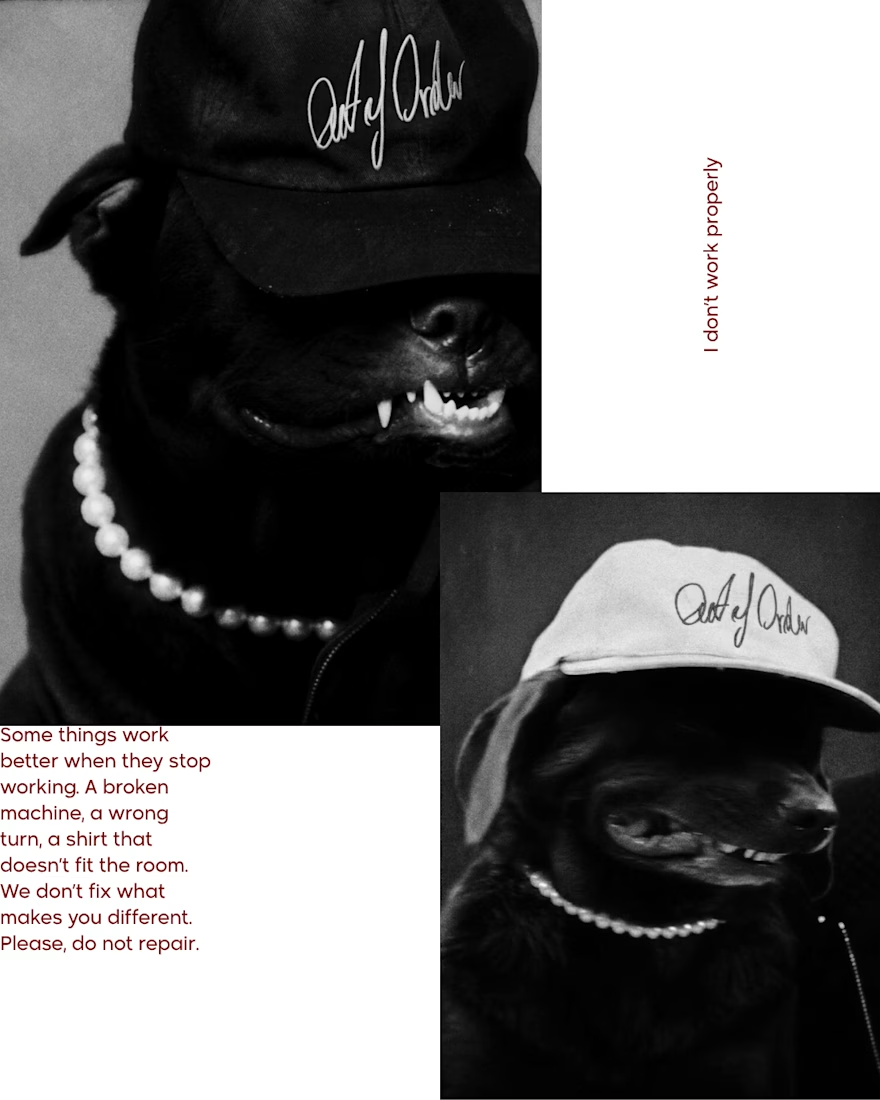
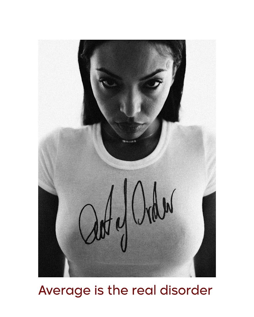


Love the handwritten logo on the tee and cap, it feels real. The aesthetic fits the brief well.

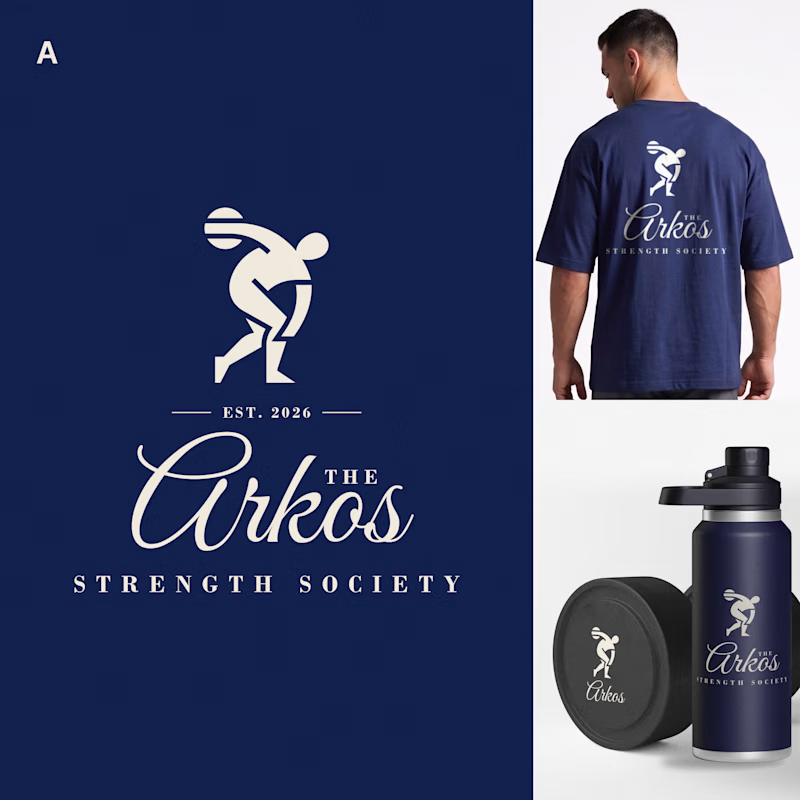
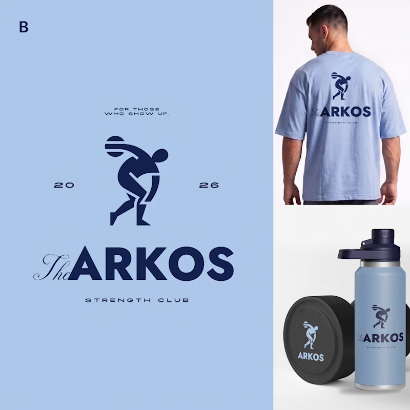
Most gyms follow a pretty similar approach to branding. I wanted to see what a strength club could look like if it drew more inspiration from a private-membership club vibe, since that's really trending right now.
Designed two directions for Arkos using the same mark. A is more refined and traditional, while B takes a bolder, more modern approach.
Which direction would you go with?
11 voted
50%
11 voted
50%
22 votes
Closed

The darker one is the best for me, but both are really good, man


