The network for creativity
Join 1.25M professional creatives like you
Connect with clients, get discovered, and run your business 100% commission-free
Creatives on Contra have earned over $150M and we are just getting started
Back to feedPost

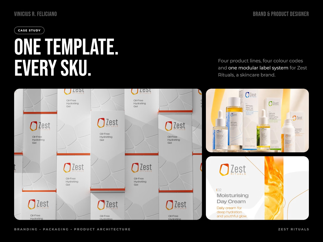
Hot take: a skincare line doesn't need a new design for every product. It needs a system.
When Zest Rituals came to me, there was a handful of products and no structure holding them together. On paper it was a packaging brief. In practice it was product architecture.
So before any label, I set three things.
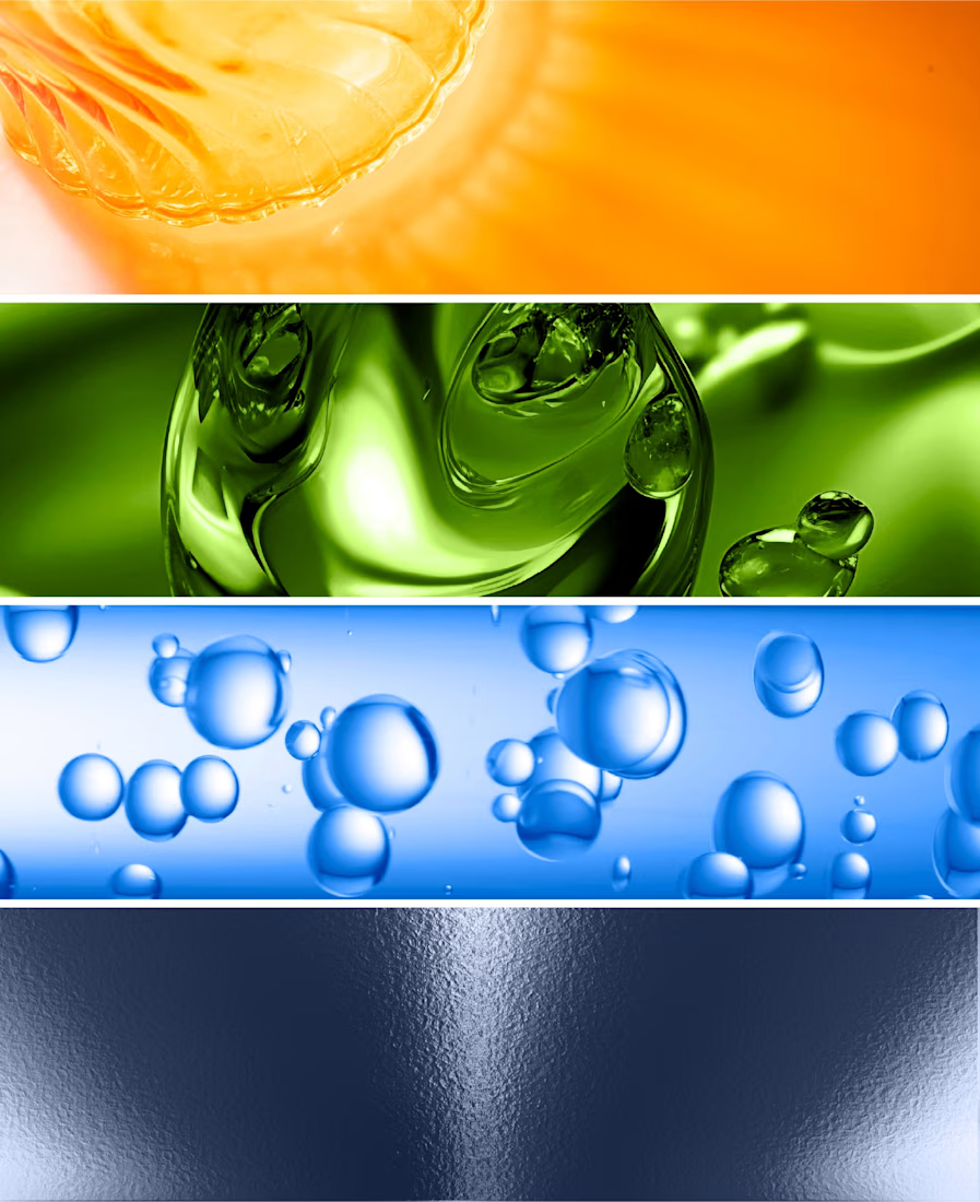
• Four lines, four colour codes. Vitality in orange and yellow, Nutrition in green, Purification in blue and cyan, Zest for Men in dark blue.
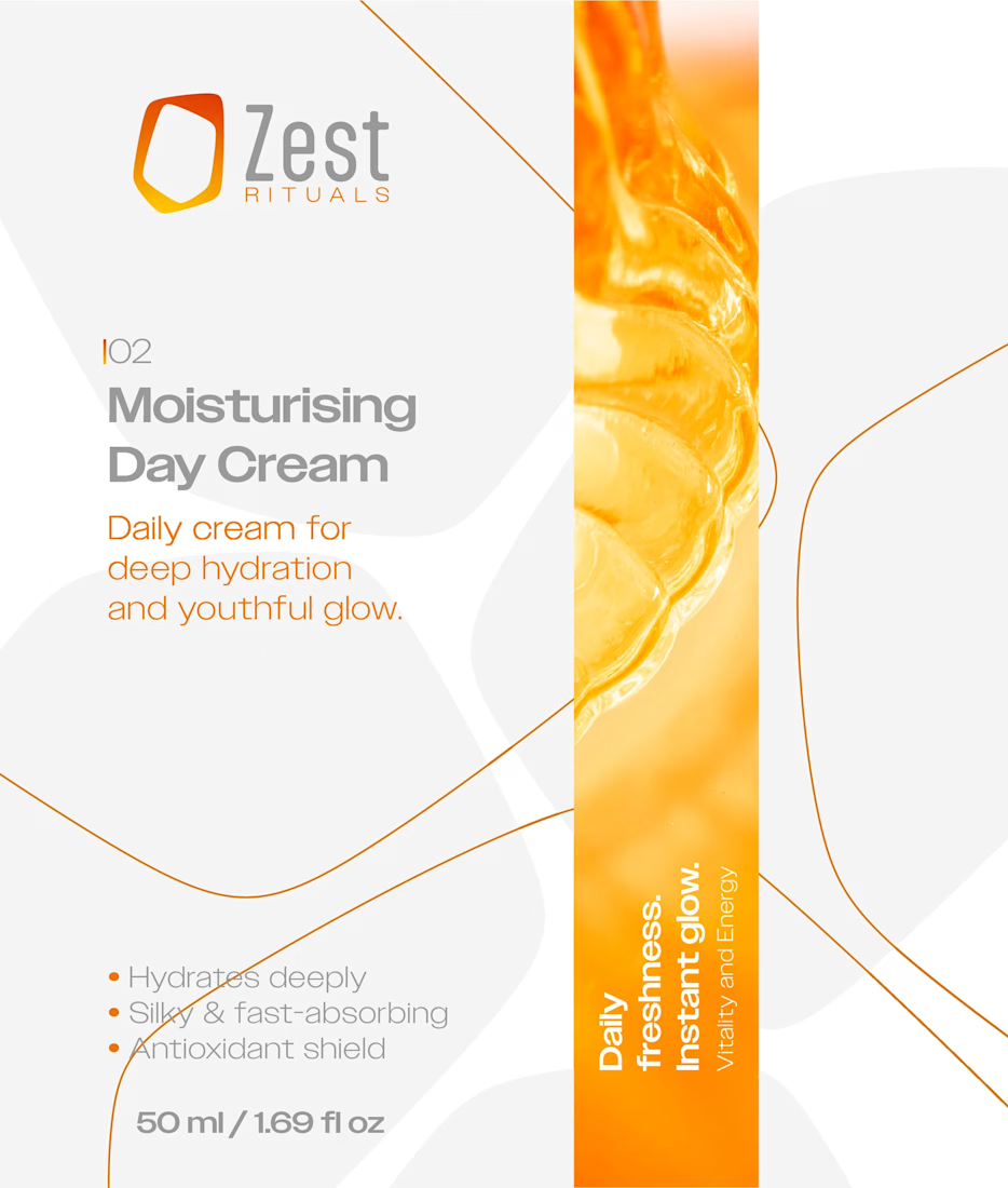
• One modular template. Logo, product number, name, benefits and volume always sit in the same place, and so does the ingredients panel.
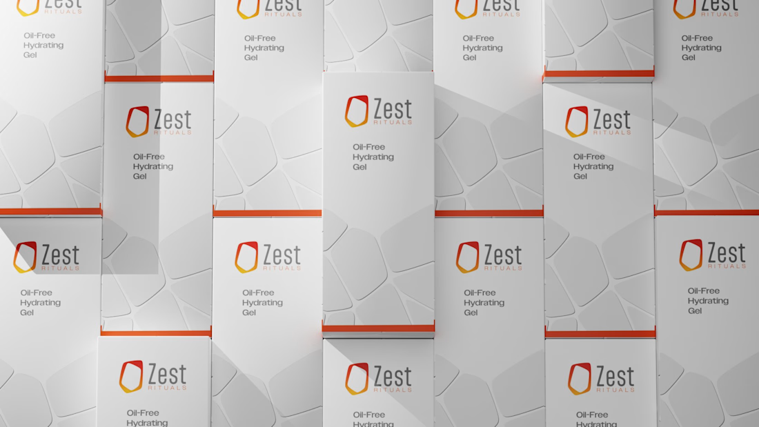
• Production dielines, with separate EU, UK and US formats.
Now a new SKU isn't a new design problem. It's a new entry in a system that already works.
The network for creativity
Join 1.25M professional creatives like you
Connect with clients, get discovered, and run your business 100% commission-free
Creatives on Contra have earned over $150M and we are just getting started







Related posts

Took a WebGL fabric physics simulation and pushed it to the absolute limit.
Built a complete visual concept for a Peptides brand around it. Pure interaction, zero boring static layouts. Let's go!


Pushing fabric physics that far for a peptides concept is a strong choice. The quiet editorial layout lets the motion carry the brand instead of competing with it.

Luxora Skincare Serum Packaging


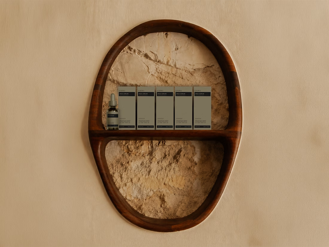
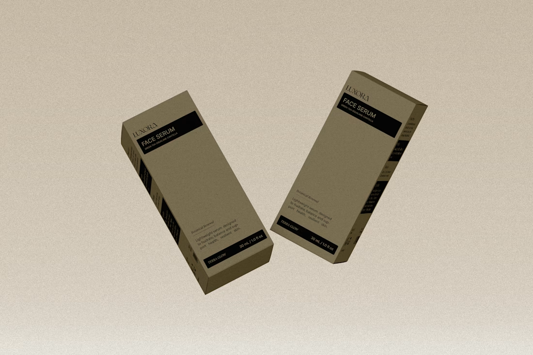
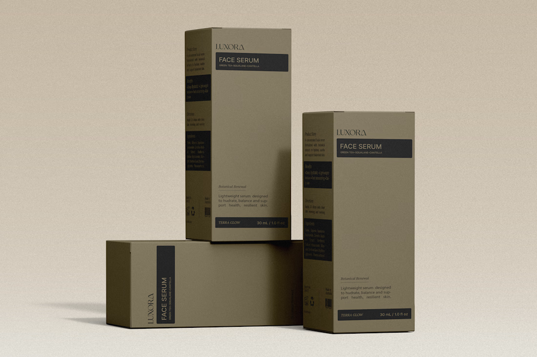
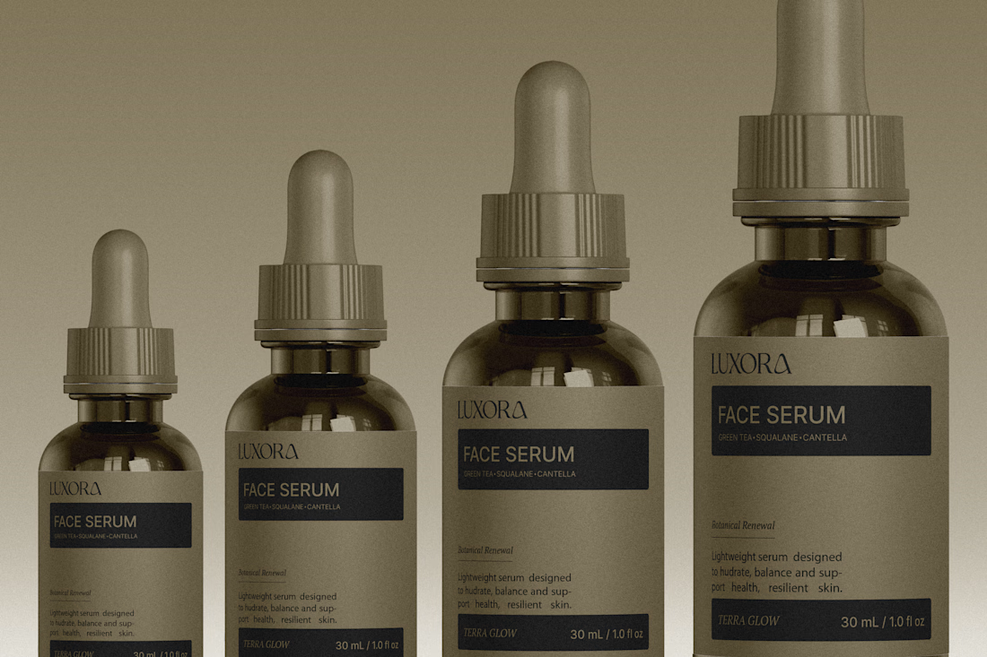
The olive droppers and FACE SERUM label stay in one calm palette, which is what makes the set feel expensive. The powder backdrop keeps it tactile instead of glossy-ad.



Nice work, Miguel!!