The network for creativity
Join 1.25M professional creatives like you
Connect with clients, get discovered, and run your business 100% commission-free
Creatives on Contra have earned over $150M and we are just getting started
Back to feedPost

Unsalted Vacation Rentals — Guest Book Design
A branded guest book designed for Unsalted Vacation Rentals to create a welcoming, informative, and cohesive experience for vacation-rental guests.
Role - Graphic/Visual Designer
Focus - Brand Design • Information Hierarchy • Print Design • Visual Communication
Client - Unsalted Vacation Rentals
The Challenge
Vacation-rental guests need quick access to important information—from Wi-Fi and emergency contacts to house rules and checkout instructions—without feeling overwhelmed by a wall of text or disconnected instructions.
The goal was to turn essential guest information into a clear, approachable, and on-brand experience that felt consistent with Unsalted's vacation-focused identity.
The Solution
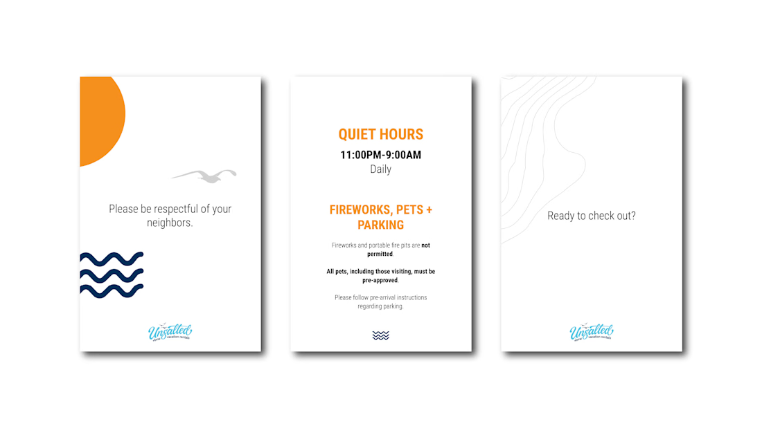
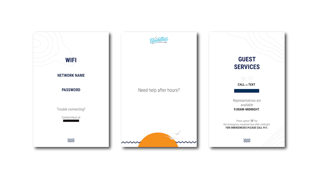
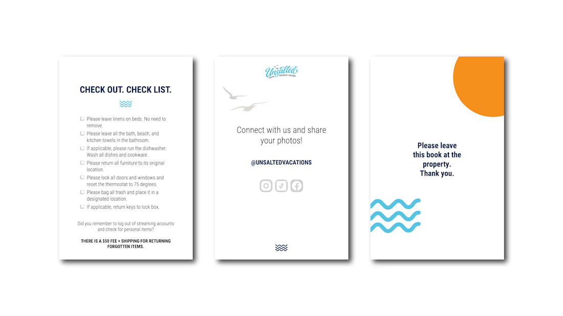
I designed a cohesive 14-page guest book that balances practical information with brand personality and creates a clear flow throughout the guest experience.
- Structured information into intuitive sections covering arrival, support, house rules, checkout, and future bookings
- Established clear visual hierarchy so important information—such as emergency contacts, quiet hours, and checkout requirements—is easy to find
- Applied Unsalted's visual identity through typography, color, imagery, and graphic elements
- Created a welcoming brand experience beginning with a branded introduction and continuing through the guest's entire stay
- Included strategic business touchpoints encouraging guests to book directly for future stays and introducing Unsalted's property-management services
- Designed for real-world use with concise copy, scannable layouts, and practical information guests can reference throughout their stay
Final Design
Welcome & Brand Introduction
- An inviting opening establishes the Unsalted experience and immediately orients guests to the property.
Guest Information
- Essential Wi-Fi, support, emergency, and house information is organized for quick reference.
House Rules & Checkout
- Clear hierarchy makes expectations and checkout responsibilities easy to understand and follow.
Stay → Return
- The final pages turn the guest experience into an opportunity to encourage direct bookings and continued engagement with the brand.



The network for creativity
Join 1.25M professional creatives like you
Connect with clients, get discovered, and run your business 100% commission-free
Creatives on Contra have earned over $150M and we are just getting started











Related posts

A little peek at the brand work we did for Elio Mortgage.
A warm, approachable identity full of warm vibrant colors paired with soft sun rising inspired gradients, inner glows and custom illustrations & more. Loved this direction!
Full case study coming soon, from process to final identity.
Plenty of logo explorations to share too!


That color palette takes the whole identity to a different level!! I loove it.

Brand Expressions -- Olivir



Thats so crazy!!!!!! Seeing this I feel we humans are still far better than AI

Ripple: book an Influencer the way you'd book a hotel 💧
Working with Influencer is still messy: DMs that go nowhere, rates you have to chase, contracts over email, and paying upfront with no guarantee.
Ripple puts the whole deal in one place:
• Discover Influencers matched to your Brand campaign, with real stats and a clear rate card
• Send a request and negotiate terms in chat
• Approve a proposal that both sides can see, line by line
• Sign once and it's binding for both sides
• Pay by phase, held in escrow until the work is approved
From "who should we work with?" to "booked" in minutes.
#ProductDesign #UIUX #CreatorEconomy #MobileApp #ConceptDesign

This is such a needed concept, Praveen! 👏 The influencer booking process is honestly a nightmare right now. Love how you simplified it like booking a hotel - super clear positioning. The design in the video looks clean too! 💧