The network for creativity
Join 1.25M professional creatives like you
Connect with clients, get discovered, and run your business 100% commission-free
Creatives on Contra have earned over $150M and we are just getting started
Back to feedPost


Zaprika: Logo Animation
Zaprika's wordmark, brought to life in about 5 seconds. Letters bounce in one by one, the lightning bolts in the A's spark on, and the logo flashes through each flavour's colour before settling.
We made it for the brand's website, social content and ads, as part of a larger project covering 3D product visualisation and Shopify store design.

Really loved the logo font, especially the lightning bolt inside the ‘A’. It looks amazing!🔥
Thanks a lot! Glad you liked our work. 😊
Great and creative work should always be appreciated😊Keep up the great work guys!!
The network for creativity
Join 1.25M professional creatives like you
Connect with clients, get discovered, and run your business 100% commission-free
Creatives on Contra have earned over $150M and we are just getting started






Related posts

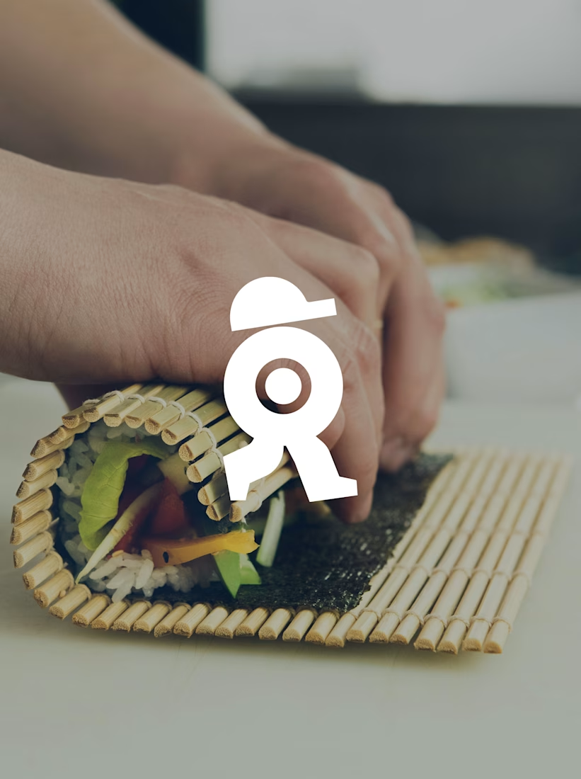
A sushi roll with a life of its own.
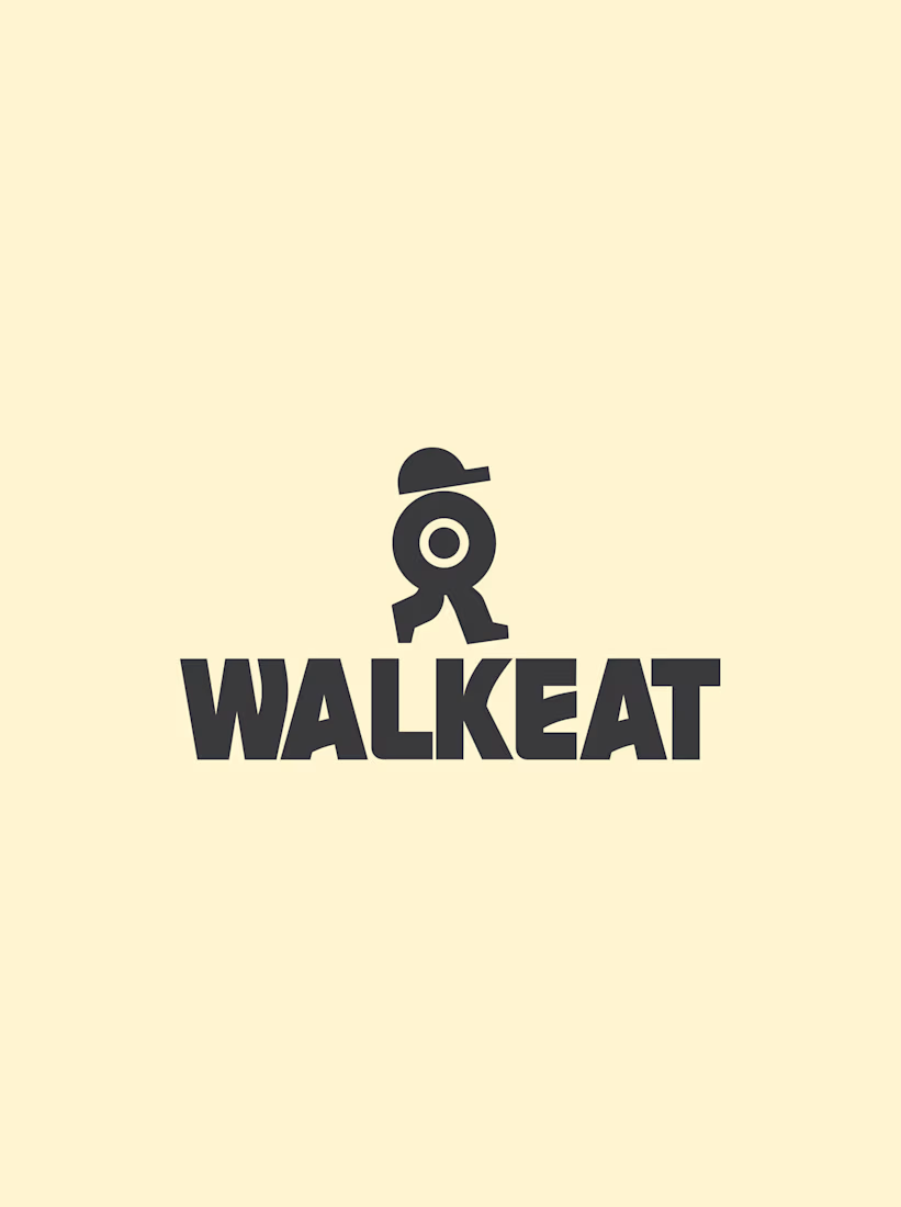
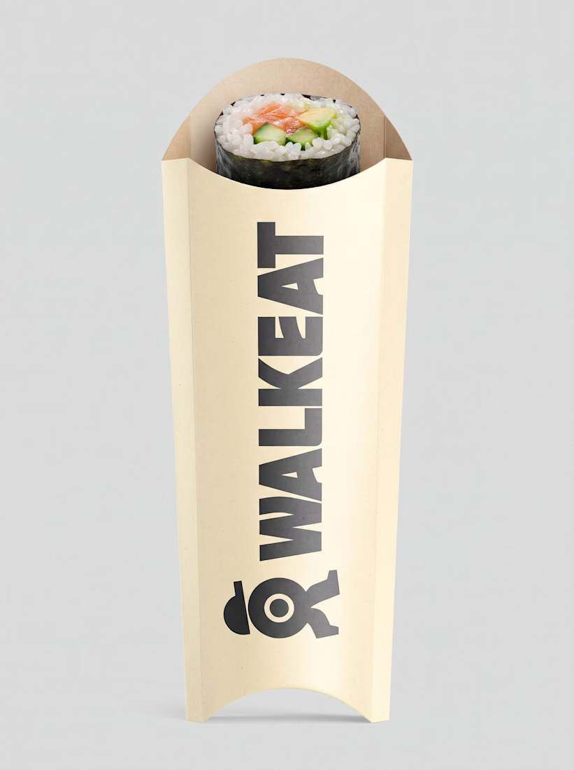
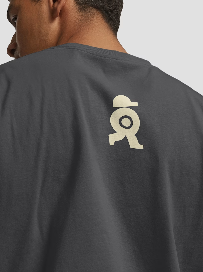
The WALKEAT identity transforms the shape of a sushi roll into a walking character. Its circular center references the cross-section of the roll, while the cap and legs bring movement and personality to the figure.
The custom-designed wordmark reinforces this concept through subtle modifications to the W, A, and E, creating a visual connection between typography and symbol.
A simple, playful and contemporary identity that communicates the product without relying on literal Japanese imagery or an overly cartoonish character.



Great work!!

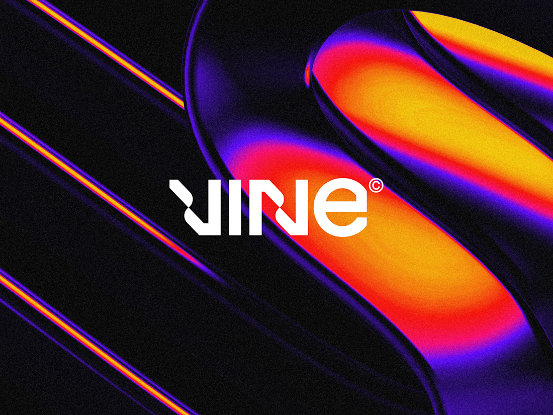

The sharp V pops against that vivid gradient.

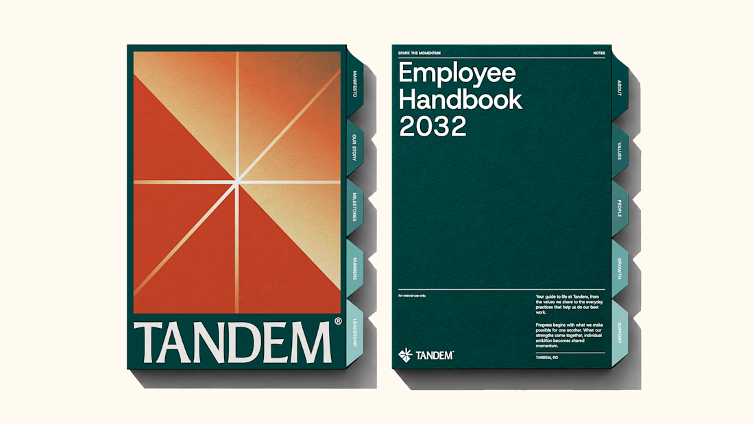
The new brand identity for Tandem is live!
Quite a lot of thought and work went into building this one, and I'm excited to finally share it. Would love to hear your thoughts!
We developed a complete brand experience for Tandem, covering:
1. Brand Strategy
2. Brand Naming
3. Logo Desig
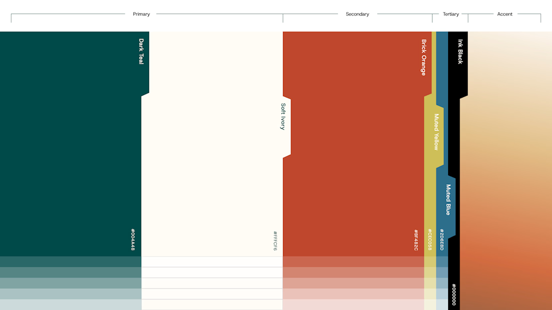
4. Visual Identity
5. Brand Collaterals
6. Brand Guidelines
7. Motion Design
The complete project is now live. Take a look and explore the full identity here

Great work!!