The network for creativity
Join 1.25M professional creatives like you
Connect with clients, get discovered, and run your business 100% commission-free
Creatives on Contra have earned over $150M and we are just getting started
Back to feedPost
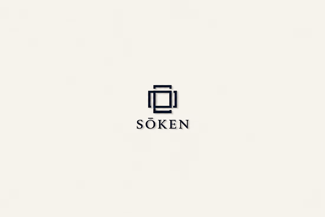
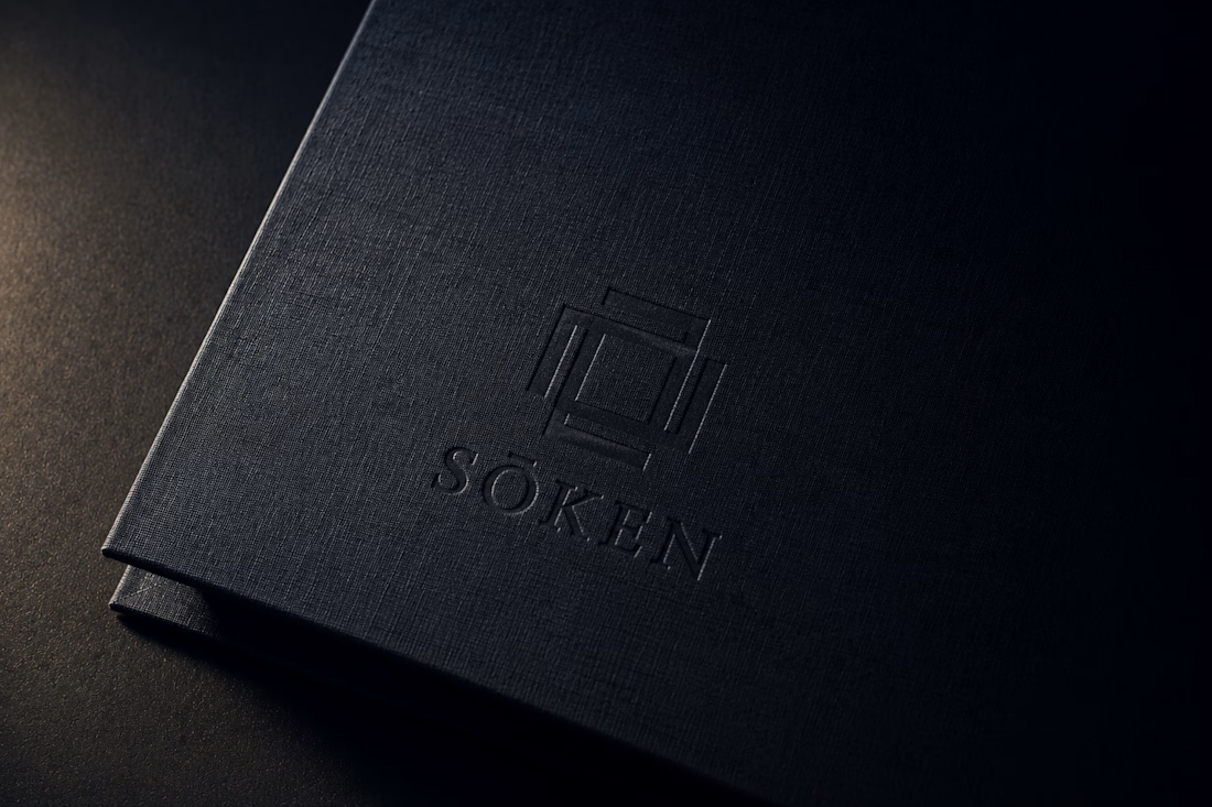
SŌKEN — Strategic Intelligence Logo Direction
SŌKEN is a boutique strategic intelligence consultancy built for sovereign wealth funds, family offices, and board-level decision makers who cannot afford to be wrong. The identity had to carry the weight of that silence — the kind of institutional authority that doesn't announce itself.
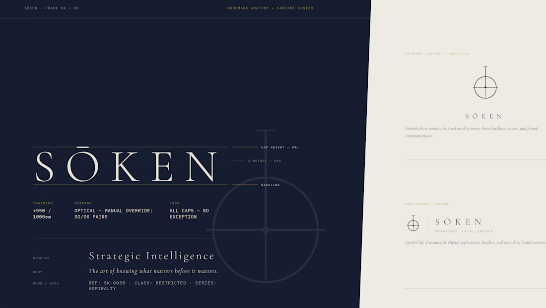
The logomark is a compass sightline bisecting a horizon: a circle interrupted by a horizontal axis, with a vertical ascender rising above it. The geometry is pure — mathematically derived on a 12-unit grid, proportioned for minimum reproduction at 12mm. The symbol does not symbolize intelligence. It demonstrates it.
The color world is four: Admiralty navy, Archive bone, Instrument brass, and Inference mid-navy. Together they read like classified documents that have aged with intention. The typography pairs Cormorant Garamond's editorial weight with IBM Plex Mono's coordinate precision — the two voices this brand speaks in.
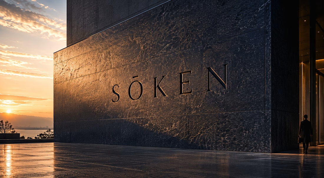
Every application — letterhead, business card, wax seal, envelope, monogram — was directed to feel like it already existed in 1987 in a building without a sign. No gradients. No decoration. No noise. Just the mark, the material, and the light.
Atmosphere Lock: 4×5 large format film · Single overhead drafting lamp at 15° · Hiroshi Sugimoto + Rut Blees Luxemburg · Admiralty navy bleeding into all shadows.
M N LOKESHWAR REDDY, Creative Director.


Link to the full project:
https://www.behance.net/gallery/250257541/SOKEN-Strategic-Intelligence-Logo-Direction
The network for creativity
Join 1.25M professional creatives like you
Connect with clients, get discovered, and run your business 100% commission-free
Creatives on Contra have earned over $150M and we are just getting started
Related posts

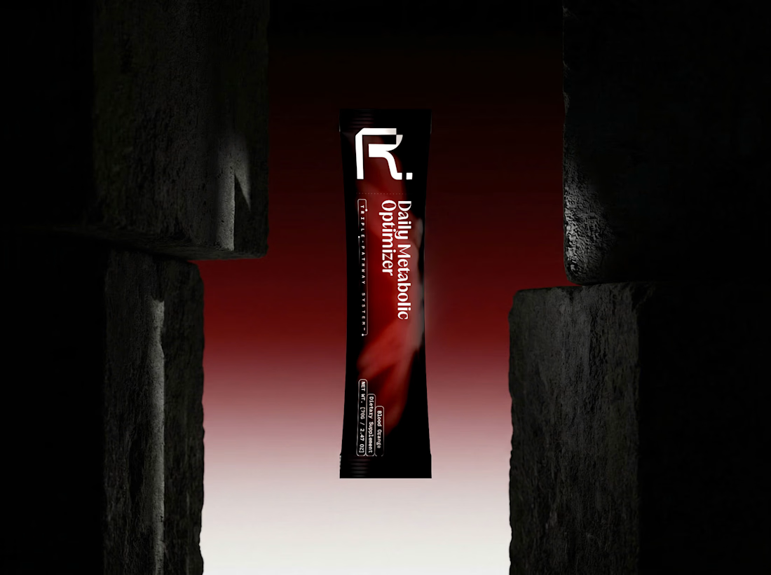
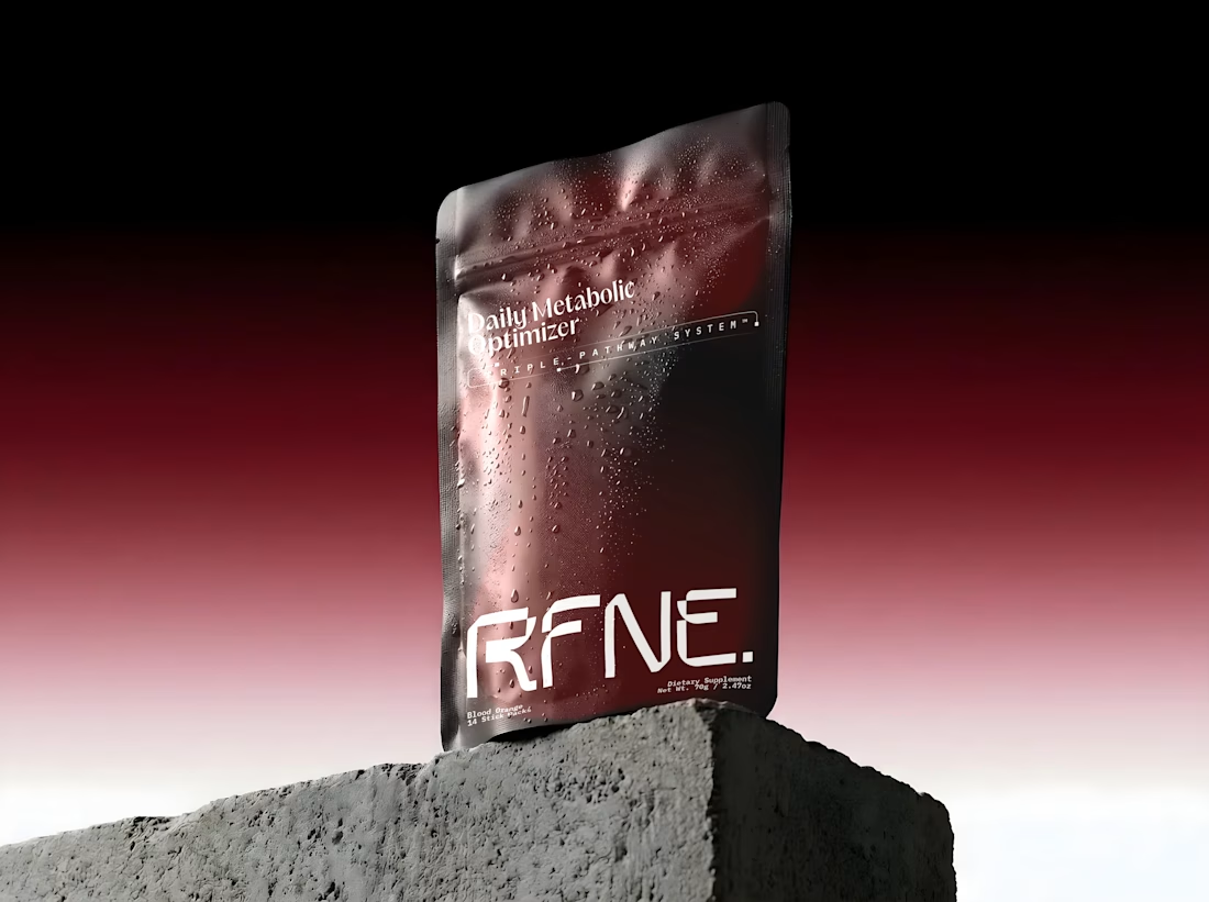
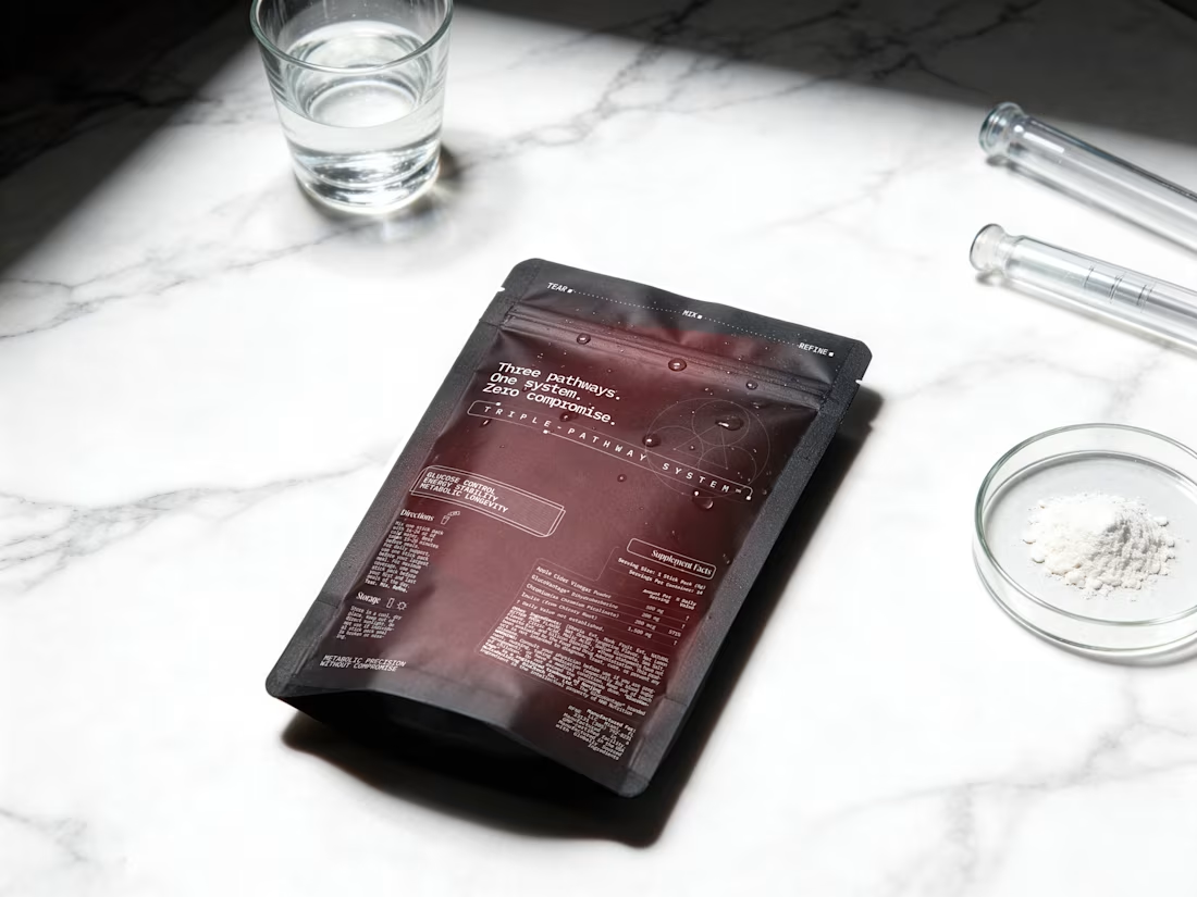
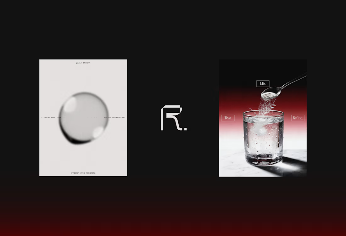
Few more scenes of the RFNE.'s Branding & Packaging design 🧪
A precision metabolic support system engineered for high performers, a silent operating infrastructure designed to stabilize the body’s baseline and unlock elevated performance across training, focus, and recovery. Rooted in the concept of the bridge, the identity carefully balances scientific rigor with quiet luxury, creating a presence that feels both clinical and sophisticated.
You can see full project and narrative here
Feel free to like, comment and follow, kindly appreciated.

Absolutely perfect!


Nice!
OSSŌ — Artisan Charcuterie Brand Application Direction
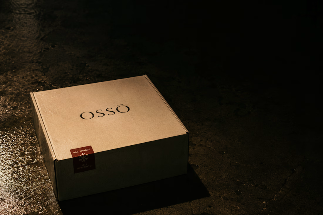
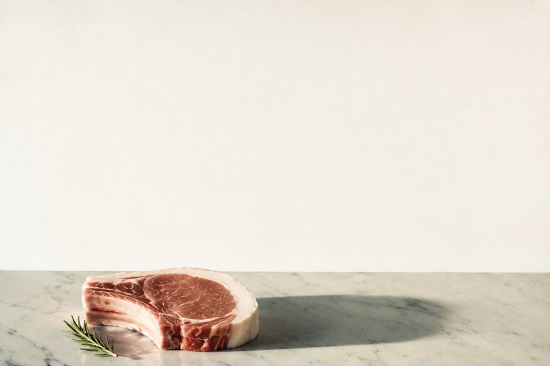
OSSŌ is an artisan nose-to-tail charcuterie house built for the chef who already knows why it matters. The brand direction began with a single conviction: the animal deserves to be known completely — not only its loin and its ribs, but its marrow, its cheeks, its rendered fat. This project is Brand Application Direction — every surface the brand touches, designed with the same severity as the product itself.
The visual world is anatomical illustration meeting Italian charcuterie tradition: bone-white, tallow amber, charcoal marrow, and one accent of oxidized blood-brick used once per composition, never twice. The Atmosphere Lock is built on expired Kodak Ektachrome 100 grain, hard raking tungsten at 12 degrees, and the isolation philosophy of Irving Penn's still life work combined with Andrea Wyner's European market grain.
Applications include butcher paper wraps, wax-sealed parcels, cold chain delivery boxes, chef coat embroidery, ceramic weight labels, a physical hang tag with letterpress weight numerals, and a cut chart that functions simultaneously as packaging and poster.
Every cut is a decision. Every cure is a philosophy. Every bone is kept.
M N LOKESHWAR REDDY, Creative Director.


Link to the full project:
https://www.behance.net/gallery/249966495/OSSO-Artisan-Charcuterie-Brand-Application-Direction







Trending

Claude
Claude has entered the design space. How are you using Claude Design?

Contra University
Learn from expert creatives how to earn more using next-gen AI tools.
creativeaiflow
Creative AI workflows are evolving. What tools do you use, and what are their strengths and weaknesses?
portfolioreview
The best portfolios tell a story, not just show a grid. Share yours for feedback.
freelancerlife
Freelancer life is wins, pivots, and everything in between. What’s yours right now?