The network for creativity
Join 1.25M professional creatives like you
Connect with clients, get discovered, and run your business 100% commission-free
Creatives on Contra have earned over $150M and we are just getting started
Back to feedPost
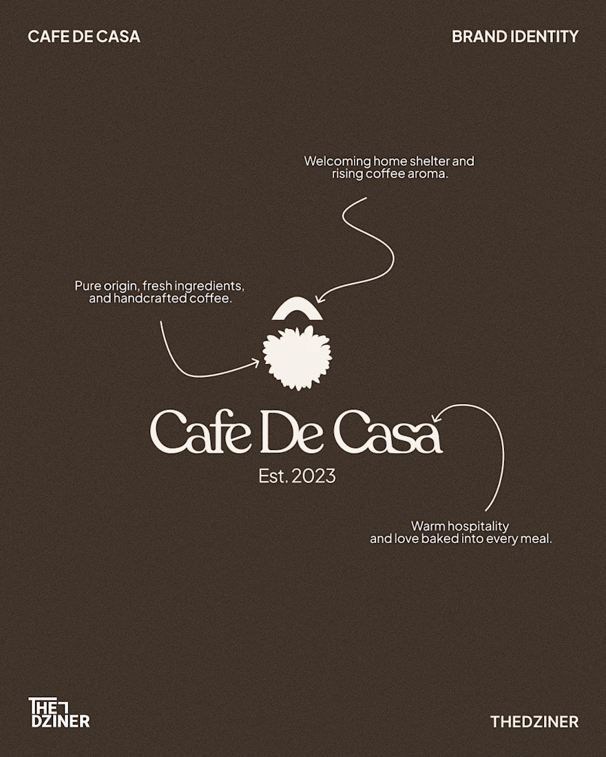
Cafe De Casa — Visual Identity System
The Problem: Beautiful physical café spaces often lose their premium feel online when their digital grid and generic brand marks don't match the in-store hospitality experience.
The Solution: A cohesive, custom word mark and unified visual system that bridges the gap between their physical storefront and digital presence. The goal was to build a mark that feels welcoming, premium, and instantly recognisable at a glance.
Deliverables:
• Custom word mark & responsive brand icon
• Unified typographic and colour system
• Digital touchpoint strategy (Instagram grid)
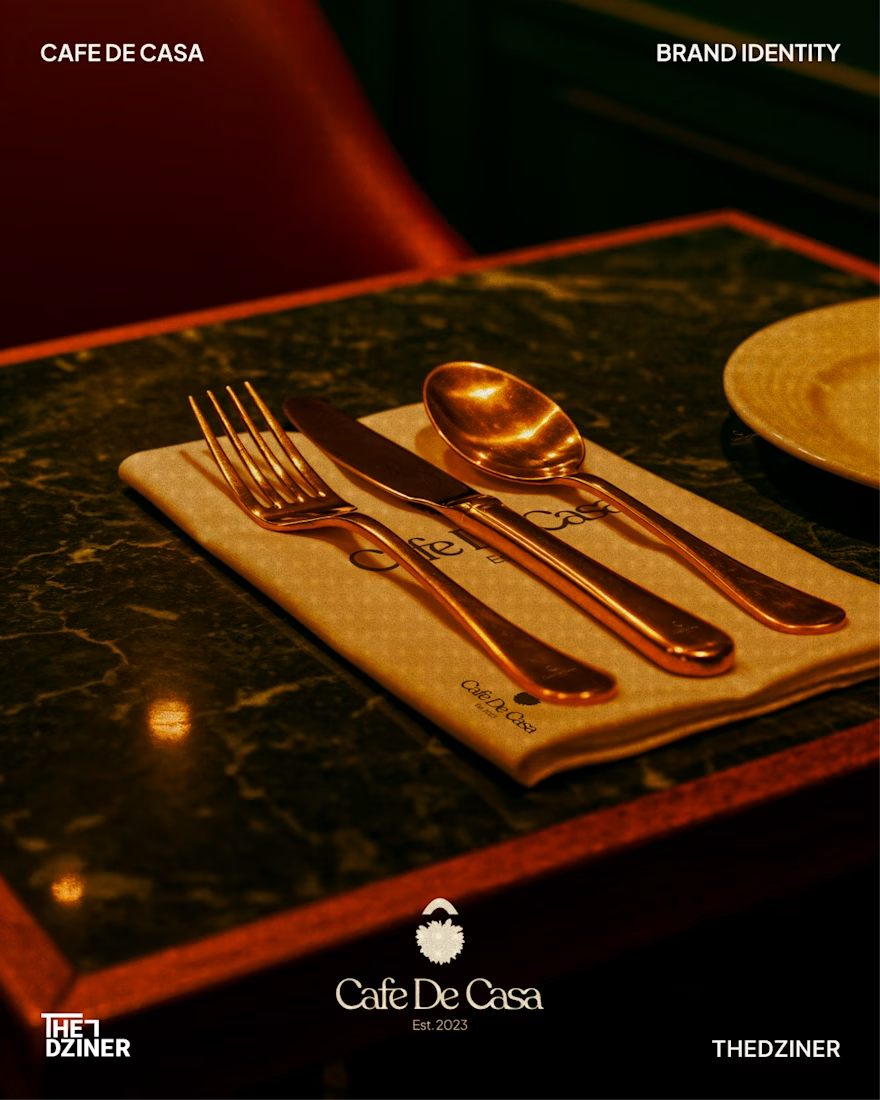
• Physical brand applications (Menu, signage, and apparel)
(Concept redesign for Cafe De Casa — Unsolicited / Not affiliated)
Available for new brand identity projects

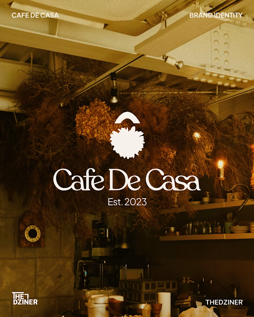
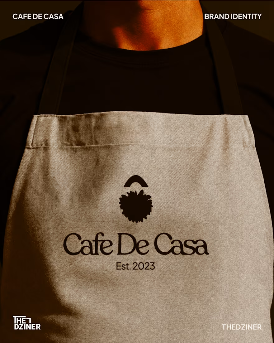

That apron mockup is so clean. Really love how warm and premium this whole system feels, fits a cafe perfectly.

Really appreciate it! Building that welcoming, premium vibe was the main focus for this identity. Thanks for noticing the apron detail!

Great visuals man
Really appreciate that! I could only fit 4 images in this quick post, but I’ll be uploading the complete case study to my profile shortly with all the extended brand touchpoints.

Love this
Appreciate it! Glad the vibe connected.
The network for creativity
Join 1.25M professional creatives like you
Connect with clients, get discovered, and run your business 100% commission-free
Creatives on Contra have earned over $150M and we are just getting started



Related posts

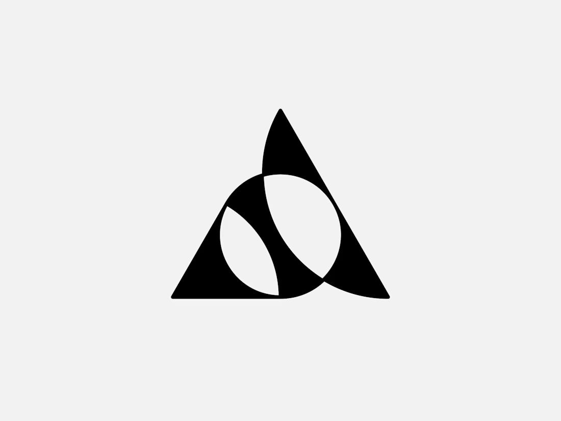
Exclusive premade abstract triangle A logo.
One buyer, full copyright transfer.
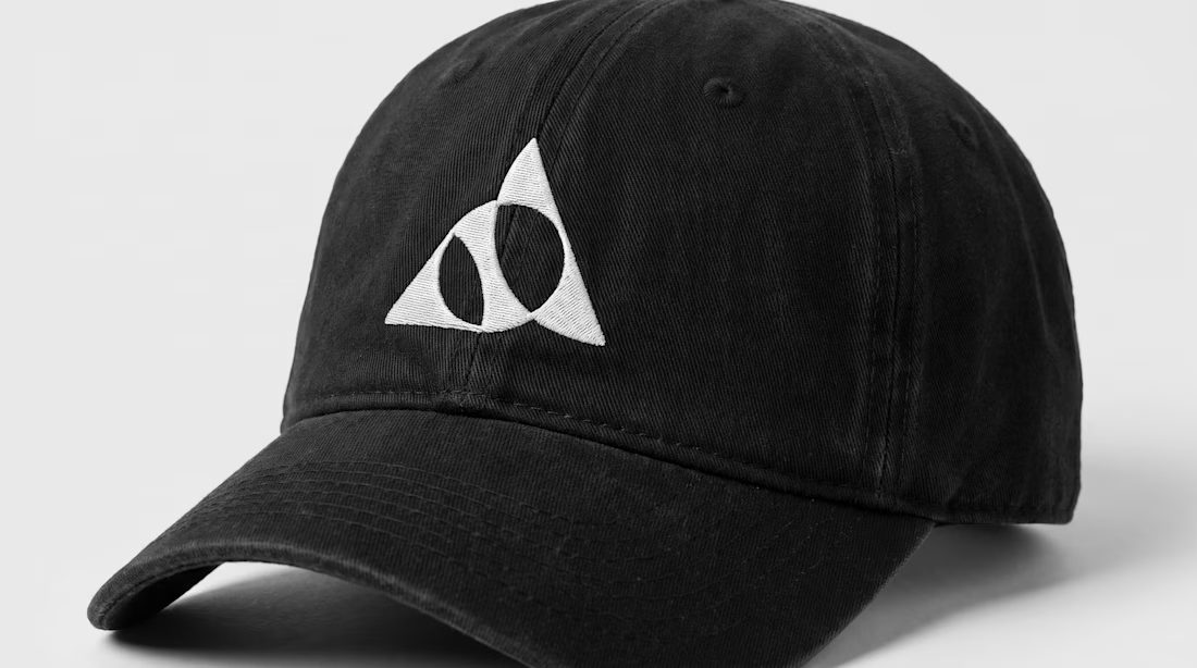
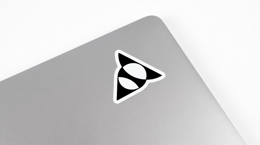
A triangle, a circle, and one sweeping curve forming a stylized letter A with two leaf-like shapes in negative space. Built for AI companies, tech startups, fintech platforms, and architecture studios.
Available now: https://brandforma.com/work/abstract-triangle-a-logo-for-sale
Design by Bohdan Harbaruk // Brandforma Studio

TOP!!

AI Analytics Dashboard
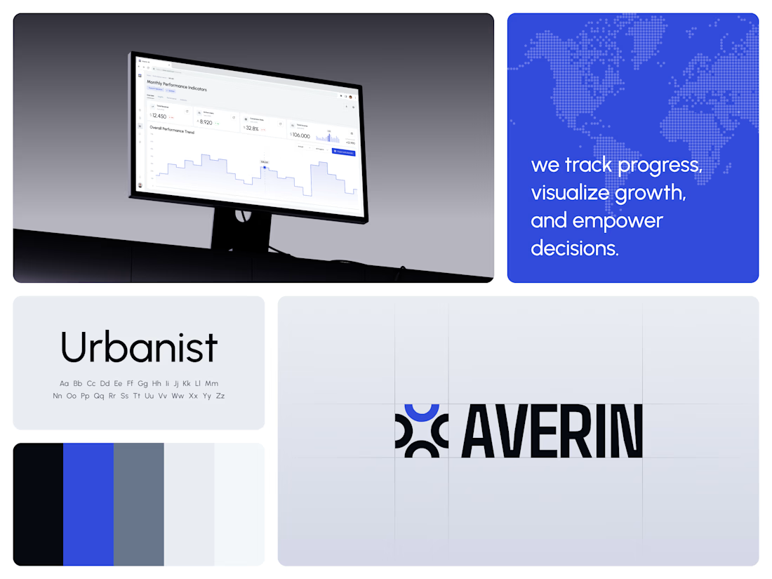
One blue runs from the logo to the chart line.
Revenue, active users, conversion rate and income sit in a row of cards above the trend chart. The cards answer where the numbers stand. The stepped line answers how they got there, holding each period's value until the next, with a tooltip on a dashed guide line for the exact figure.
The identity pairs a four-arc mark with a condensed wordmark, drawn to the same top and bottom lines on the construction grid. The top arc's blue comes back in the slogan tile, the chart line and the main button, so the brand and the product share one accent.
Designed by the Hue & Machine team.
#DashboardDesign #DataVisualization #SaaS #Analytics #AI #WebApp #BrandIdentity #UIDesign #ProductDesign #FigmaDesign



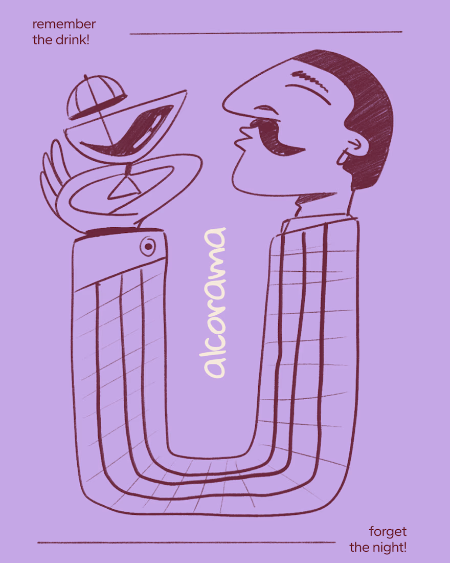
Final direction picked! I love when brands use custom illustration as the main way to communicate with their audience.
Direction discovery should not take more than one week and it should be full of personality! Ready to upgrade your brand?
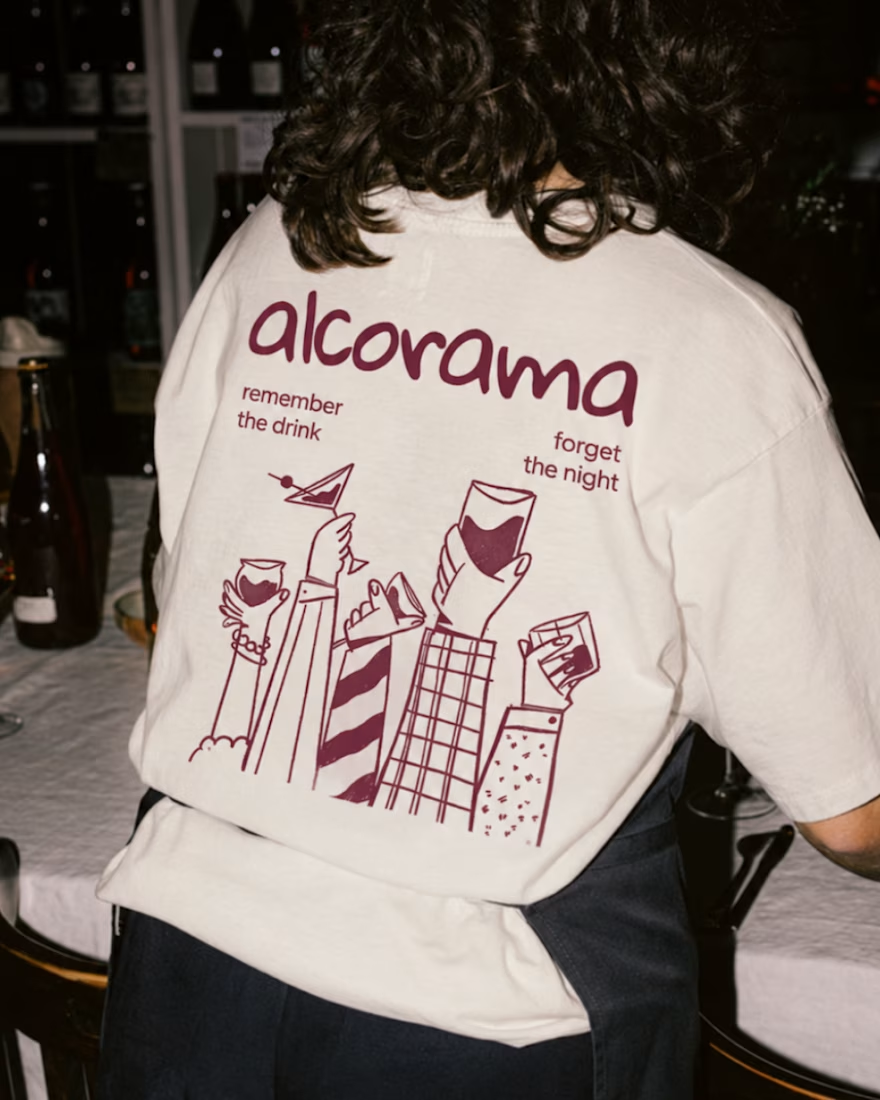
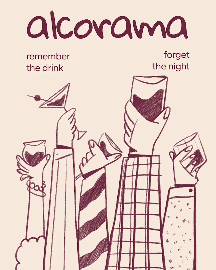

Amazing work!