The network for creativity
Join 1.25M professional creatives like you
Connect with clients, get discovered, and run your business 100% commission-free
Creatives on Contra have earned over $150M and we are just getting started
Back to feedPost
Taste Test

To be honest, we like both options. So we're curious—which one appeals to you more?

10 voted
48%
11 voted
52%
21 votes
Closed

Ganesh 🙌

I’d go with the white version, it feels cleaner, more modern, and keeps the focus on the message and the flow between the platforms. The dark background adds more visual weight than this concept really needs.
Thanks, Elvira. Good point about visual weight: on a light background the connections between platforms read faster, and that's the core of the message. Noted.

white definitely reads to me as more professional & refined.
As always thank you, Nicolette


option 2
Nazar 🤜🤛

I choose option 1 it feels more balanced in visuals and more vibrant but option 2 is good but option 1 is the best ❤️❤️
Mostafa, you saw this dilemma too.

Give me the first option please

option 1

nice work

Option 1 looks more elegant in terms of color, and in my opinion, it’s more marketable.

GOing with option 2
Going say you thanks 👍

Aside from looking more professional, 1st option speaks security and transparency so I'd go with that one 👍

Both are amazing and my vote is for Option 1....
Thanks, Umar 🙌
The network for creativity
Join 1.25M professional creatives like you
Connect with clients, get discovered, and run your business 100% commission-free
Creatives on Contra have earned over $150M and we are just getting started











Related posts

Two page transitions, one site. Which one feels better to you?

5 voted
83%
1 voted
17%
6 votes
Closed
Kinetic Reveal feels more natural ❤️❤️
great job Dayyan🎉🎉

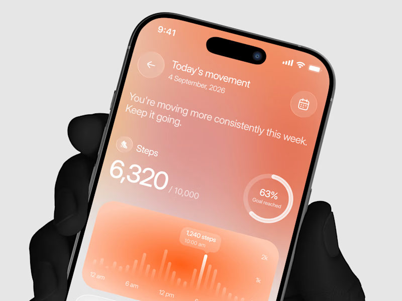
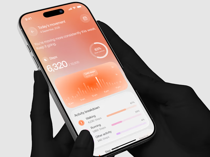
Designed a step tracking screen where you can see your daily progress and weekly trend in one glance.
Same screen, two shots. Which one would stop your scroll? 👀

11 voted
73%
4 voted
27%
15 votes
Closed


Hey everyone! 👋
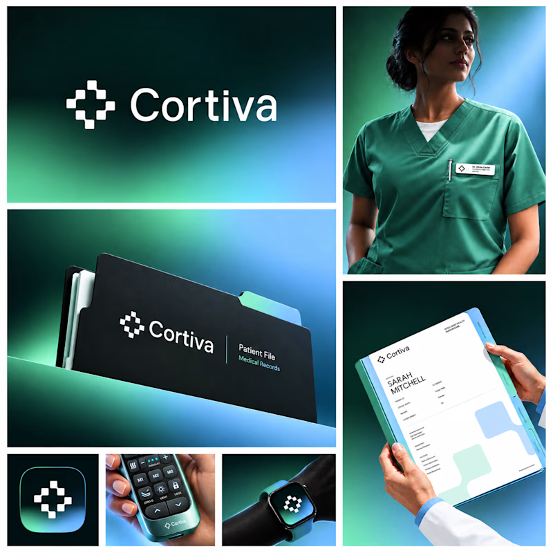
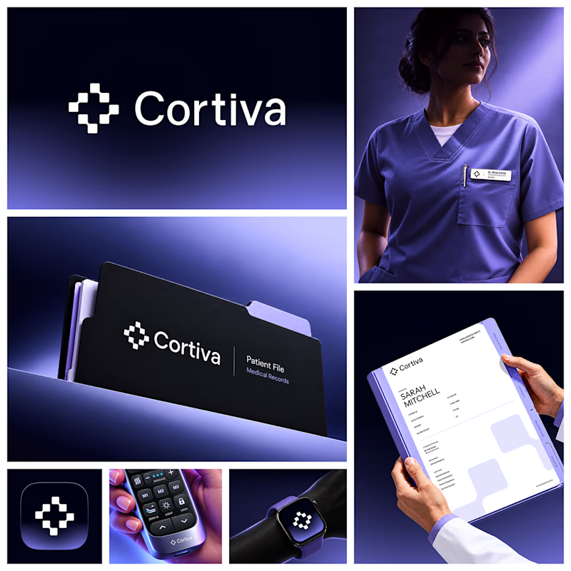
Working on Cortiva, an AI-first hospital branding project.
I've already finalized the color direction, but I thought it would be fun to explore two different moods.
Option 01💚 or Option 02? 💜
Both have their own personality, and I'm curious to see which one you prefer!
Let's see which one wins! 👀
5 voted
33%
10 voted
67%
15 votes
Closed

Option 01 for me. Green gets to "care" faster in a hospital setting, while the violet pulls the whole system toward a tech product. Since the identity is AI-first, I'd be curious whether you want patients to read it as clinical or as friendly first.