The network for creativity
Join 1.25M professional creatives like you
Connect with clients, get discovered, and run your business 100% commission-free
Creatives on Contra have earned over $150M and we are just getting started
Back to feedPost

Just wrapped a custom store build and I'm genuinely proud of this one.
Minimal. Clean. The kind of ecommerce experience that doesn't shout—it just works. Product pages that breathe. A checkout flow so smooth it almost feels intentional. Collections that actually make sense when you're browsing.
The hero hits different when you scroll through it live. Real product imagery. Real storytelling. The whole vibe just clicks.
This is what I build for brands that know design matters. No template defaults. No generic flows. Just a store that converts because it feels right.
Demo's ready to show—thinking this could be something special for the right founder.
→ DM if you're building something like this.


The network for creativity
Join 1.25M professional creatives like you
Connect with clients, get discovered, and run your business 100% commission-free
Creatives on Contra have earned over $150M and we are just getting started
Challenges
View all


Related posts

VYRO — redefining essentials through a bold, minimal digital experience.


Nice work!


You spend 6 figures on a brand tracking agency. They spend three months "running the wave." You get a 100-page slide deck that tells you what happened in Q2 while you’re already halfway through Q3.
That’s a post-mortem, not a strategy.
We built the identity and product framing for Timelaps to represent the opposite: continuous visibility.
Research-grade data from 4,000+ consumers, flowing in real-time. No "waves", no dusty decks, just an always on dashboard that shows you if your marketing is actually landing before the budget is gone.
If you’re still waiting 90 days to see if your brand is growing, you’re flying blind.


I have to say, You leave an ipression everytime you appear in my feed. You have got great taste Daniel💪

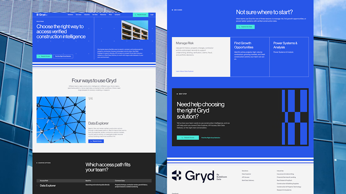
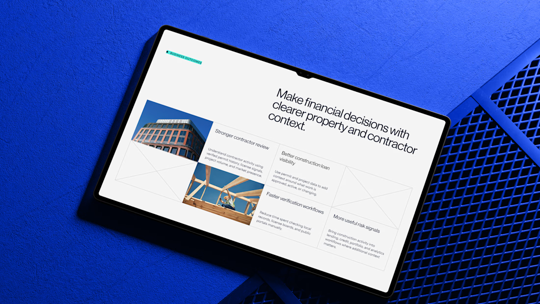
30+ pages, 3 weeks, and honestly one of my favorite projects in a while.
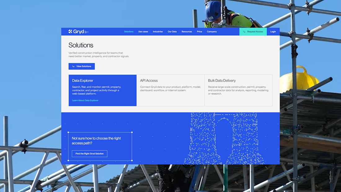
I'd been wanting to design something more tech-driven for a long time, and Gryd, a platform turning construction permit data into intelligence for insurers, lenders, and real estate teams, was exactly that.
Wireframes first, then UI across every page, fully responsive, with animation on the key screens, all built inside the brand the client had already set.
Case study's on my profile.

Clean design 😍