The network for creativity
Join 1.25M professional creatives like you
Connect with clients, get discovered, and run your business 100% commission-free
Creatives on Contra have earned over $150M and we are just getting started
Back to feedPost
Taste Test
Which palette would you keep?
The first sets deep navy glows top and bottom, bending around a pale ice band. The title racks into focus in oxblood serif, ANIMATED fades in beside GRAPHICS, and the letters keep tracking slowly apart.
The second runs the same move in crimson on blush, the title switched to amber, the glows softer at their edges so the whole frame sits warmer.
One reads like deep space. The other reads like a red carpet.
👇 #motiondesign #typography #aftereffects
6 votes
Ends in 5h

Deep field is more powerful ❤️

Deep field looks more interesting to me, but more importantly, it has contrast and reads well. In Heat Bloom the title is hard to read at first glance.
The network for creativity
Join 1.25M professional creatives like you
Connect with clients, get discovered, and run your business 100% commission-free
Creatives on Contra have earned over $150M and we are just getting started





Related posts


Which one would you shelf?
The first is a brushed silver can tilted against deep sage, a ribbon of water spiralling around it, beads of condensation across the metal, type in black and green.
The second is a blush can over pale sand, embossed type, fine linework up the side, two blocks of ice at the edges, droplets in a loose arc.
One sells performance. The other sells recovery.
👇 #packagingdesign #brandconcept #productphotography
5 voted
83%

1 voted
17%

6 votes
Closed

Steel🔥


Should a flower shop ever go black and white?
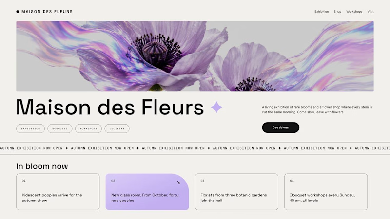
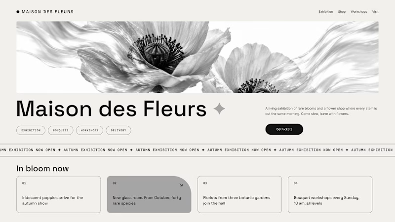
Same flower house, same layout. We only took the color out.
1. Full color. The iridescent petals do the selling: lilac, pink, a little shimmer. The photo is the brand, and every accent on the page borrows from it.
2. Monochrome. No color at all. Shape, texture and typography have to carry everything, and the page suddenly reads like a gallery catalogue.
Color sells the flower. Monochrome sells the exhibition.
Which one would get you through the door?
67 voted
91%
7 voted
9%
74 votes
Closed

The problem with monochrome is that, throughout computer history, it has conditioned users to associate gray and monochrome with being disabled, dysfunctional, or something to ignore and avoid.

Same product, two first screens. Jockey by TwelveLabs, dark neon or clean white. 1 or 2.
8 voted
17%
38 voted
83%
46 votes
Closed