The network for creativity
Join 1.25M professional creatives like you
Connect with clients, get discovered, and run your business 100% commission-free
Creatives on Contra have earned over $150M and we are just getting started
Back to feedPost
Taste Test


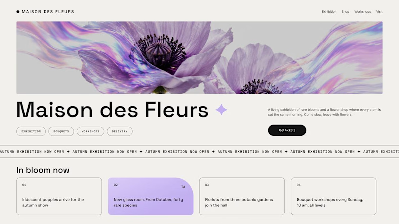
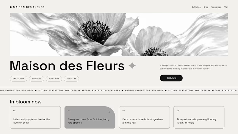
Should a flower shop ever go black and white?
Same flower house, same layout. We only took the color out.
1. Full color. The iridescent petals do the selling: lilac, pink, a little shimmer. The photo is the brand, and every accent on the page borrows from it.
2. Monochrome. No color at all. Shape, texture and typography have to carry everything, and the page suddenly reads like a gallery catalogue.
Color sells the flower. Monochrome sells the exhibition.
Which one would get you through the door?
54 votes
Ends in 16h


Full color for me, that iridescent shimmer is the whole mood. Was the hero image generated or a real photo you edited?

the domain of flowers is too high that i think it can never be black and white because its uniqueness is its colors

Full Color looks great..!!

I like it better with color

Both are great works; it's hard to choose. Which one do you like most?


obvs colour 😍

Full color for me. Those iridescent petals are basically the whole brand, taking them out makes it feel like a different shop.

First one looks cool


Full color for me. The flowers really benefit from the color, and it makes the whole brand feel more inviting.


black and white works, flowers pop more somehow

nice design

The problem with monochrome is that, throughout computer history, it has conditioned users to associate gray and monochrome with being disabled, dysfunctional, or something to ignore and avoid.

Both are great designs, but I like the Monochrome one more.

Love the full colour version

Both are amazing but Full color got my vote


The design is lovely; but I would agree that the full color even with a pop is just so nice. Very visually appealing especially with that sort of lavender / wisteria color. Calming as well.

Color looks lifeful

Color one stands out and looks so lovely, the background really is the one making it stand out
The network for creativity
Join 1.25M professional creatives like you
Connect with clients, get discovered, and run your business 100% commission-free
Creatives on Contra have earned over $150M and we are just getting started





Related posts

I think this could be my favorite Framer code component I’ve created. Meet Page Transition Studio, you can add animated transitions between pages across 10 styles. My favorites are vertical strips and centre split. What’s yours? Check the live preview here

Good work, like the interaction

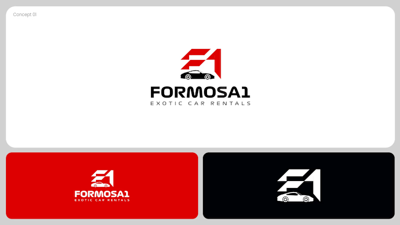
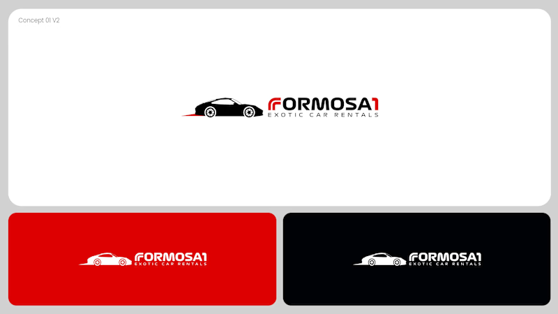
Two logo concepts for Formosa1 Exotic Car Rentals. Which one wins?
A: bold geometric F1 monogram, car tucked inside the mark. Strong and iconic.
B: car silhouette leads, red wordmark with a speed streak. Fast and clean.
Drop your vote 👇
17 voted
53%
15 voted
47%
32 votes
Closed

Both are great but I feel that was something special in the bottom one that's why I choose it❤️❤️

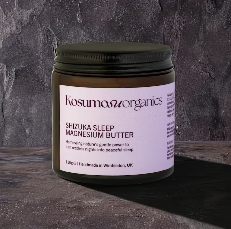
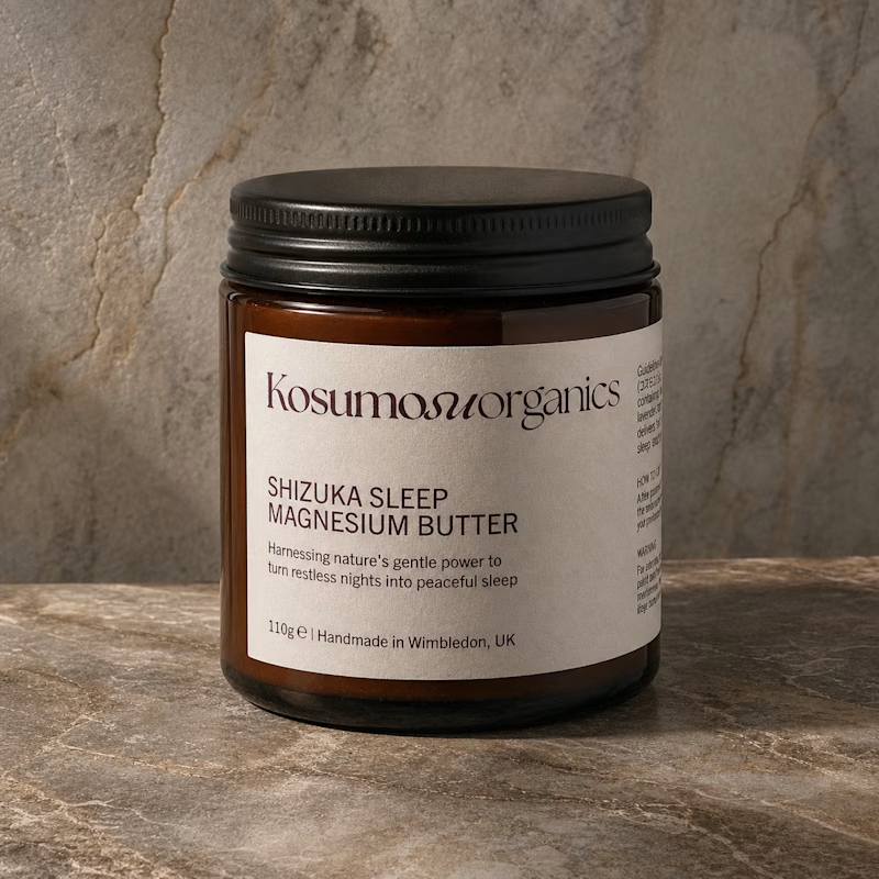
I went back to some AI-generated packaging images I created one year ago and tried to recreate them using newer AI models.
The difference is honestly wild. The materials, lighting, shadows, reflections, proportions… everything feels significantly more realistic now.
It made me wonder what we'll be recreating with these tools another year from now.
2025 or 2026: which one looks more convincing?

3 voted
11%
25 voted
89%
28 votes
Closed

"October 2026" looks better. It has better lighting, shadow, material design and it looks more realistic.