The network for creativity
Join 1.25M professional creatives like you
Connect with clients, get discovered, and run your business 100% commission-free
Creatives on Contra have earned over $150M and we are just getting started
Back to feedPost

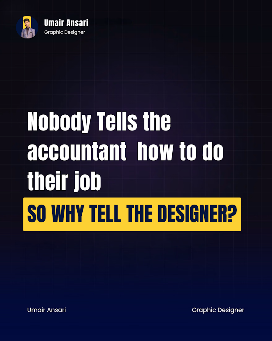
𝗡𝗼𝗯𝗼𝗱𝘆 𝘄𝗮𝗹𝗸𝘀 𝗶𝗻𝘁𝗼 𝗮 𝗳𝗶𝗻𝗮𝗻𝗰𝗲 𝗺𝗲𝗲𝘁𝗶𝗻𝗴 𝗮𝗻𝗱 𝘁𝗲𝗹𝗹𝘀 𝘁𝗵𝗲 𝗮𝗰𝗰𝗼𝘂𝗻𝘁𝗮𝗻𝘁 𝗵𝗼𝘄 𝘁𝗼 𝗱𝗼 𝘁𝗵𝗲𝗶𝗿 𝗷𝗼𝗯.
But put a logo on screen and suddenly everyone's an art director.
"Move it left a bit."
"Can we make it pop?"
"Make it feel more premium."
Here's the uncomfortable truth: design is the only skill in the room where the output is visible but the reasoning is invisible.
People see a color, a font, a layout.
What they don't see is the decision behind it, the eye tracking data, the drop off point, the conversion lift a single button placement can create.
A CTA isn't red because red is trendy. It's red because everything else on the page is blue, and the eye has to land somewhere.
That gap between what's seen and what's understood is exactly why design reviews turn into taste contests instead of strategy conversations.
The designers I respect most don't get defensive when challenged. They don't say "trust the process" either.
They just explain the "why." And that one sentence usually ends the debate faster than any mockup could.
𝗦𝗼 𝗵𝗲𝗿𝗲'𝘀 𝗺𝘆 𝗾𝘂𝗲𝘀𝘁𝗶𝗼𝗻 𝗳𝗼𝗿 𝘁𝗵𝗲 𝗿𝗼𝗼𝗺: 𝘄𝗵𝗲𝗻 𝗮 𝘀𝘁𝗮𝗸𝗲𝗵𝗼𝗹𝗱𝗲𝗿 𝗽𝘂𝘀𝗵𝗲𝘀 𝗯𝗮𝗰𝗸 𝗼𝗻 𝗮 𝗱𝗲𝘀𝗶𝗴𝗻 𝗱𝗲𝗰𝗶𝘀𝗶𝗼𝗻, 𝗱𝗼 𝘆𝗼𝘂 𝘀𝗵𝗼𝘄 𝘁𝗵𝗲𝗺 𝘁𝗵𝗲 𝗱𝗮𝘁𝗮 𝗼𝗿 𝗱𝗼 𝘆𝗼𝘂 𝗷𝘂𝘀𝘁 𝗺𝗮𝗸𝗲 𝘁𝗵𝗲 𝗲𝗱𝗶𝘁 𝘁𝗼 𝗸𝗲𝗲𝗽 𝘁𝗵𝗲 𝗽𝗲𝗮𝗰𝗲?
𝗗𝗿𝗼𝗽 𝘆𝗼𝘂𝗿 𝘄𝗼𝗿𝘀𝘁 "𝗺𝗮𝗸𝗲 𝗶𝘁 𝗽𝗼𝗽" 𝘀𝘁𝗼𝗿𝘆 𝗯𝗲𝗹𝗼𝘄.
The network for creativity
Join 1.25M professional creatives like you
Connect with clients, get discovered, and run your business 100% commission-free
Creatives on Contra have earned over $150M and we are just getting started











Related posts

Which creative direction better communicates a Tech-Forward AI Brand Identity for anvio.online ?
25 voted
44%
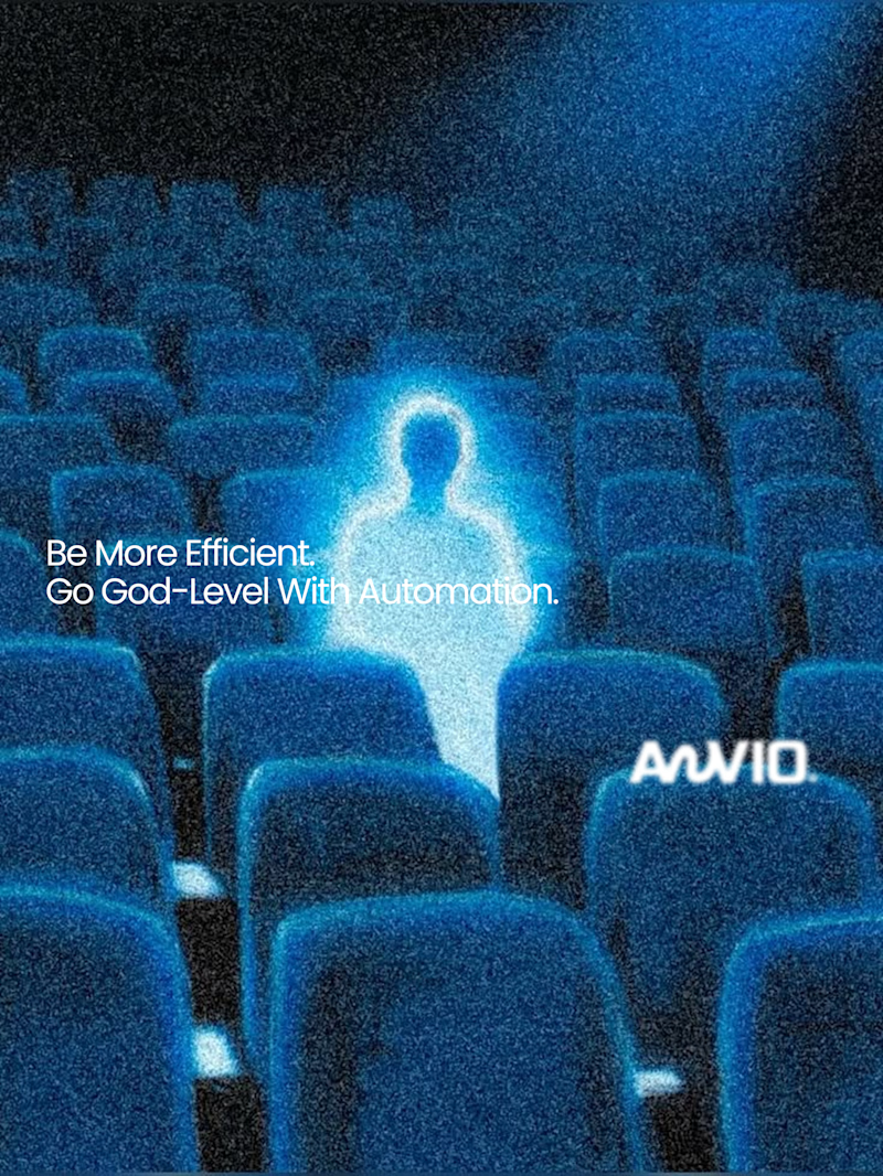
32 voted
56%
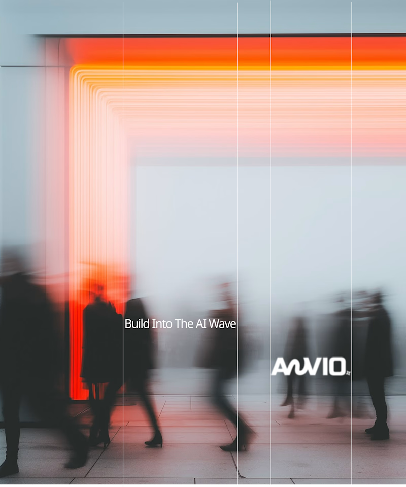
57 votes
Closed

Fast vibrant energy gets my vote. The warm glow feels more human, which is nice for an AI brand.

The team is cooking
Motion design for the logo we are making for Nation e-commerce


Wou

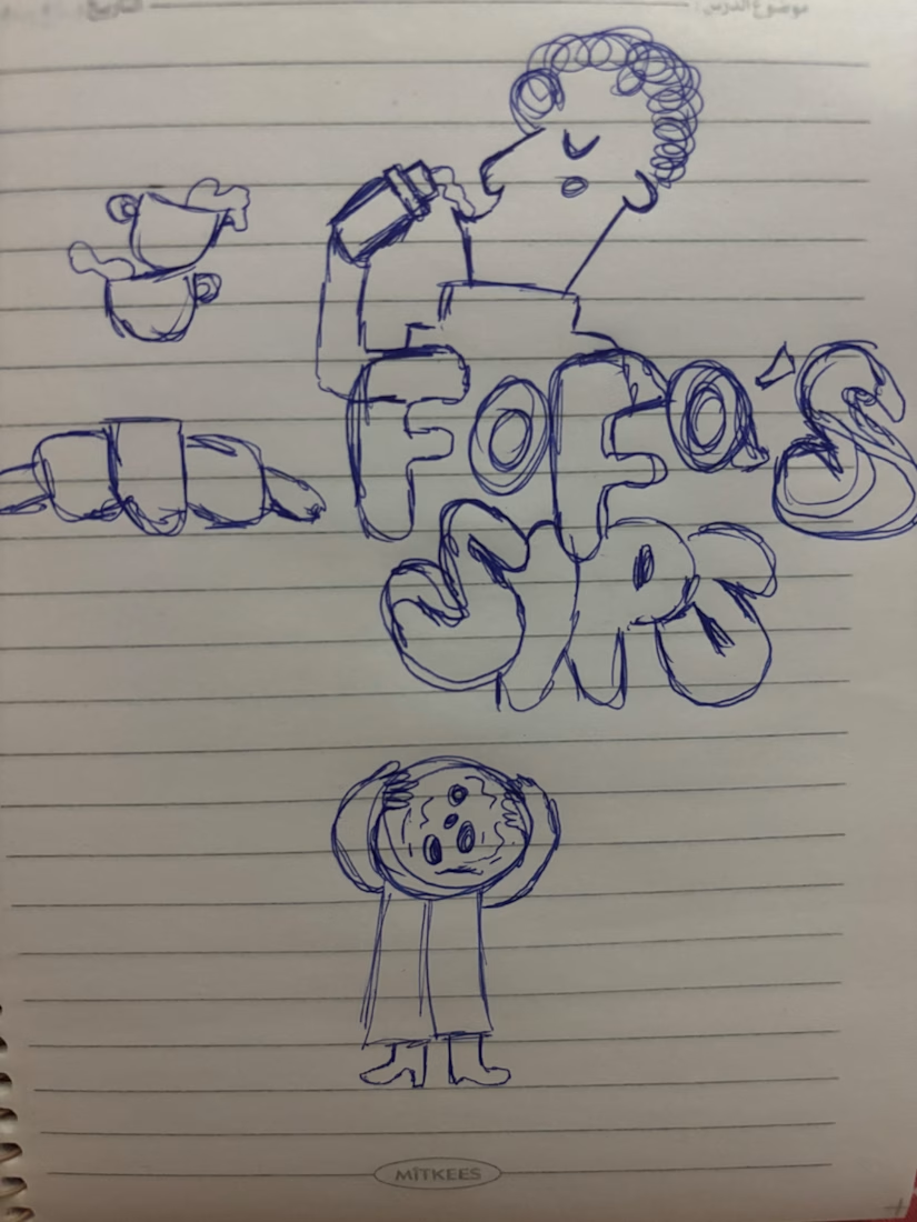
I turned one of my notebook doodles into a whole brand identity. And honestly this was way more fun than I expected I usually work on UI/UX and digital products so I wanted to take a step back from screens and explore something completely different: illustration-led branding.
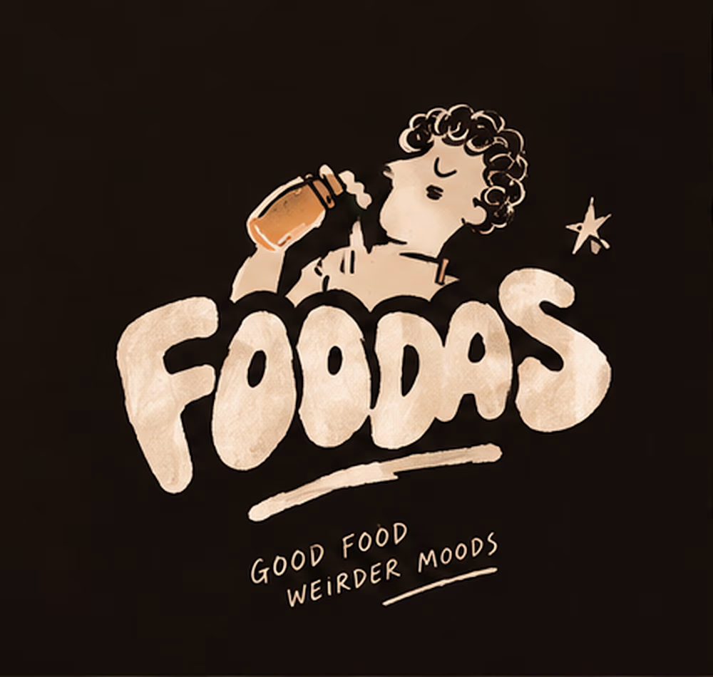
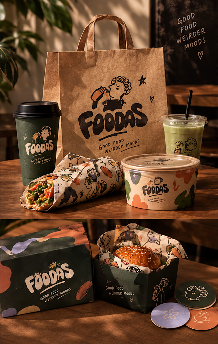
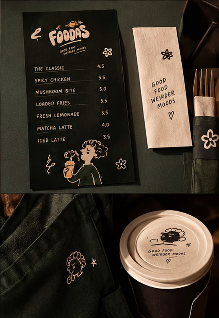
I took my original FOODAS sketch and built an entire visual world around it from the logo and mascot illustrations to the color palette packaging, cups, and menus
The goal wasn't to make it look perfectly polished and predictable I wanted it to feel playful, a little weird, and still premium.
Now I'm curious about one thing:
Can playful, imperfect illustrations make a brand feel more premium or do you think premium branding needs to be more minimal?
I have a feeling designers will disagree on this one