The network for creativity
Join 1.25M professional creatives like you
Connect with clients, get discovered, and run your business 100% commission-free
Creatives on Contra have earned over $150M and we are just getting started
Back to feedPost

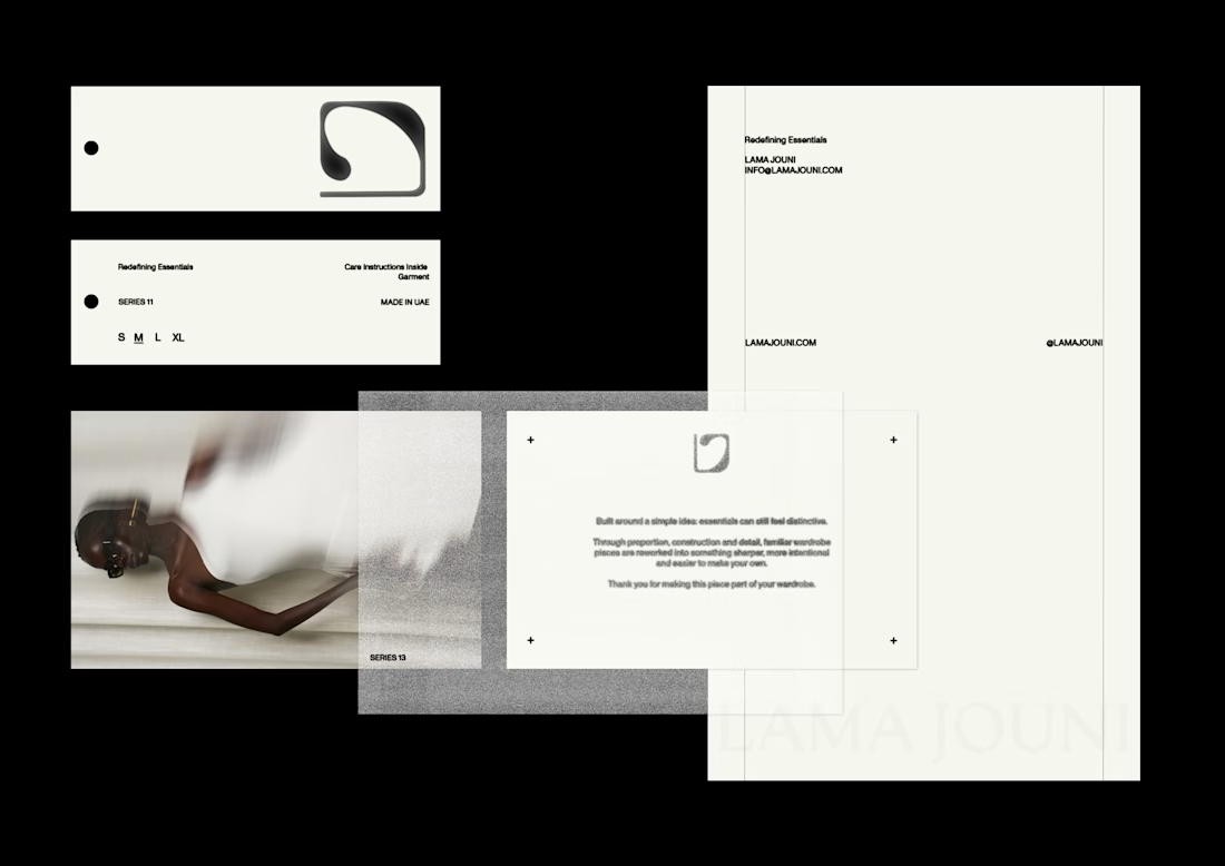
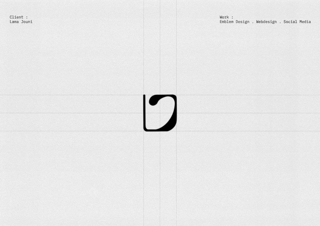
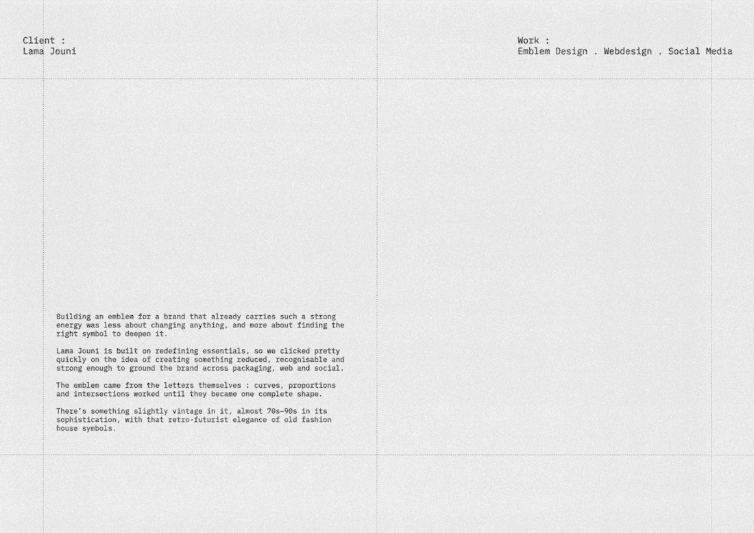
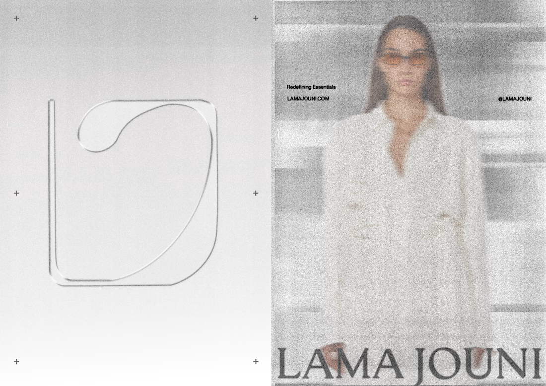
Lama Jouni has always lived in that space between ease and precision, essential pieces with enough attitude to never feel basic. The work started by finding a symbol that could hold that tension. Built from the letters themselves, the emblem was shaped through curves and proportions until it became one complete form, carrying a subtle 70s–90s fashion-house character. From there, the same logic extended across packaging, web and social, giving the brand more cohesion, recognition and depth without disturbing the energy that was already there.



Obsessed!

This is Amazing

Fantastic visuals! 💯💯

That '70s-90s fashion-house character is such a specific reference to hit and you clearly landed it. Was the emblem built by tracing the letterforms directly, or did you sketch it freehand first and formalize the curves afterward?


clean

So nice. I like it

This is a masterclass!
The network for creativity
Join 1.25M professional creatives like you
Connect with clients, get discovered, and run your business 100% commission-free
Creatives on Contra have earned over $150M and we are just getting started





Related posts

Doppel — Threat Graph
Making complex cybersecurity concepts clear through motion.
For the Doppel Threat Graph product film, I contributed to the visual development and animation. The product connects digital threats across multiple channels, revealing how individual signals form part of a coordinated attack campaign.
The challenge was to translate this technical functionality into a clear visual narrative—showing why the connections between threats matter and how they help reveal the bigger picture.
My work covered storyboard and motion exploration, animation, and scene refinement throughout the feedback process. The focus was on introducing information progressively and guiding attention toward the relationships central to the product’s value.
The result is an animated product film that introduces Doppel Threat Graph and makes its core functionality easier to understand. The project demonstrates how motion design can bring clarity to a complex software product.
Services: Storyboard Exploration · Motion · Animation


That's unbelievable great job 🎉🎉🔥🔥


Very nice

NICE HUMANS
Making automation feel human.
Context
Nice Humans is a growing automation studio that helps teams streamline how they work. As they scaled, their brand no longer reflected the expertise or the people behind it.
The challenge
The automation market speaks in efficiency, systems and scale, and it often sounds interchangeable. Nice Humans needed to claim leadership in that space while standing for something competitors overlook: automation is ultimately about people.
The approach
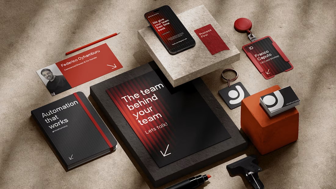
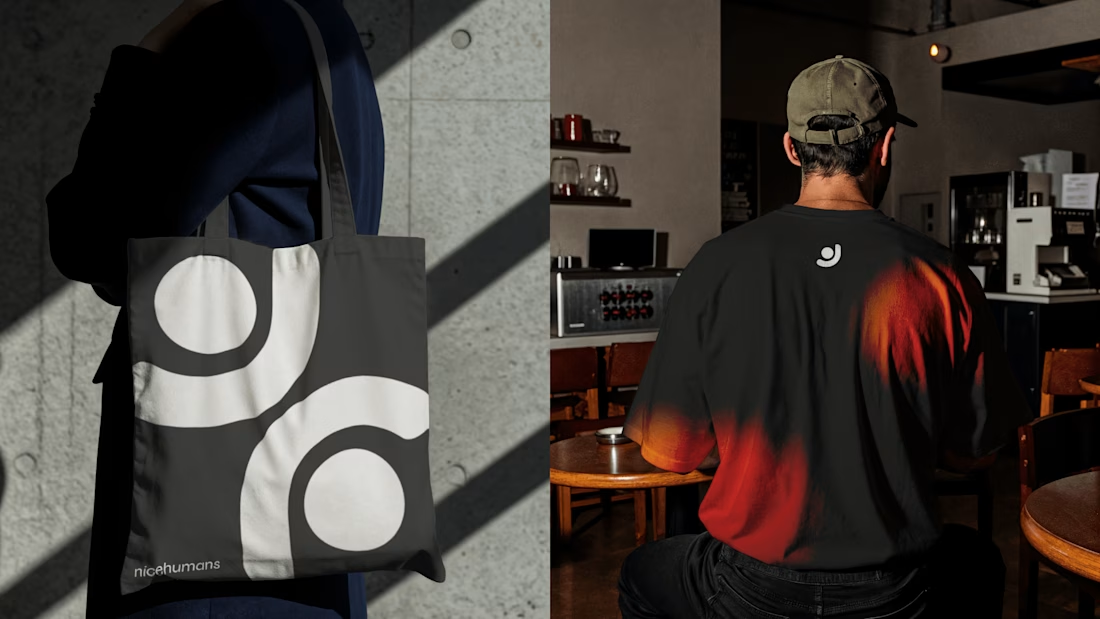
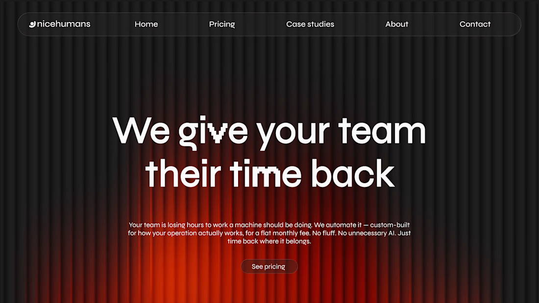
Rather than starting with a logo, we started with a positioning: a team that builds for other teams. From there we developed a complete brand strategy, including archetype, tone of voice, verbal identity and a visual language. Each one was designed to balance technical authority with human warmth.
The outcome
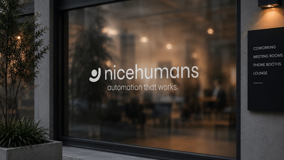
A cohesive brand system that sets Nice Humans apart in a crowded category and gives them a clear, consistent voice to grow with.

Great strategy and sleek execution! The visual hierarchy across web and print is spot on. 👏