The network for creativity
Join 1.25M professional creatives like you
Connect with clients, get discovered, and run your business 100% commission-free
Creatives on Contra have earned over $150M and we are just getting started
Back to feedPost

I'm really excited to have the opportunity to build the new website for Ayble Health.
A components-first structure gives marketers their own playground, so they can easily build new landing pages and manage all the content on their own.
Built using Webflow and GSAP.
Live site: ayblehealth.com

The network for creativity
Join 1.25M professional creatives like you
Connect with clients, get discovered, and run your business 100% commission-free
Creatives on Contra have earned over $150M and we are just getting started





Related posts

Meridian is an HTML or React template with AI-ready docs, contour maps drawn in the browser and a real route on top.
Preview it live to see the animations.
Starting at $29
https://no-code.supply/templates/meridian
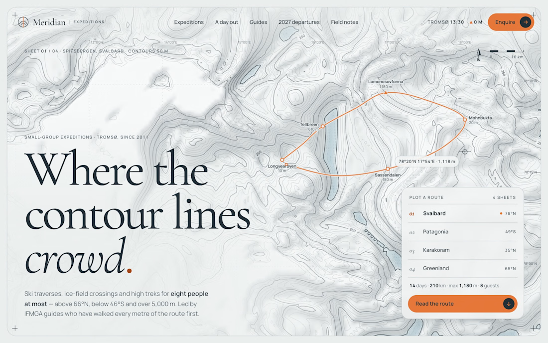

The contour-map rendering in the browser is a nice touch, most template sites just ship a static hero image. Is the route data generated per session or a fixed dataset baked into the template?

Creating immersive digital experiences with smooth website animations ✨
Designed & developed by Usman DevHub Tech & Creative Studio.
We create premium websites with modern UI, interactive animations, and unique visual experiences that help brands stand out. 🚀
Want a website like this for your brand?
DM us and let's discuss your project.
#WebDesign #WebDevelopment #WebsiteAnimation #UIDesign #CreativeStudio #DigitalAgency #UsmanDevHub


Light or refined - which E-Bike product breakdown section design would you choose?
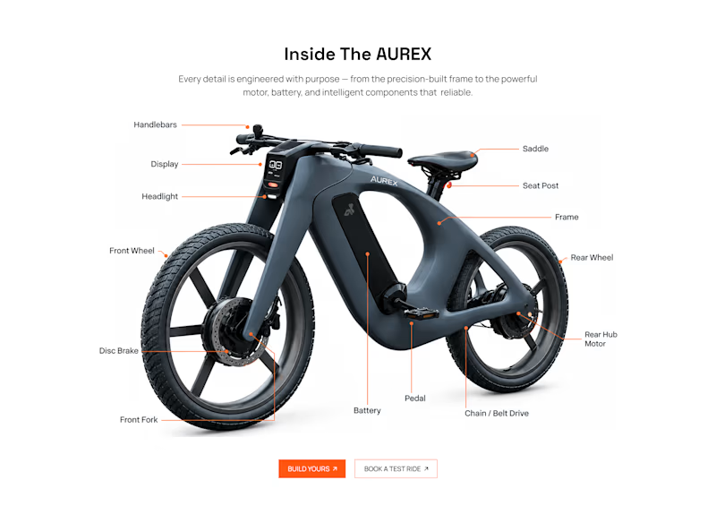
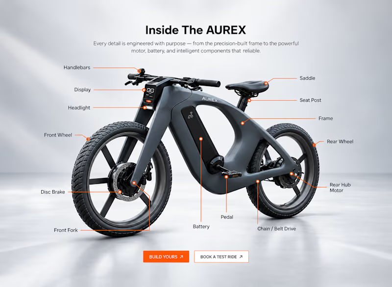
Two concepts for the same AUREX e-bike. Same product, same components, two different presentation styles:
A - Soft Studio: subtle gray depth, larger product focus, and a more premium visual feel.
B - Clean Minimal: bright white background, tighter spacing, and a more technical editorial layout.
Which direction feels stronger for a premium e-bike brand and why?

5 voted
31%
11 voted
69%
16 votes
Closed

A feels more premium to me. The soft gray depth and bigger product focus make the bike feel like something special. B is great for specs, but A sells the feeling