The network for creativity
Join 1.25M professional creatives like you
Connect with clients, get discovered, and run your business 100% commission-free
Creatives on Contra have earned over $150M and we are just getting started
Back to feedPost

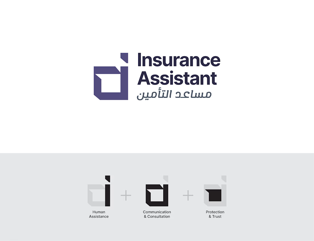
Hey Contra network! I’m wrapping up this brand identity for Insurance Assistant, balancing trust and modern accessibility, but need your feedback and recommendations before finalizing.
As broken down in the monogram weaves Human Assistance, Communication, and Protection—how do you feel about the concept's clarity and the bilingual typography balance?
The network for creativity
Join 1.25M professional creatives like you
Connect with clients, get discovered, and run your business 100% commission-free
Creatives on Contra have earned over $150M and we are just getting started





Related posts


The thing I keep relearning: a design is never finished because someone ran out of ideas. It's finished because someone decided to stop. Knowing when to stop is the hardest part.
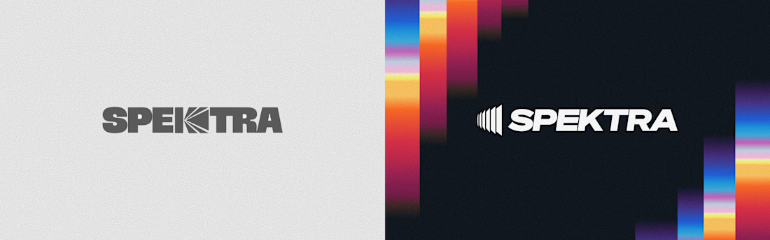


Damn.... Crazy colors 👏😍

Brand identity work for WesoftAI





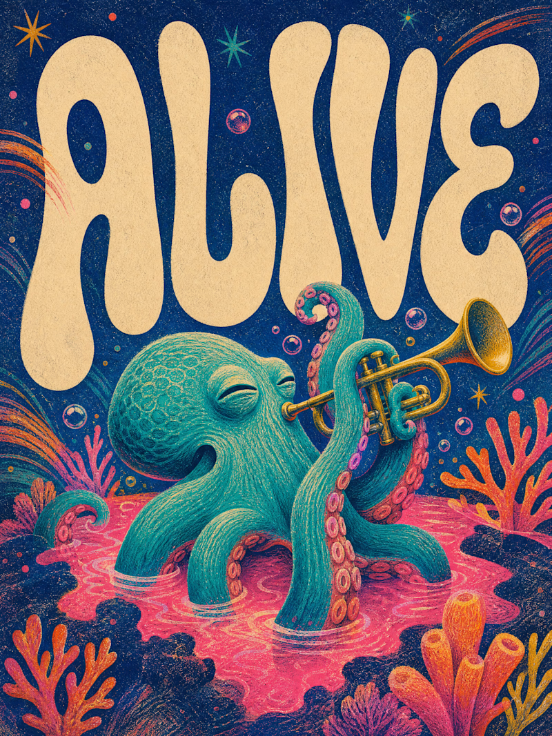
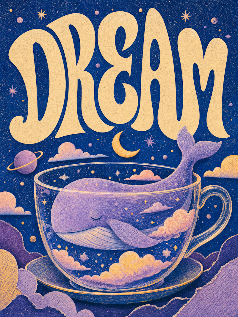
Only one will win, and you get to decide which.
Two AI-generated images. Same creative intent. Different visual outcomes.
The images were generated with AI, but the art direction, visual decisions, composition, styling, and overall creative direction came from me as the human behind the work.
Now comes the real taste test.
Which one has the stronger visual language? Which one feels more intentional, more refined, and more memorable?
11 voted
69%
5 voted
31%
16 votes
Closed

Outstanding work