The network for creativity
Join 1.25M professional creatives like you
Connect with clients, get discovered, and run your business 100% commission-free
Creatives on Contra have earned over $150M and we are just getting started
Back to feedPost




Perfect
Thanks! Appreciate you, Kabir 🙌

Fan of the Picasso inspired direction 👌🏻
Appreciate it! Picasso's art definitely influenced my thinking while exploring directions for this project. 🧠

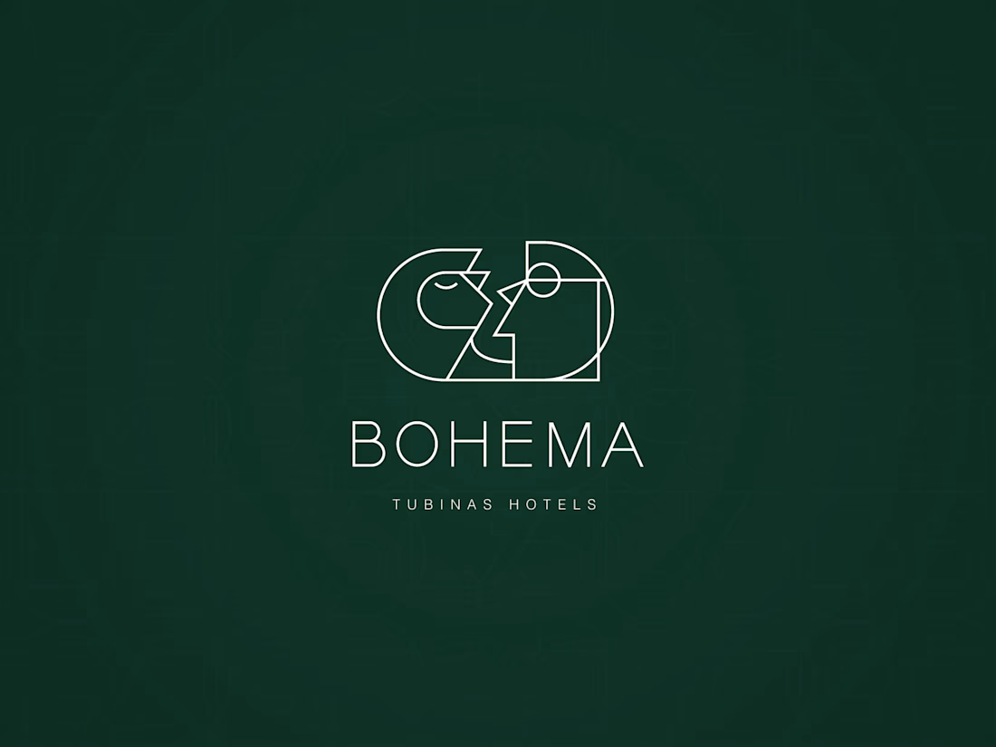
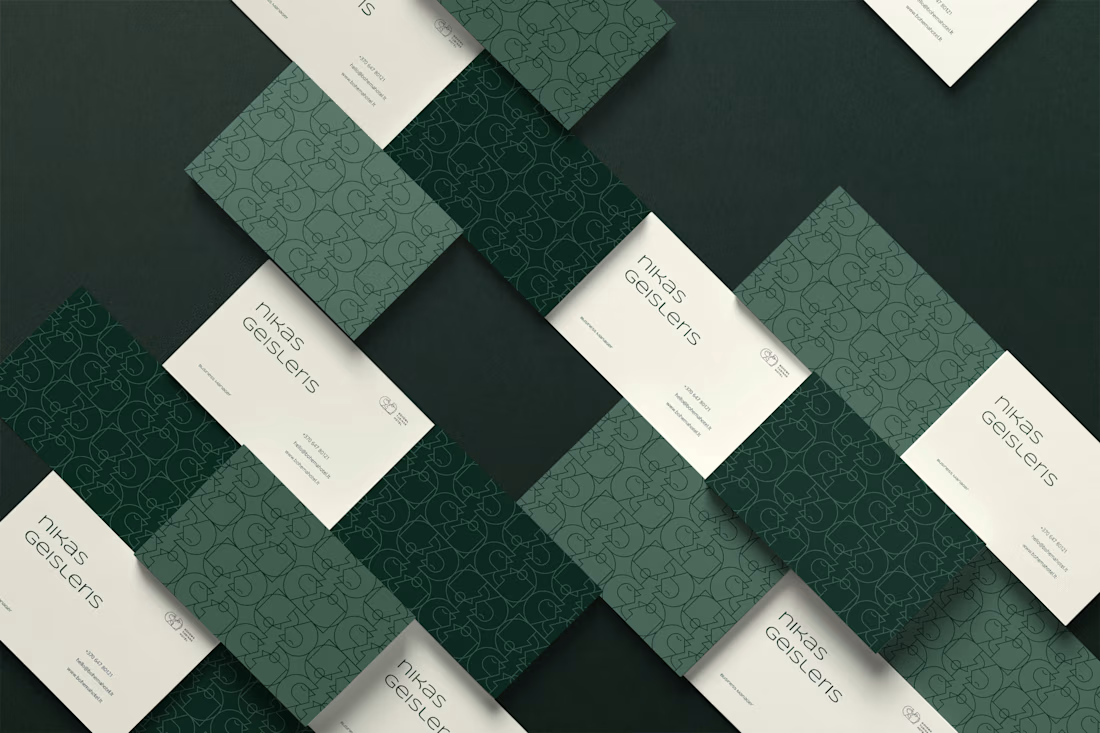
The interlocking B monogram reads almost like two puzzle pieces fitting together, nice touch for a hotel brand about hospitality. That deep green with the diamond pattern on the cards feels more boutique lodge than typical hotel chain, which suits the name well.

Love the direction and colors

Bohema as a name already does a lot of the positioning work before anyone even sees the mark. When you're building brand identity for a hotel like this, do you start from the name and let it dictate the visual language, or does the concept usually come first and the name gets fit around it after?

The logo fits the brand perfectly

Nice work


The final result looks amazing. 🔥


that green is gorgeous

This is Clean

thats amazing nikas

This is so clean and professional — love it! 🔥
The network for creativity
Join 1.25M professional creatives like you
Connect with clients, get discovered, and run your business 100% commission-free
Creatives on Contra have earned over $150M and we are just getting started





Related posts

The Rebranding Challenge - Season Investments
One of the key challenges was deciding what to change and what was worth preserving.
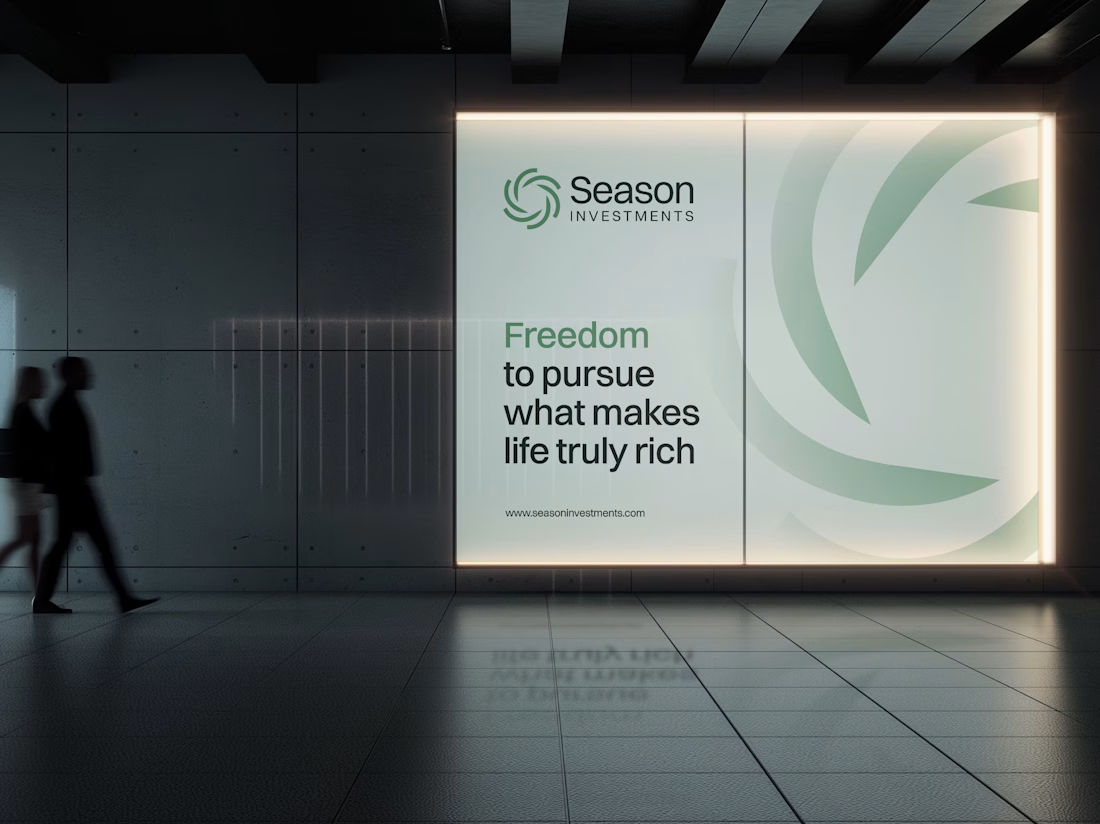
Rather than starting from scratch, the new identity retains a visual connection to Season Investments’ heritage, but reframes it for a more contemporary and flexible brand system.
A major improvement was creating a symbol that can work independently from the wordmark. This gives the brand a stronger presence across investment platforms, digital interfaces, profile images, and other compact applications where the previous identity was difficult to use.
The result is a more adaptable system that moves the brand forward without losing its familiarity.


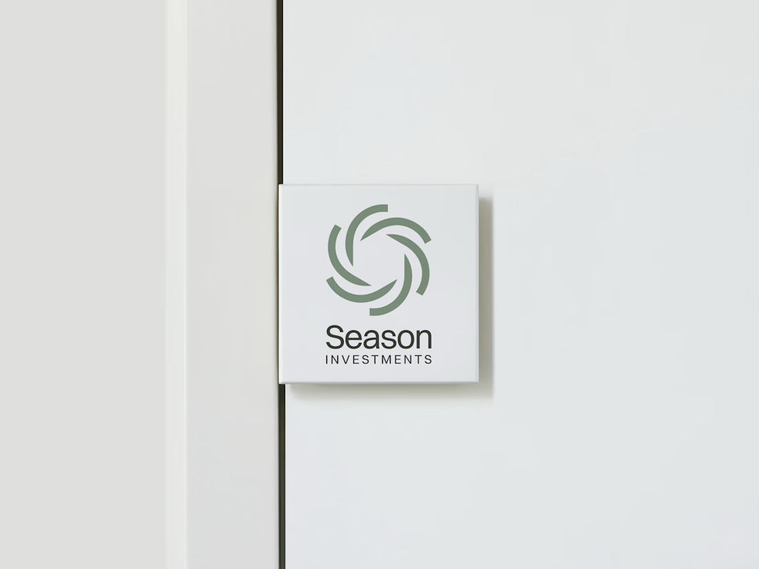

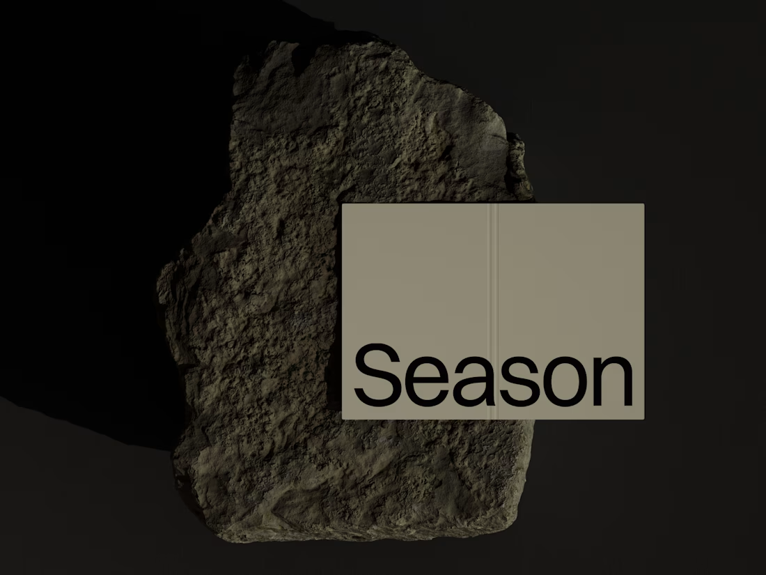

Love how adaptable this feels across compact digital spaces. Really well done. Any plans to post the original before version for comparison?

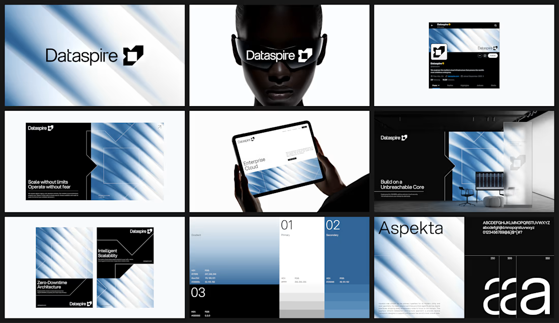

Beautiful work.

Top 1% on Contra. 🎉
A little milestone, but a reminder that showing up and doing good work consistently actually pays off.
If you're just starting out and wondering if it's worth it: it is. Keep going.
Thanks to all my clients and everyone here who's been so supportive.
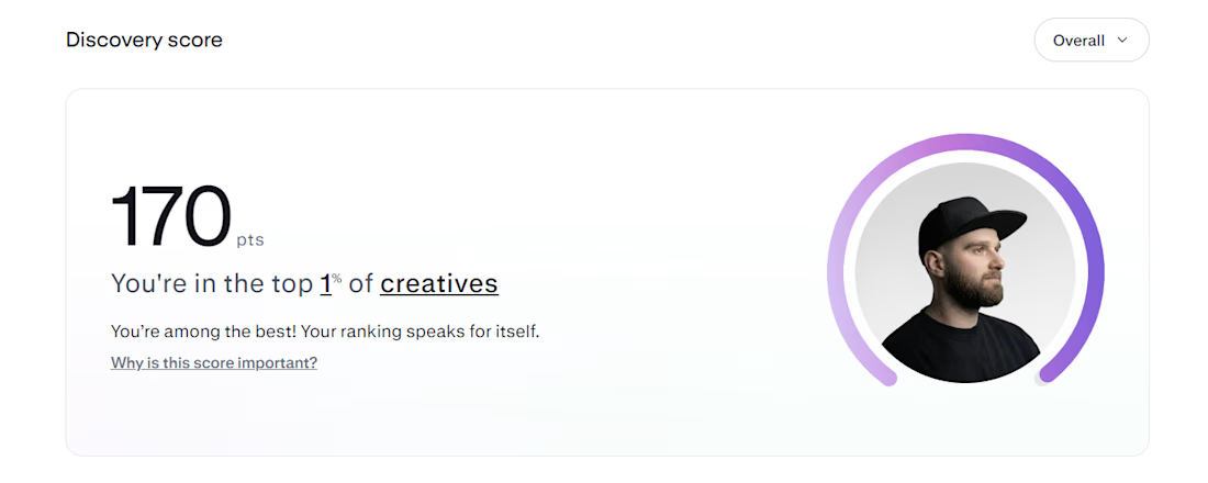

That's Legendary bro congrats 🔥🔥🔥🔥