The network for creativity
Join 1.25M professional creatives like you
Connect with clients, get discovered, and run your business 100% commission-free
Creatives on Contra have earned over $150M and we are just getting started
Back to feedPost

I've been thinking about this for a while, how much your visual world says about you without you ever having to explain it.
The music you gravitate toward, the cities you feel at home in, the brands that just get you. It's all there, quietly, in the things you save and share.
So I built Doppelgänger. 🪞
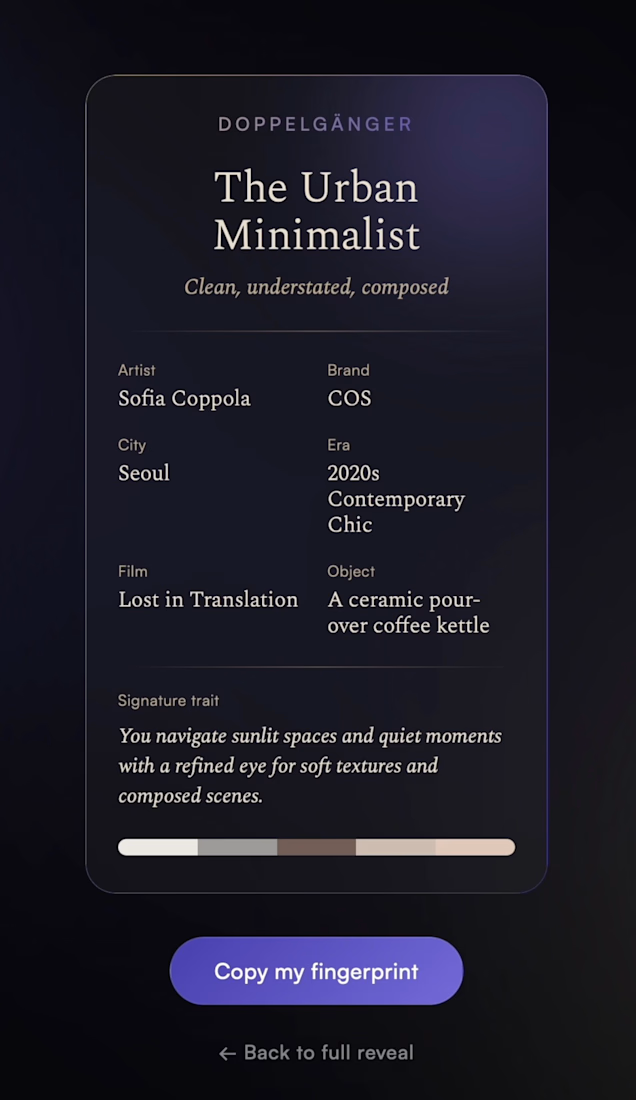
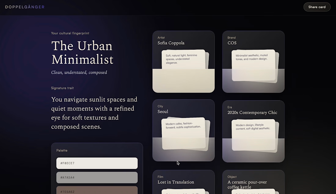
Drop a screenshot of your Instagram profile. In a few seconds, it tells you the artist, brand, city, era, film, and object that define your visual world. Your cultural fingerprint.
Not a personality test. Not a mood quiz. Something closer to holding up a mirror and having it actually see you.
Mine came back: Sofia Coppola. COS. Seoul. A coffee kettle. And the line "a refined eye for soft textures and composed scenes" honestly made me put my phone down for a second.
I'm Nyai, a communication designer working across product and brand. I built this solo during the makeathon using Figma Make, and it was the first time I genuinely felt like I was designing with AI rather than just using it.
Try it yourself → hello-large-83588053.figma.site
Would love to hear what fingerprint you get. 👇
#ConfigMakeathon #FigmaMake #Figma


The network for creativity
Join 1.25M professional creatives like you
Connect with clients, get discovered, and run your business 100% commission-free
Creatives on Contra have earned over $150M and we are just getting started





Related posts

Which hero visual feels right for this brand?
While working on the homepage for Halfspace, a website design and SEO agency, I explored two different hero visuals for the same headline and layout. Same message, same structure, just a different visual metaphor and mood.
Option 1 - Rocket Launch. Bold, literal, and energetic, visually reinforcing the "launch your business" message with motion and fire.
Option 2 - Glass Cube. Abstract, sleek, and premium, giving a more refined, tech-forward feel without relying on a literal metaphor.
Would love your honest UX/UI take, which direction feels more impactful, memorable, and aligned with a web design/SEO brand, and why?
11 voted
41%
16 voted
59%
27 votes
Closed

Both design are great; it's hard to choose one




Option B feels nothing but premium


