The network for creativity
Join 1.25M professional creatives like you
Connect with clients, get discovered, and run your business 100% commission-free
Creatives on Contra have earned over $150M and we are just getting started
Back to feedPost
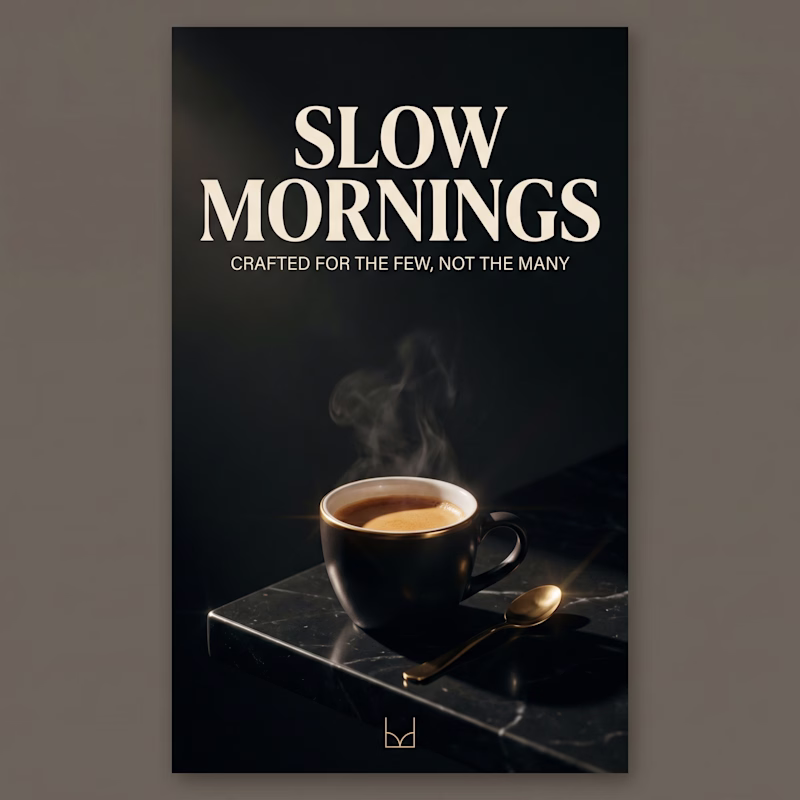
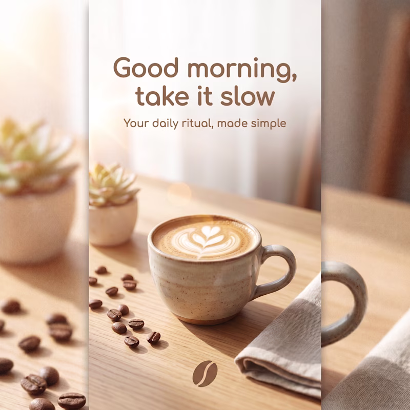
Taste Test
Same product. Two completely different brands.
Which one are you buying from? A or B 👇
20 votes
Ends in 1d
A has no distractions and the headline matches perfectly with the rising vapour of the hot coffee making it ideal for Ads. The spoon beside the cup of coffee shows that someone's morning is actually slow and warm.
Going for A cause i like something bold
B for me. The photography version feels more honest about what the product actually is, a daily ritual. A is sharp, but it reads more like a luxury fashion brand than something I'd use every morning.
A for me.
The positioning feels more distinctive and memorable. The darker palette, stronger typography, and focused composition immediately communicate a premium experience before I even start reading the copy.
Version B feels warmer and more approachable, but A creates a clearer...
That last question is exactly the point, the aesthetic is the targeting. A self-selects for people who already see themselves as discerning. B casts a wider net but loses that edge. Both are valid strategies, just for completely different brands.
Mornings is best associated with Sunlight and Warmth.
The dark one 🔥
Option A is definitely the one I’d go with! 💯
The network for creativity
Join 1.25M professional creatives like you
Connect with clients, get discovered, and run your business 100% commission-free
Creatives on Contra have earned over $150M and we are just getting started
Related posts
New rebranding project for TrinkTiger.de 🐾
We refreshed the brand with a warmer, more premium identity designed to feel trustworthy, friendly, and easy to recognize across packaging, digital, and product touchpoints.
The direction balances pet care warmth with a more confident visual system, helping the brand feel less generic and more ownable.
A rebrand built around the quiet everyday moments of care between pets and their owners.

Same elements, same font, same design
But different colors applied
Which would you go for?
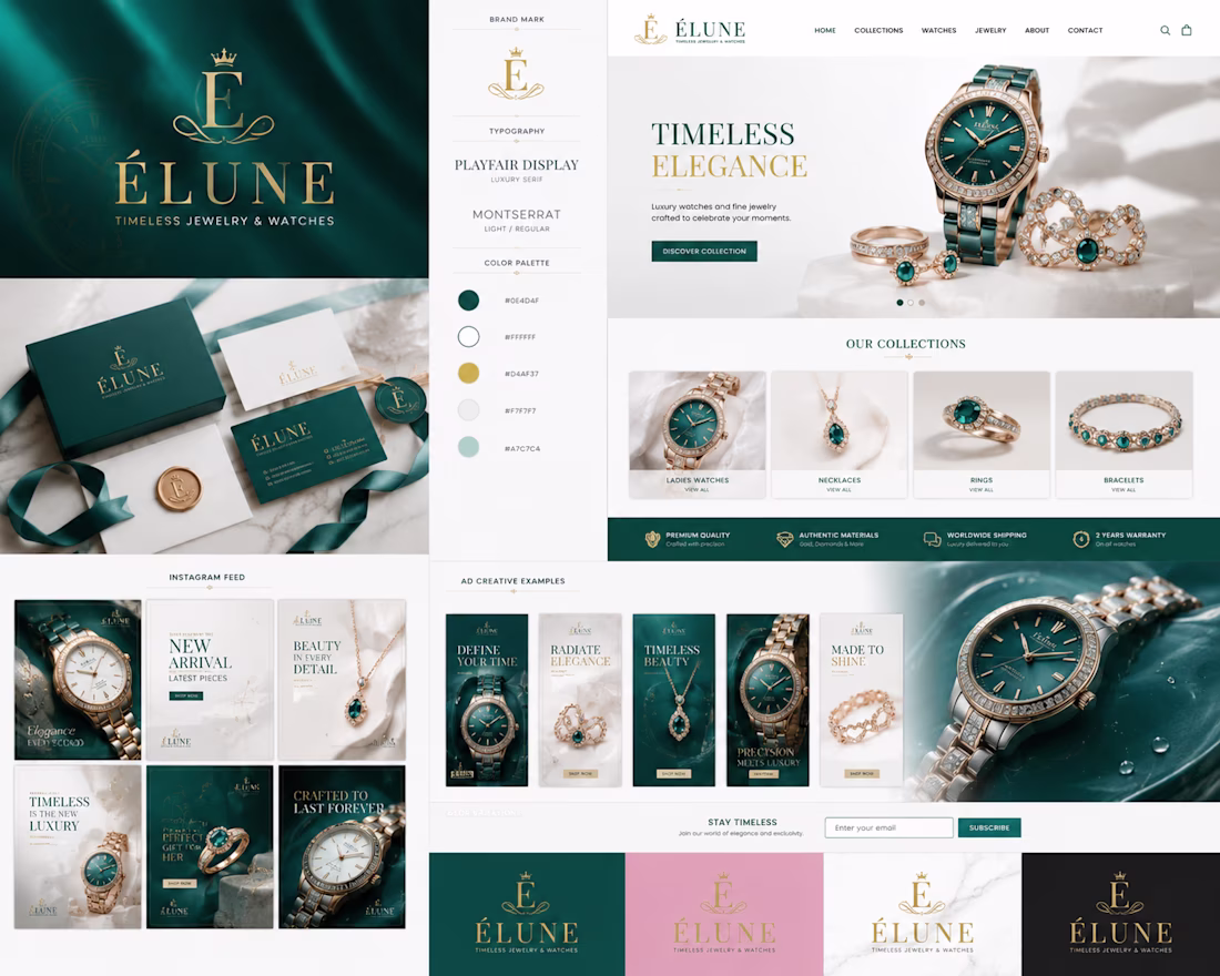
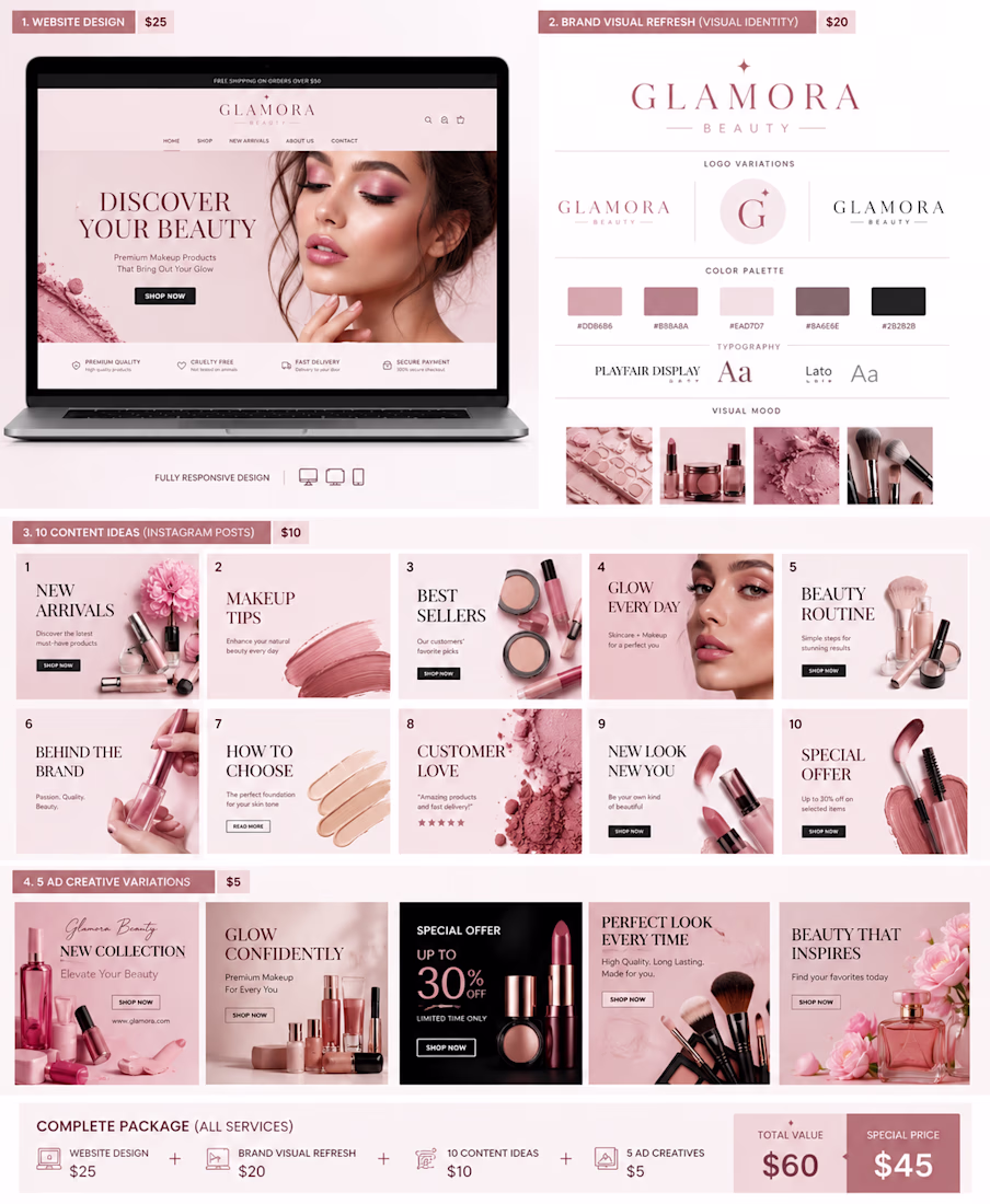
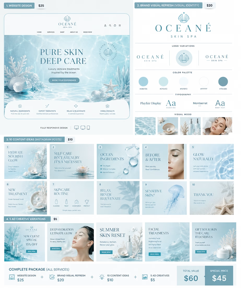
💎 VELORA Identity Lab — Luxury brand system for beauty & lifestyle brands including website, visual identity, and ad creatives. Starting from $25.
Challenges
View allTrending
Claude
Claude has entered the design space. How are you using Claude Design?
Contra University
Learn from expert creatives how to earn more using next-gen AI tools.
MagicPath
The canvas is infinite, and exploration is becoming the workflow. How are you using MagicPath?
creativeaiflow
Creative AI workflows are evolving. What tools do you use, and what are their strengths and weaknesses?
freelancerlife
Freelancer life is wins, pivots, and everything in between. What’s yours right now?