The network for creativity
Join 1.25M professional creatives like you
Connect with clients, get discovered, and run your business 100% commission-free
Creatives on Contra have earned over $150M and we are just getting started
Back to feedPost

SAVIA / Integral Design Project
Conceptual design project focused on urban nature, wellbeing, and spatial experiences that reconnect people with natural rhythms.


Beautiful execution.
Thank you! 😊


Soooo many talented designers on this platform, everyday i'm stunned!! Super cool work!!
Thank you so much Hanna 😊

I like how you use that lemon/yellow color; it's one of my favorites. Love the minimalism. 🔥 🔥
Thank you so much Matias, always a fan of yellow! 💛
The network for creativity
Join 1.25M professional creatives like you
Connect with clients, get discovered, and run your business 100% commission-free
Creatives on Contra have earned over $150M and we are just getting started








Related posts

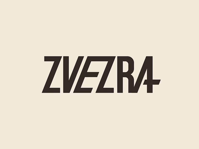
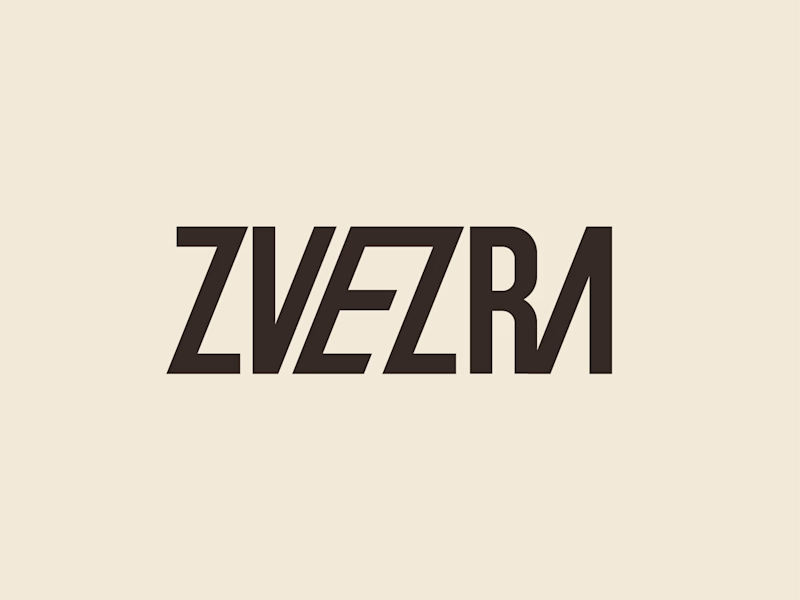
Which ZVEZRA logo direction do you prefer? 👀
I’ve been exploring two variations of the wordmark. Both follow the same visual direction, but each has its own character.
Vote below!
I’d love to hear your thoughts! 👇

39 voted
53%
34 voted
47%
73 votes
Closed

Option 1 for me, it has a bit more personality. Both are strong though, tough call


Design Sprint: ESCO Token
How do you build a brand for a business most people can't explain?
ESCO Token is built to become the standard behind Europe's Digital Product Passport: the system that will track what a product is made of, where it came from and where it goes next. Necessary, regulated, and completely abstract for most people.
One sprint. Zero to an identity that works:
- Micro-design style: restraint over noise, shaped by European design discipline.
- Wordmark and symbol built to hold up anywhere.
- Full brand identity.
- Landing page ready for the go-to-market.
When a business is hard to explain, the brand has to do the talking.
Teaser below.


Wonderful craftsmanship! 🎯

Product Designer Portfolio Website
Client focused solutions
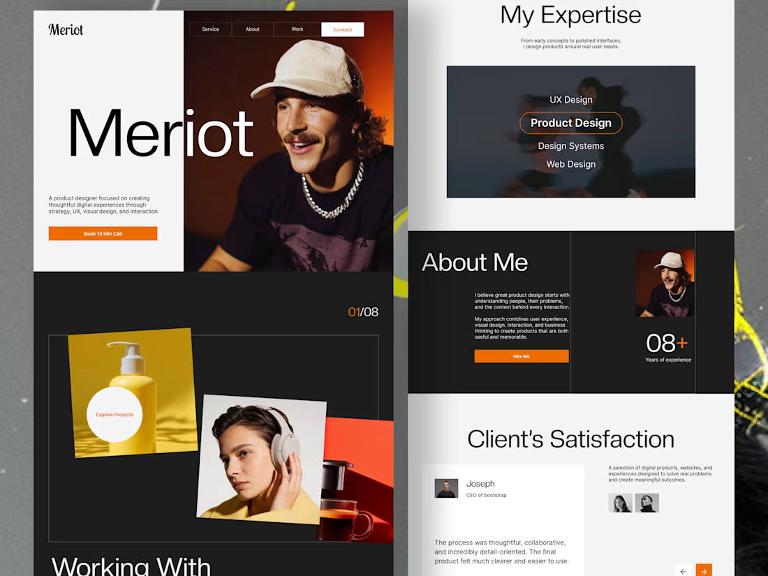
The goal was to create a digital experience that presents a designer’s expertise, showcases selected projects, and guides potential clients toward taking action.
From the split-screen hero section to the interactive-looking project showcase, expertise section, and client testimonials, every section is designed to balance visual impact with usability.
From the split-screen hero section to the interactive-looking project showcase, expertise section, and client testimonials, every section is designed to balance visual impact with usability.
Design highlights:
Modern, editorial-inspired visual direction
Bold typography and clear visual hierarchy
Engaging project presentation
Structured expertise and about sections
Client-focused layout with clear calls to action
Minimal, high-contrast design with vibrant orange accents
Looking for a portfolio website or a landing page that makes your brand stand out? I design thoughtful digital experiences that combine aesthetics, usability, and business goals.
Have a project in mind? Let's connect and bring your vision to life.


Outstanding approach.