The network for creativity
Join 1.25M professional creatives like you
Connect with clients, get discovered, and run your business 100% commission-free
Creatives on Contra have earned over $150M and we are just getting started
Back to feedPost

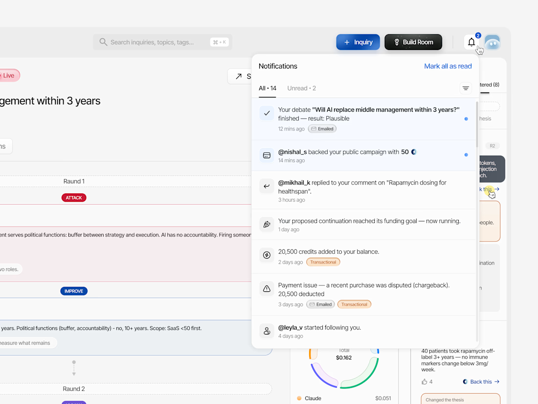
Designed a modern CRM SaaS product focused on clarity, efficiency, and seamless user experience.
From dashboard workflows to data management, every screen was designed with usability and scalability in mind.
Looking for a UI/UX Designer for your next digital product?
Let’s work together — I’d love to help bring your idea to life.
View the Dovexaaa CRM SaaS UI Concept


Clarity in a CRM often comes down to helping people spot the next action among lots of data. Which dashboard workflow was the most challenging to simplify?
The network for creativity
Join 1.25M professional creatives like you
Connect with clients, get discovered, and run your business 100% commission-free
Creatives on Contra have earned over $150M and we are just getting started

Challenges
View all


Related posts

Designed a dashboard concept for tracking net worth across every asset type — stocks, crypto, property, pensions, funds, cash, and liabilities — all in one place.
Instead of the usual pie chart or bar graph, the centerpiece is a dial: a single, glanceable gauge showing where your wealth actually sits. Behind it, a quiet grid of every asset category fades in and out of visibility, reinforcing that everything's accounted for even when it's not the focus.
Dark UI, a single confident green accent, and a lot of negative space — built to make a genuinely overwhelming task (seeing your entire financial picture at once) feel calm instead of cluttered.


wow the animation feels super smooth, what is this animation for?


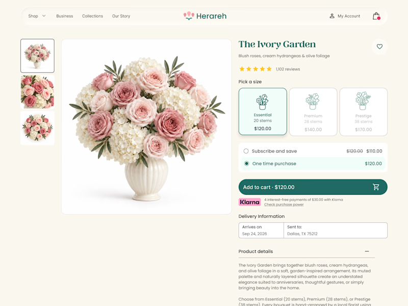
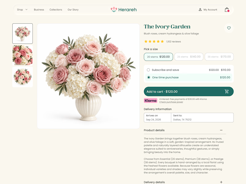

Icon cards for me, bouquets are such a visual purchase that a scannable icon beats reading "small/medium/large" every time. Did the compact chips version convert worse in testing, or are you still gathering data on that?