The network for creativity
Join 1.25M professional creatives like you
Connect with clients, get discovered, and run your business 100% commission-free
Creatives on Contra have earned over $150M and we are just getting started
Back to feedPost

I help authors fix Amazon visibility issues. Keywords, categories, blurbs, and listing optimization that get books discovered and selling.
The network for creativity
Join 1.25M professional creatives like you
Connect with clients, get discovered, and run your business 100% commission-free
Creatives on Contra have earned over $150M and we are just getting started

Challenges
View all


Related posts

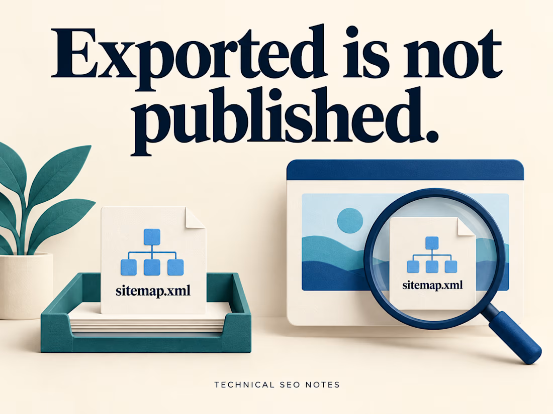
Check the Live Sitemap Before Signing Off the Release
A sitemap can export correctly while the live website still serves an older URL list. The task needs a check at the public sitemap address after deployment.
That check should compare the published file with the pages the team agreed to include.
Imagine an export containing 200 URLs. The public sitemap also contains 200, but it still lists a retired service page and omits the new replacement. The totals match. The contents do not.
Before closing the task, check:
• The production sitemap address returns the expected XML.
• Its complete URL list matches the agreed inventory.
• Each intended page type is represented, including a newly published page.
• Deliberately excluded pages remain absent.
• Someone owns the process that keeps the file current.
Start with the sitemap already on the site. It may be an index pointing to several smaller files. Include those files in the comparison so a working index does not hide an outdated section underneath it.
Keep the inventory decision explicit: which service pages, locations, articles or products belong in this release? A crawler's export tells you what it discovered. Compare that list with the pages the site was supposed to publish.
Open a sample of the listed URLs as well. Check that they reach the intended production pages and use the preferred addresses. If the sitemap includes modification dates, those dates should reflect significant page updates; exporting the file again does not make every page newly updated.
For a site that publishes regularly, document how new pages enter the sitemap and how retired pages leave it. An automated generator still needs clear inclusion rules and a check when those rules change.
Keep the public address, inventory comparison and update owner in the release notes. Make the sitemap discoverable through Search Console or robots.txt, and check for retrieval or processing errors. Submission does not guarantee that every listed page will be crawled or indexed.
I put together the generation, export and publishing steps in the full guide on Technical SEO Notes:
https://technicalseonotes.org/how-to-generate-and-export-an-xml-sitemap/
Projects and client work: NikoCodes
https://nikocodes.com/

Solid checklist. I'd add lastmod: if every release stamps today's date on every URL, Google learns to ignore it. It should only change when the page content changes. Also worth confirming every sitemap URL returns a direct 200, not a redirect.

𝗧𝗵𝗲 𝟱 𝗙𝗮𝘁𝗮𝗹 𝗦𝗘𝗢 𝗠𝗶𝘀𝘁𝗮𝗸𝗲𝘀 𝗕𝗲𝗴𝗶𝗻𝗻𝗲𝗿𝘀 𝗠𝗮𝗸𝗲 𝗶𝗻 𝗪𝗼𝗿𝗱𝗣𝗿𝗲𝘀𝘀 (𝗔𝗻𝗱 𝗛𝗼𝘄 𝘁𝗼 𝗙𝗶𝘅 𝗧𝗵𝗲𝗺)
Having a great WordPress site means nothing if nobody finds it on Google. 𝗧𝗵𝗲 𝟱 𝗺𝗼𝘀𝘁 𝗰𝗼𝗺𝗺𝗼𝗻 𝗦𝗘𝗢 𝗯𝗹𝘂𝗻𝗱𝗲𝗿𝘀:
Leaving default permalinks as plain IDs.
Ignoring Image Alt Tags and compression.
Missing XML Sitemaps in Google Search Console.
Having multiple H1 tags per page.
Not setting canonical URLs.
𝗕𝗼𝗼𝗸𝗺𝗮𝗿𝗸 𝘁𝗵𝗶𝘀 𝗰𝗵𝗲𝗰𝗸𝗹𝗶𝘀𝘁 𝘁𝗼 𝗮𝘂𝗱𝗶𝘁 𝘆𝗼𝘂𝗿 𝘀𝗶𝘁𝗲 𝗯𝗲𝗳𝗼𝗿𝗲 𝗹𝗮𝘂𝗻𝗰𝗵𝗶𝗻𝗴!


Good list. I'd add a 6th: the "Discourage search engines from indexing this site" box under Settings → Reading. It often stays ticked after a staging launch and adds noindex to every page. Small note on #4: multiple H1s aren't a problem on their own for Google; a clear heading structure matters more.

Are AI Search Engines & LLMs Diluting Your GSC Traffic Data? 🤖📉
If you’re seeing sudden spikes in impressions with 0 clicks in Google Search Console, you're not alone.
When LLMs like ChatGPT, Perplexity, Claude, and Gemini process user requests, their web-browsing agents run background searches (fan-out queries) using direct site: operators to find and verify official sources.
Want to isolate this AI-driven query data in your own accounts?
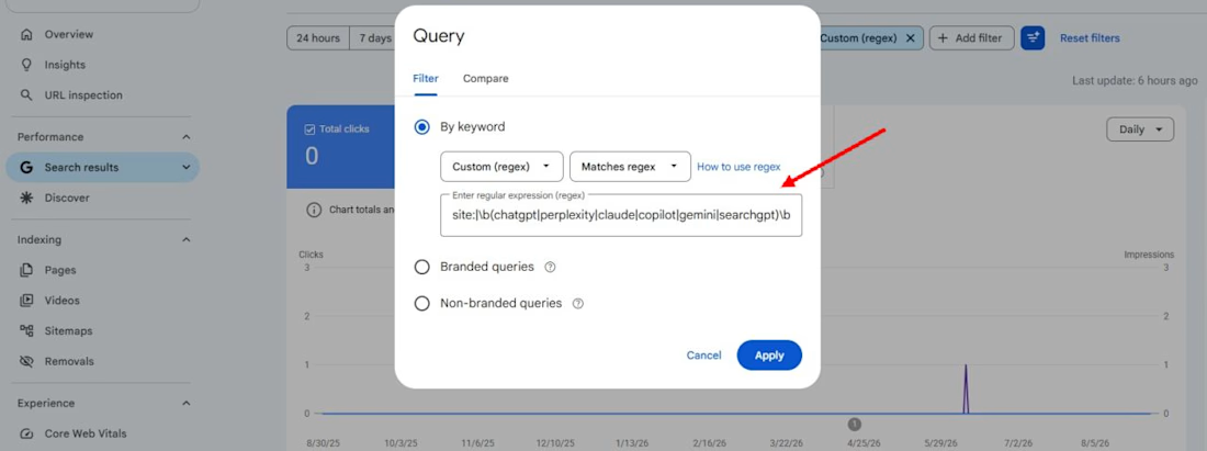
Run this custom Regex filter under Performance > Query > Custom (regex) in GSC:
site:|\b(chatgpt|perplexity|claude|copilot|gemini|searchgpt)\b
(Make sure to select "Matches regex" in the dropdown)
What this highlights:
• High-impression, zero-click fan-out searches generated by AI web-browsing bots
• Brand searches where users explicitly look for AI summaries or integrations • Clearer CTR data by identifying AI search noise from standard organic traffic
Have you checked for AI query footprints across your client sites yet?
What patterns are you seeing?
Drop your findings below! 👇
#SEO #SearchEngineOptimization #GoogleSearchConsole #GenerativeAI #AEO #TechnicalSEO #AISEO

Useful regex. Before blaming AI agents for every spike, it's worth checking the opposite effect: when Google stopped supporting the num=100 results parameter in September 2025, many sites saw desktop impressions drop overnight because rank-tracker scrapes stopped counting....