The network for creativity
Join 1.25M professional creatives like you
Connect with clients, get discovered, and run your business 100% commission-free
Creatives on Contra have earned over $150M and we are just getting started
Back to feedPost

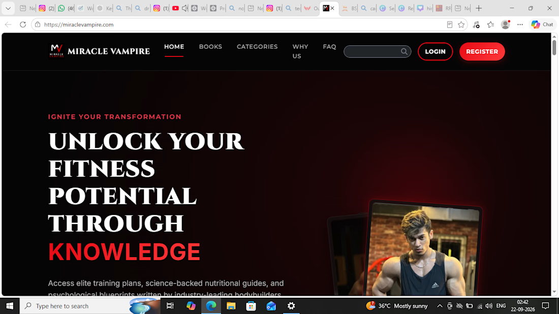
The website was created to present fitness eBooks and digital content in a professional, engaging, and easy-to-navigate experience, with a strong focus on visual presentation and user conversion.


The network for creativity
Join 1.25M professional creatives like you
Connect with clients, get discovered, and run your business 100% commission-free
Creatives on Contra have earned over $150M and we are just getting started





Related posts

Remove Liquidity component cards for a recent Web3 design project—what would be the best direction for readability and focus? Dark Mode or Light Mode? ⚡️

12 voted
40%
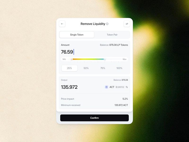
18 voted
60%
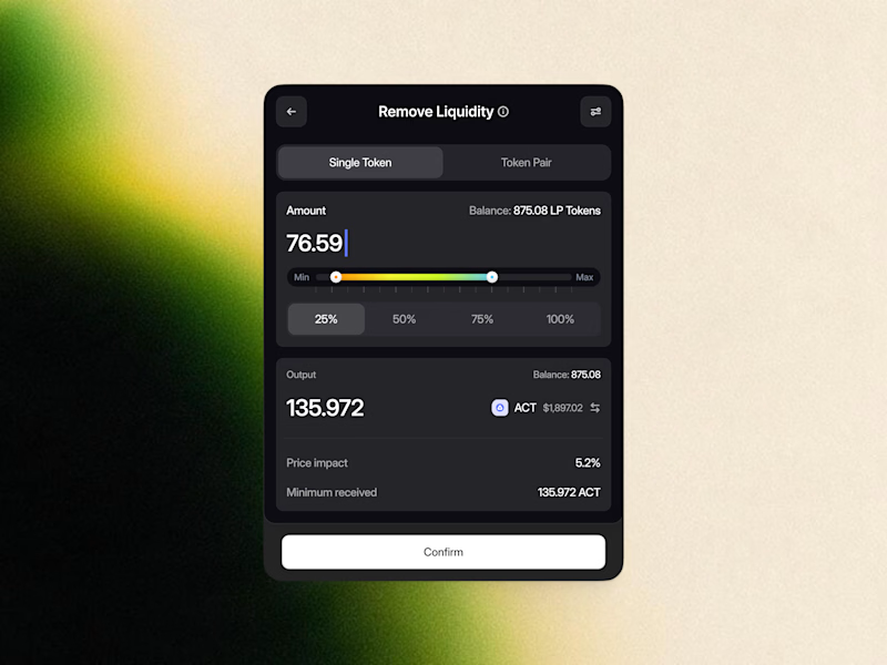
30 votes
Closed

White one need bit more darker bg on elements to make them visible like the dark more does.

Built the site for Linea — a boutique rail brand where the whole UI is made of the same rule as the print system.
Every route card's red line isn't decoration, it's that route's actual elevation profile. Fare tiers aren't styled, they're the same data at different density.
The logo's sparkle mark even resolves from the exact same contour-drawing logic, live on the page.
One idea, all the way down → Here

Made an hyper realistic earth using classic shading techniques like perling noises, specular, fresnel effects, etc. using WebGL, Three.js and GLSL. What do you think?
Part of three.js journey
Pueden probarlo aquí: https://earth-shaders-six.vercel.app


Looks amazing! 🙌