The network for creativity
Join 1.25M professional creatives like you
Connect with clients, get discovered, and run your business 100% commission-free
Creatives on Contra have earned over $150M and we are just getting started
Back to feedPost

Most businesses lose customers due to long wait times or poor app UI.
I built these solutions to fix exactly that:
1: A Food Delivery App that makes ordering food a 3-click process.
2: An AI Chatbot that solves customer problems in seconds, not hours.
Context-aware conversations for personalized support.
24/7 availability to handle high volumes of inquiries.
Optimized for seamless integration into existing mobile apps.


The network for creativity
Join 1.25M professional creatives like you
Connect with clients, get discovered, and run your business 100% commission-free
Creatives on Contra have earned over $150M and we are just getting started



Related posts


🌸 What drives long term retention in wellness apps: emotional ownership or visible progress?
Two approaches to the same product challenge.
🅰️ The Garden: Emotional Ownership
Every completed ritual grows a personal keepsake. Progress becomes something beautiful to care about.
🅱️ The Quilt: Visible Momentum
Every completed day adds a patch to a bigger story. Progress becomes tangible, cumulative, and rewarding.
Both turn everyday habits into something users create, not just track.
If you were building a wellness app, which approach would you bet on for long term retention?
🌸 A: Emotional ownership
🧵 B: Visible momentum
Why?
#TastyTest #GrowthUX #WellnessApp #Gamification #ProductDesign #AsolDesign #MobileAppDesign
28 voted
76%
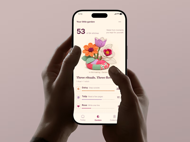
9 voted
24%
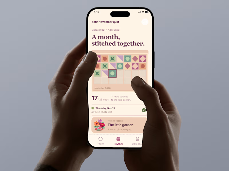
37 votes
Closed


emotional ownership is a smart angle for retention

Design Agency Website
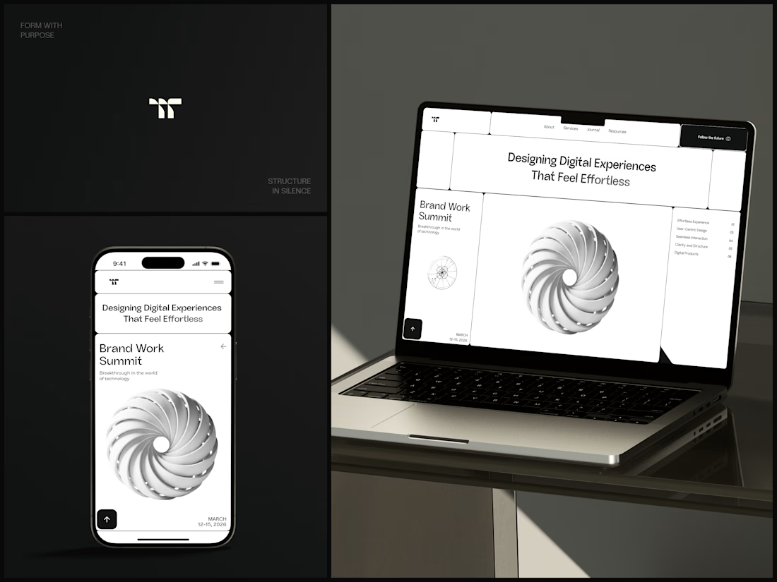
Only one cell on this homepage is black.
The rest of the page is a grid of rounded white cells: the headline, an event card, a white 3D spiral and a list of services. The black one, top right, holds the "Follow the future" button and stands out against all that white.
On the phone, the cells stack into a single column. The navigation folds into a menu icon, and the event card and spiral merge into one cell.
The headline reads "Designing Digital Experiences That Feel Effortless", so the grid has to look organized before anyone reads a word.
Designed by the Hue & Machine team.
#DesignAgency #WebDesign #AgencyWebsite #LandingPage #BentoGrid #MinimalDesign #UIDesign #ResponsiveDesign #MobileDesign #FigmaDesign



Looks cool


Nice!