The network for creativity
Join 1.25M professional creatives like you
Connect with clients, get discovered, and run your business 100% commission-free
Creatives on Contra have earned over $150M and we are just getting started
Back to feedPost
Taste Test
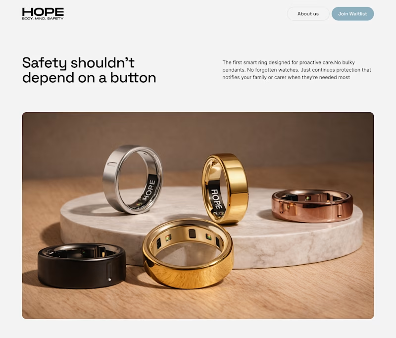
Hero section design for " Hope Health ring" Which one looks better?
60 voted
74%
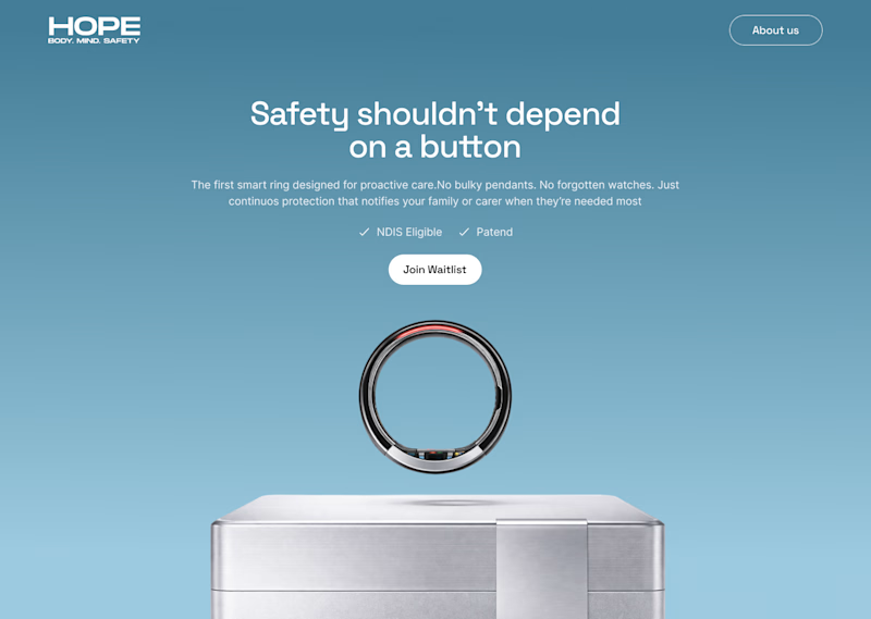
21 voted
26%
81 votes
Closed

Simplicity always beats

True

Definitely A

The information pacing on the right version is excellent.


A is better

its cool 🔥


A looks better


Sharp and cool

A something different

A is good

Both are Awesome but am going for A

I prefer A. It feels cleaner and more focused.

The simplicity really enhances the overall presentation. (A)

Both designs look great! I prefer A — the light background makes the product stand out more and feels cleaner for a health brand.

Imagery is outstanding

I want to learn this art from you bro. @Muhammad Suleman

definitely A

nice work~

Brilliant work

i love this
Thanks

B looks better!
The network for creativity
Join 1.25M professional creatives like you
Connect with clients, get discovered, and run your business 100% commission-free
Creatives on Contra have earned over $150M and we are just getting started
Trending

Claude
Claude has entered the design space. How are you using it?

Contra University
Learn from expert creatives how to earn more using next-gen AI tools.
Brand Design
The best brand designers are on Contra. Scroll to see what's trending in brand design. What are you building?
creativeaiflow
Creative AI workflows are evolving. What tools do you use, and what are their strengths and weaknesses?
freelancerlife
Freelancer life is wins, pivots, and everything in between. What’s yours right now?



Related posts