The network for creativity
Join 1.25M professional creatives like you
Connect with clients, get discovered, and run your business 100% commission-free
Creatives on Contra have earned over $150M and we are just getting started
Back to feedPost

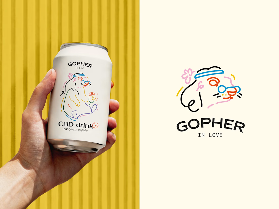


Cooool! Artur.

How do you keep a mascot like this feeling loose and hand drawn without it turning messy? The line work on the gopher's expression in the second mark especially has so much personality for something this simple.
Many drafts and attempts :) thanks

Obsessed with the illustration!
You're great, so appreciate!

Great work

hm great work i love it

The illustration very very dope

This is so cute!! Im def getting it for the branding 😂

Nice work 🧡

I would drink it, no matter whats inside haha
Same! haha


appreciate!

Did the client see both directions, the CBD can linework and this fuller color gopher illustration, or did one win out early? The loose line quality on the flowers and glasses is such a nice contrast to how clean the can label reads.
The main version is head only . The full body one is for presentation!


artur the gopher on the can is so cute. did you draw it by hand?
Yep!

Minimal perfection ✨

Fantastic
thanks!

Outstanding work, I really like it! 🔥
thank you, so much!


mascot's so cute
🙌


Outstanding

Nice

So cute! He has so much personality 💫

My eyes are resting while i'm look at it! Кайф)

super unique and vibrant. love it!

Sooo cute!


Great Concept!

Bro i love this concept

looks fantastic

amazing!

Illustration is very Amazing😊
The network for creativity
Join 1.25M professional creatives like you
Connect with clients, get discovered, and run your business 100% commission-free
Creatives on Contra have earned over $150M and we are just getting started











Related posts


A little excerpt from the brand guidelines for a recent project


The APS mark built from the four small symbols reads like a map legend, which suits a psychology service. Nice that the guidelines page shows it on the dark teal, most would have played it safe on white.


One letter. Eight personalities. 🔤
I explored the letter S in 8 different directions: soft and rounded, sharp and angular, bold and blocky, and fast like a bolt.
Same letter, same white-on-black treatment. The only thing that changes is the character.
Each mark could suit a different kind of brand, from tech and sports to fintech and lifestyle.
Which S would you pick, and what kind of brand would it belong to? Drop the number below. 👇
Looking for a logo mark or a full brand identity? My services are on my profile.


S letter designs is the best ❤️
Great job Shahwaiz🔥🔥


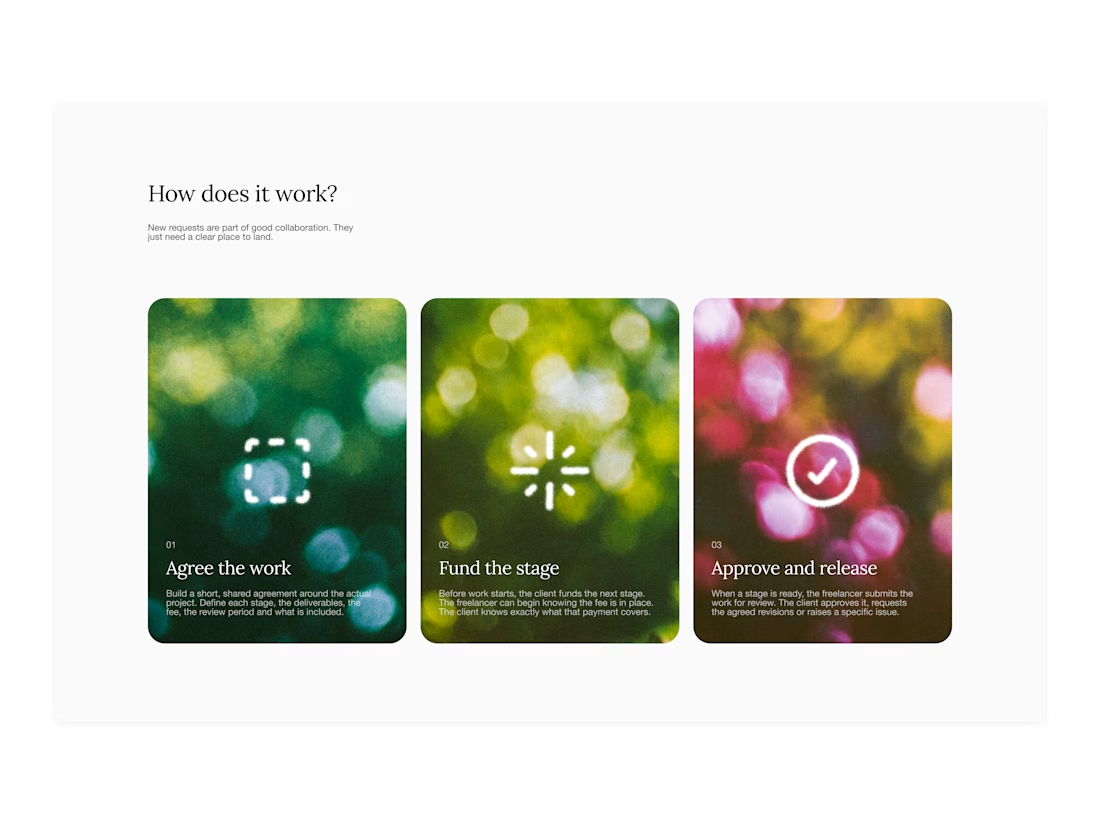

Your web sections always have such strong art direction. Great to see the brand carried right into the layout.