The network for creativity
Join 1.25M professional creatives like you
Connect with clients, get discovered, and run your business 100% commission-free
Creatives on Contra have earned over $150M and we are just getting started
Back to feedPost

A bespoke tailor doesn't cut three different suits for three body types. They build one pattern that moves with whoever's wearing it — adjusts without ever looking altered.
I used to build Webflow sites backwards. Design desktop first, then panic-shrink everything for tablet and mobile. Same boxes, smaller numbers, hope for the best.
That's not responsive. That's three outfits stitched together and called one suit.
Now I build the relationship first — what stretches, what stacks, what just disappears below 768px — before I even look at a second breakpoint. The layout doesn't change shape. It just moves differently depending on who's wearing it.
Where's your site still wearing three different outfits at once?
The network for creativity
Join 1.25M professional creatives like you
Connect with clients, get discovered, and run your business 100% commission-free
Creatives on Contra have earned over $150M and we are just getting started







Related posts


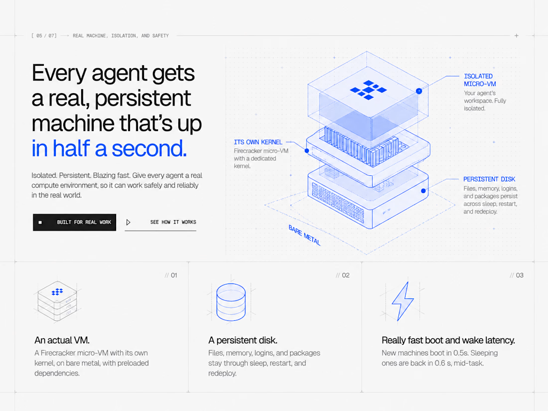
Messing with the layout again. 😄


the grid balance looks super clean rashid. CRISP hierarchy.


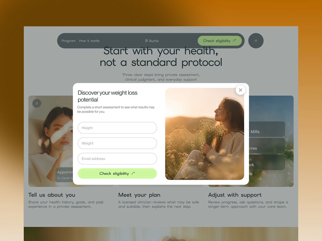
Auria’s enquiry form opens over the page, with a photograph beside the fields. The underlying layout stays visible.
Framer template: https://startfrom.co/templates/auria


Excellent work. Alex like it.


I haven’t posted much lately because the work got intense.
Two Webflow builds I’ve just finished: MavBio and Jemba9.
One works with biomaterials for medical and research applications. The other builds mission-critical technology for the space industry.
Very different worlds, and genuinely exciting projects to work on.
I’ve also wrapped up a much larger wellness platform that is now being turned into a full case study, while a few new projects are already underway.
A small preview for now. More soon!


wow, the smoothness is mindblowing here