The network for creativity
Join 1.25M professional creatives like you
Connect with clients, get discovered, and run your business 100% commission-free
Creatives on Contra have earned over $150M and we are just getting started
Back to feedPost
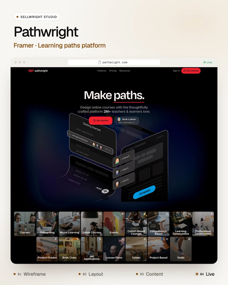
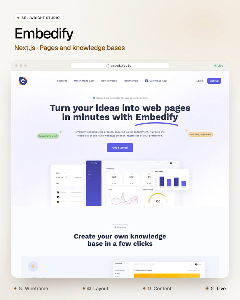
Taste Test

Dark or light: which SaaS homepage makes you scroll?
A: Pathwright (Framer), guided learning paths for teachers and teams.
B: Embedify (Next.js), a tool that turns ideas into web pages and knowledge bases.
Both heroes have one job: show the product before the first scroll.
Which one gets you there first, and why?
Live: pathwright.com · embedify.io
More builds: instagram.com/sellwrightstudio · youtube.com/@sellwrightstudio
2 votes
Ends in 1d

I would pick A for the story and B for the clarity. The one that shows the product before the first scroll wins, so I would check which hero has a real screenshot above the fold.
Good test, Piet. A real screenshot above the fold is my tiebreaker too, because mood can't show anyone what the product actually does. Story earns the look, clarity earns the scroll.

I’d go with B! A clean, visual layout can make a product feel more engaging while keeping the message clear.
The network for creativity
Join 1.25M professional creatives like you
Connect with clients, get discovered, and run your business 100% commission-free
Creatives on Contra have earned over $150M and we are just getting started











Related posts

Same content, different experience. A few thoughtful design choices can completely change how a presentation feels, flows, and communicates. Which version would you choose?

11 voted
31%
24 voted
69%
35 votes
Closed

Verde Vista 1 is more modern and futuristic specially with blue colors and robotic hand❤️
Great job Rasid🎉🎉🔥🔥

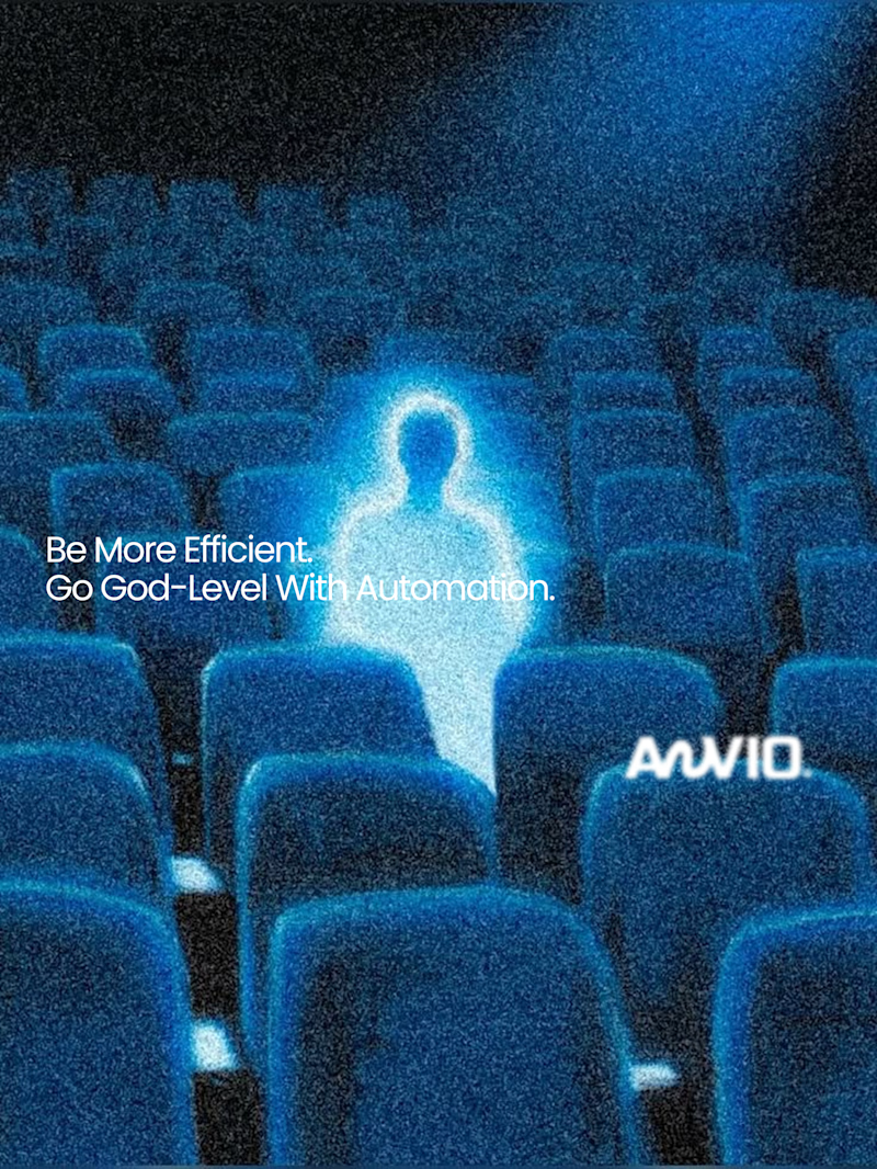
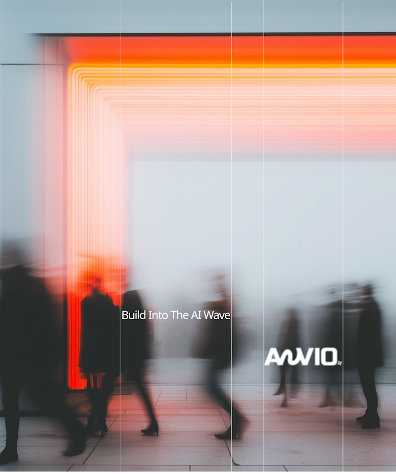
Which creative direction better communicates a Tech-Forward AI Brand Identity for anvio.online ?
25 voted
44%
32 voted
56%
57 votes
Closed

Fast vibrant energy gets my vote. The warm glow feels more human, which is nice for an AI brand.

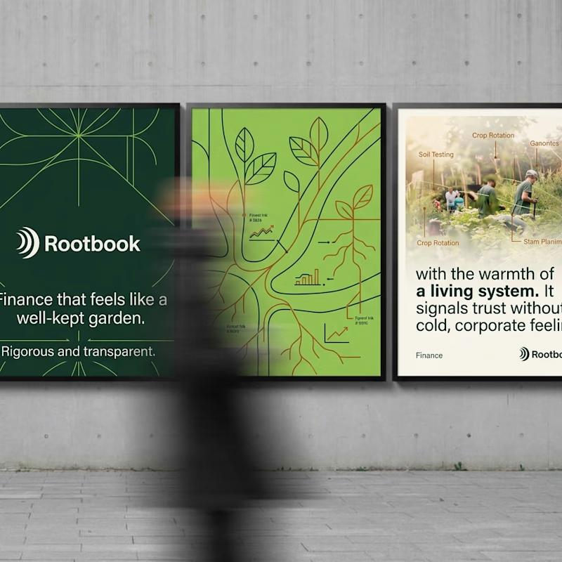
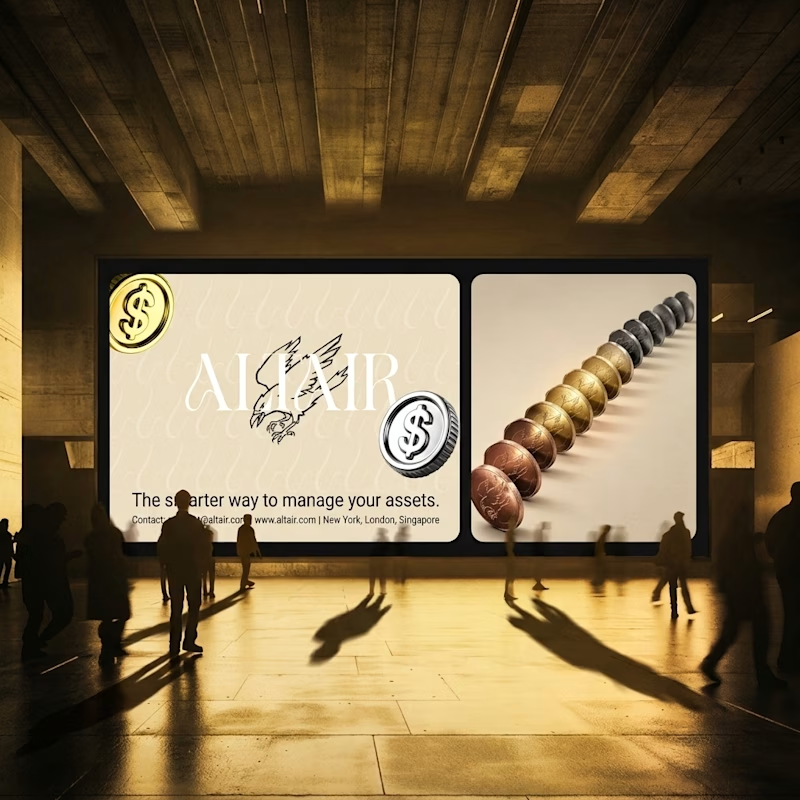
What does trustworthy finance look like to you?
A) Rootbook: Finance that feels like a well-kept garden.
B) Altair: The smarter way to manage your assets.
Two finance brands I’m designing, two completely opposite worlds. Which one gets your money?
28 voted
61%
18 voted
39%
46 votes
Closed
Rootbook wins for me. A finance brand that feels like a well kept garden is such a refreshing idea.