The network for creativity
Join 1.25M professional creatives like you
Connect with clients, get discovered, and run your business 100% commission-free
Creatives on Contra have earned over $150M and we are just getting started
Back to feedPost
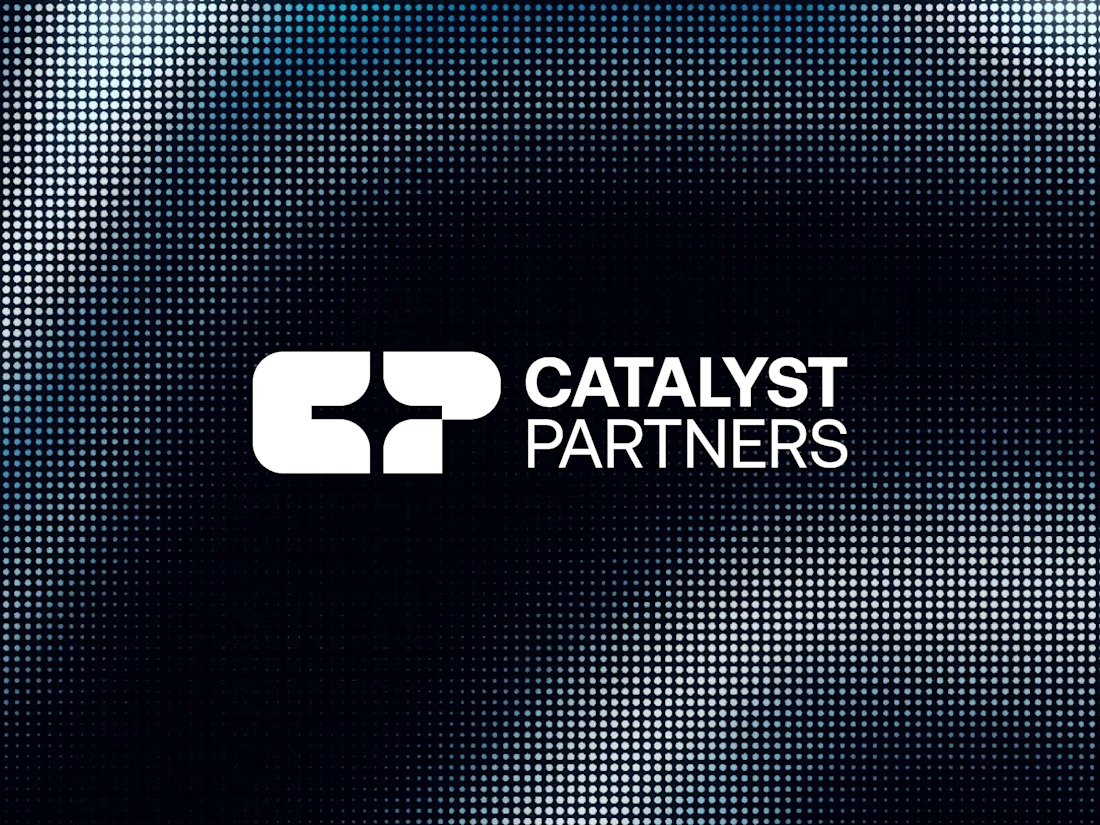
Catalyst Partners is a modern brand identity concept for a business development agency focused on strategy, growth, partnerships, and business transformation.
The identity is built around a bold CP lettermark, combining geometric forms, balanced negative space, and a distinctive visual structure to create a memorable and scalable brand symbol.
A vibrant lime green paired with deep black creates a confident, energetic, and contemporary personality, while the clean typographic system keeps the identity professional and corporate.
The visual direction is designed to communicate growth, momentum, collaboration, and strategic progress across digital and business environments.
Industry: Business Development / Consulting
Logo Type: Lettermark / Monogram
#LogoDesign #BrandIdentity #Branding #LettermarkLogo #LogoDesigner #CorporateBranding #BusinessBranding #VisualIdentity #GeometricLogo #BusinessDevelopment



Love it 🧡

Thanks mate

Your creativity knows no bounds!
Thanks
The network for creativity
Join 1.25M professional creatives like you
Connect with clients, get discovered, and run your business 100% commission-free
Creatives on Contra have earned over $150M and we are just getting started




Related posts

Metrics - Brand Identity Design

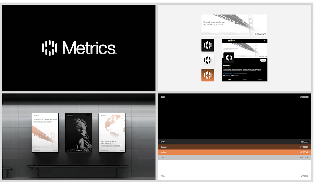


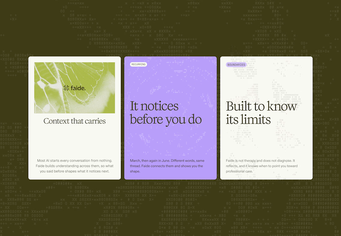
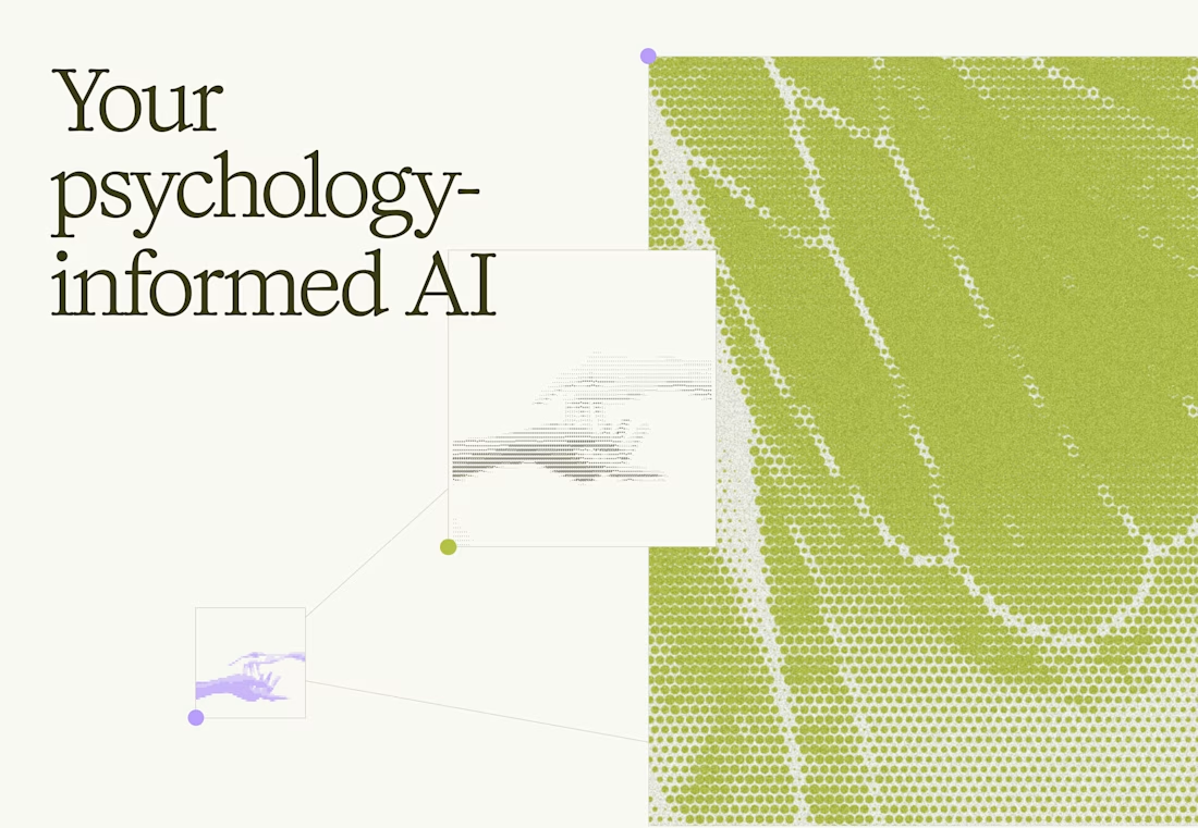
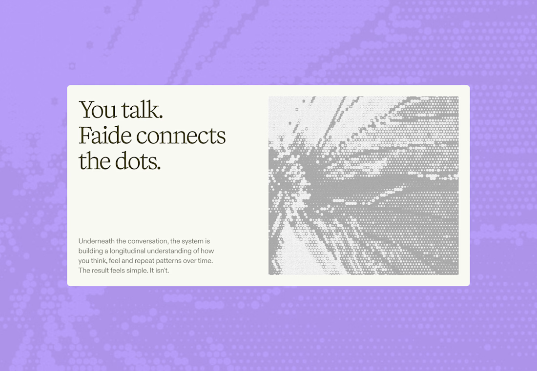
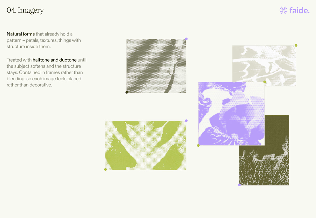

Love the colors and the texture!

Which Rhino Vector Logo You Guys Like Most?
These 100% Handmade Vector Logos Are Also Available For Purchase With Exclusive Copyrights Transfer Ownership, Feel Free To Contact Us.
4 voted
50%
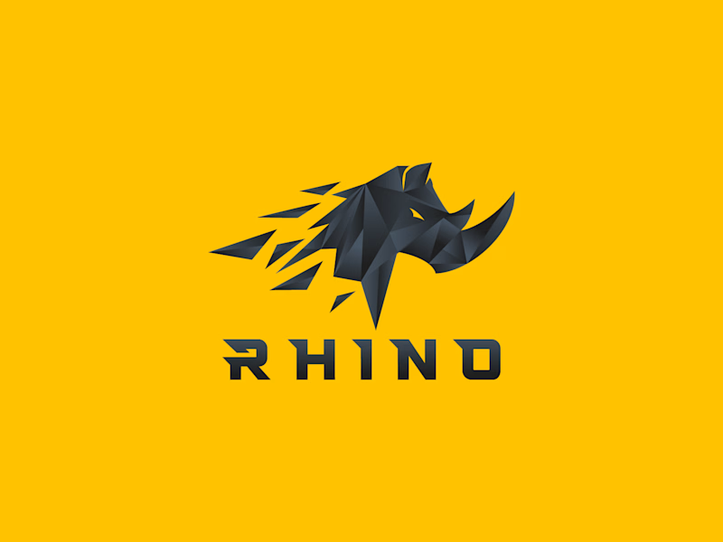
4 voted
50%
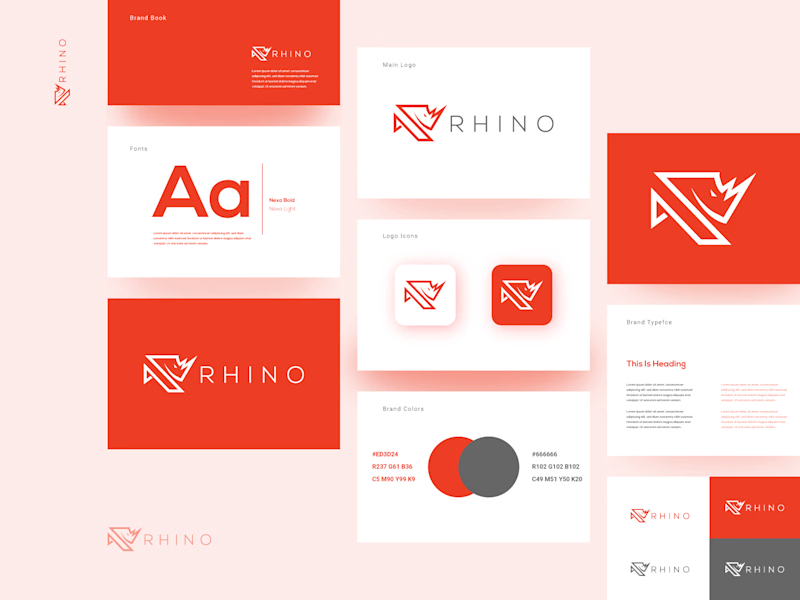
8 votes
Closed

B for me. A is a great mascot, but B actually behaves like a brand, it stretches across a whole system without breaking a sweat. The rhino stays recognisable even when it goes minimal, which is the real test.