The network for creativity
Join 1.25M professional creatives like you
Connect with clients, get discovered, and run your business 100% commission-free
Creatives on Contra have earned over $150M and we are just getting started
Back to feedPost
Taste Test
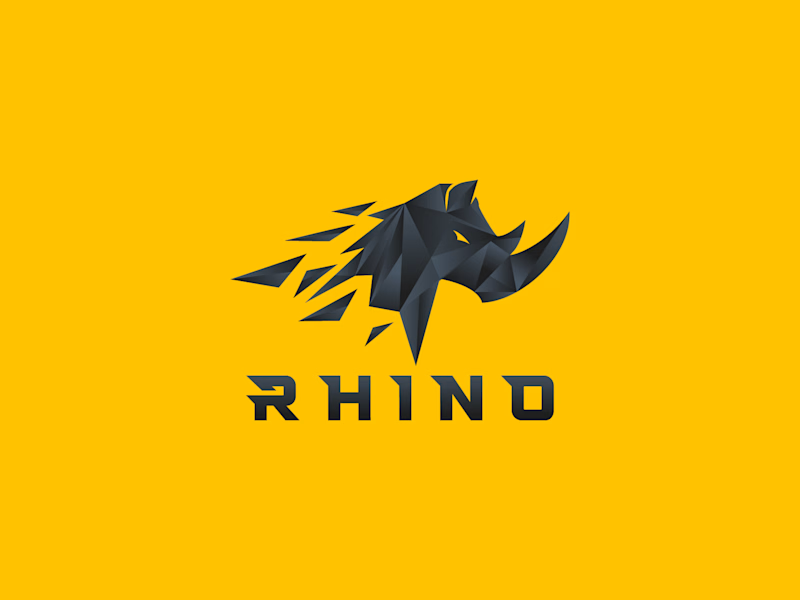
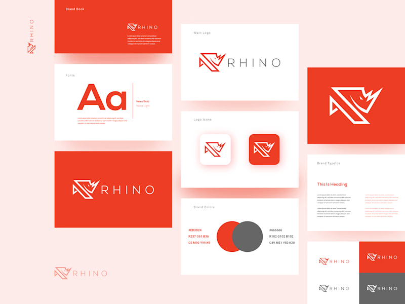
Which Rhino Vector Logo You Guys Like Most?
These 100% Handmade Vector Logos Are Also Available For Purchase With Exclusive Copyrights Transfer Ownership, Feel Free To Contact Us.

7 votes
Ends in 15h

B gets my vote. The simpler outline feels more versatile, especially across the stationery and smaller brand applications.

B for me. A is a great mascot, but B actually behaves like a brand, it stretches across a whole system without breaking a sweat. The rhino stays recognisable even when it goes minimal, which is the real test.

B for me. A is a striking standalone mark, but B gives you so much more to work with across a whole system. The geometric construction on the icon holds up really well even when it goes smaller.
The network for creativity
Join 1.25M professional creatives like you
Connect with clients, get discovered, and run your business 100% commission-free
Creatives on Contra have earned over $150M and we are just getting started
Challenges
View all


Related posts

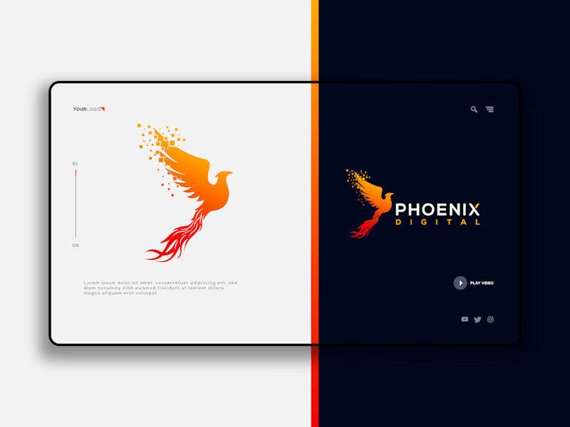
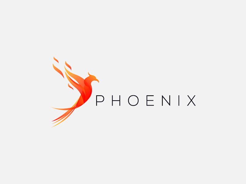
Which Phoenix Vector Logo You Guys Like Most?
These 100% Handmade Vector Logos Are Also Available For Purchase With Exclusive Copyrights Transfer Ownership, Feel Free To Contact Us.
5 voted
38%
8 voted
62%
13 votes
Closed

B has more life to it, that wing gradient gives it some motion the flat mark in A doesn't have. Are you pricing these as one-off logo packs or is there a bigger identity system behind them?
Which Red Panda Vector Logo You Guys Like Most?
These 100% Handmade Vector Logos Are Also Available For Purchase With Exclusive Copyrights Transfer Ownership, Feel Free To Contact Us.
4 voted
36%
7 voted
64%

11 votes
Closed
Which Lions Vector Logo You Guys Like Most?
These 100% Handmade Vector Logos Are Also Available For Purchase With Exclusive Copyrights Transfer Ownership, Feel Free To Contact Us.
1 voted
20%
4 voted
80%
5 votes
Closed