The network for creativity
Join 1.25M professional creatives like you
Connect with clients, get discovered, and run your business 100% commission-free
Creatives on Contra have earned over $150M and we are just getting started
Back to feedPost

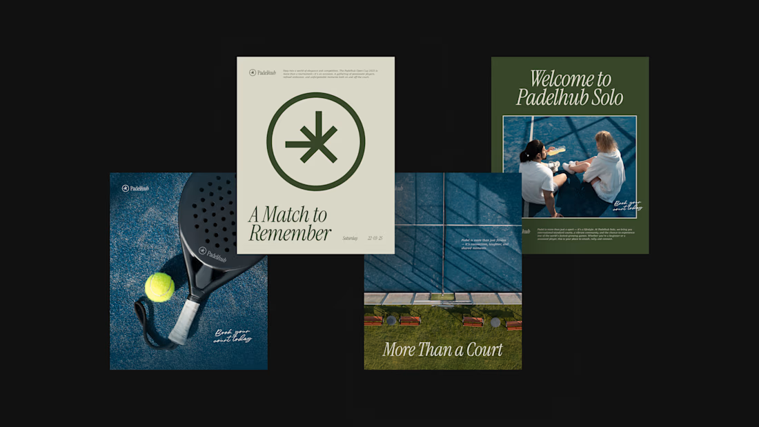
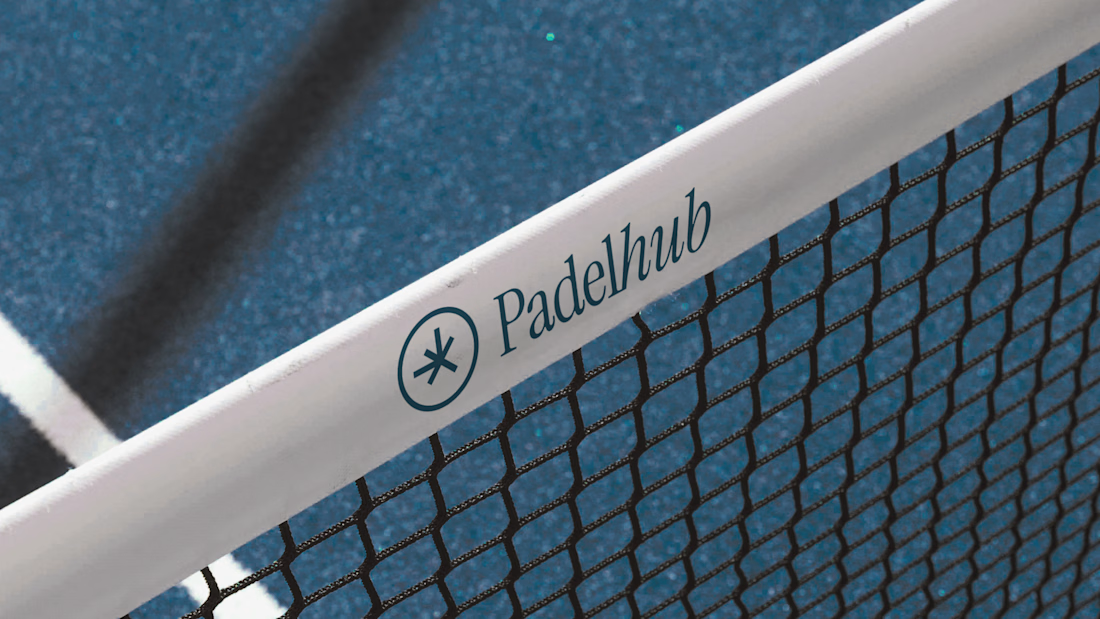
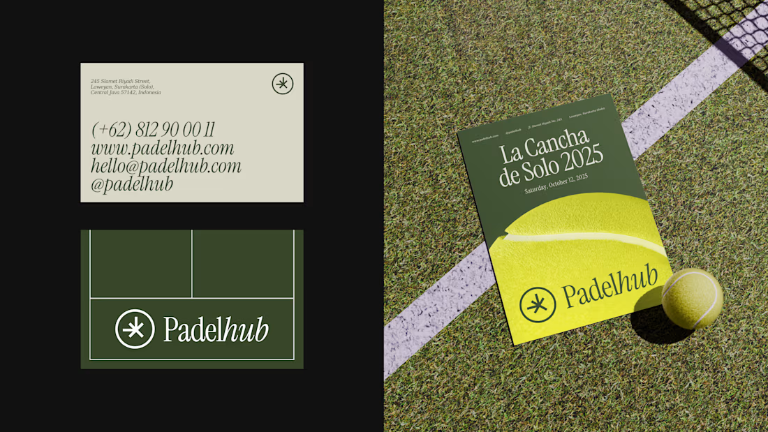
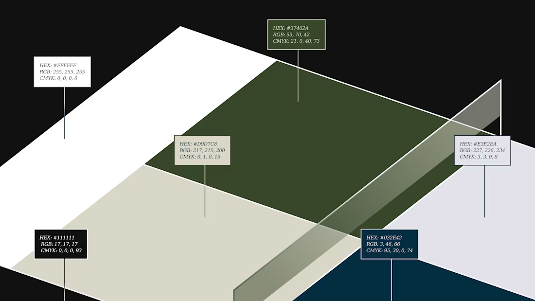
Padelhub is a padel club in Surakarta that wanted its brand to feel as considered as its courts. We built one mark, an asterisk inside a circle, paired it with an italic serif wordmark, and held that lockup across every touchpoint. Deep green and cream carry the posts and business card, while the tennis-ball yellow poster and the net banner show the same mark at a different scale.
Which touchpoint do you trust most when choosing a sports club: the poster, the card, or the website?

The network for creativity
Join 1.25M professional creatives like you
Connect with clients, get discovered, and run your business 100% commission-free
Creatives on Contra have earned over $150M and we are just getting started



Related posts

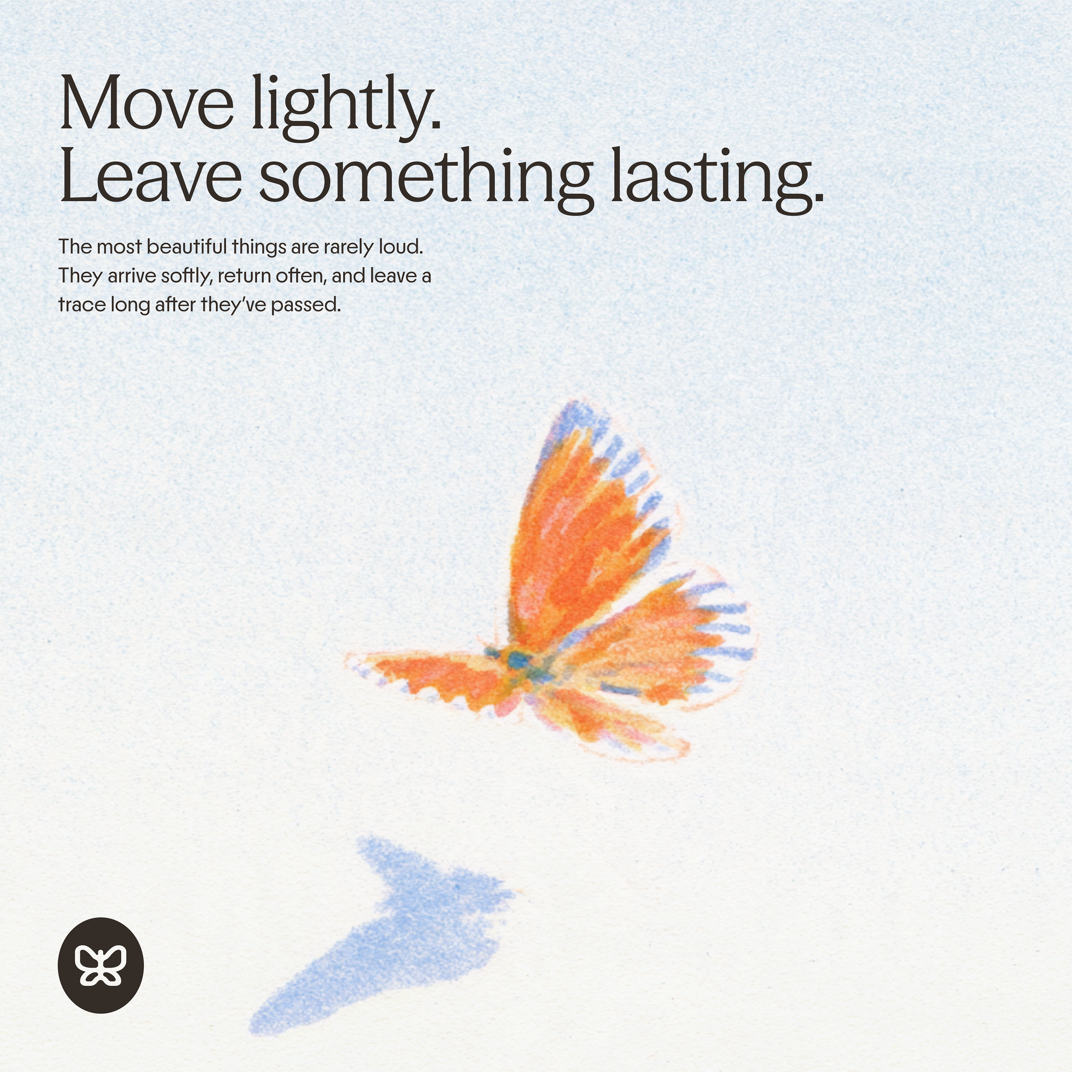
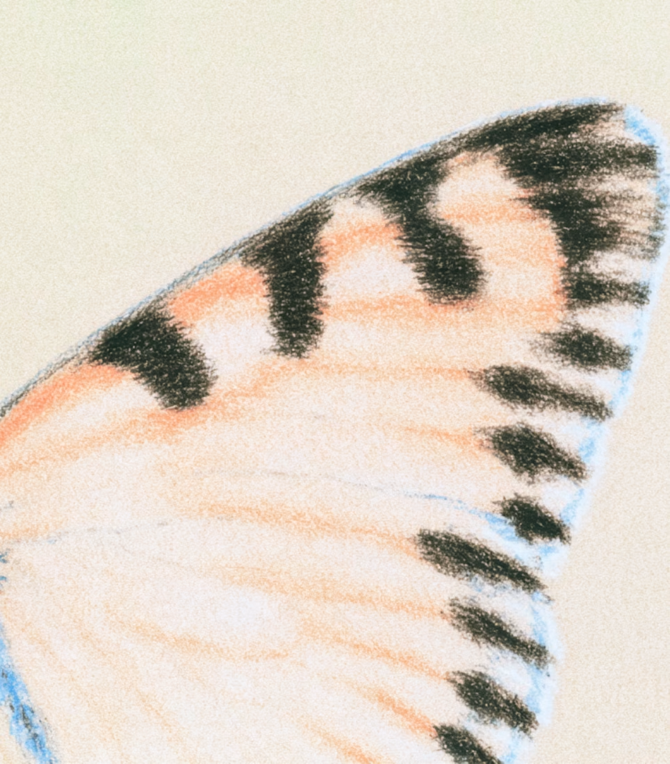
generated these little fellas for a concept and now i want to build a whole brand around them.
if you're making something that helps people dream and aspire, they're looking for a home:)


adorable!🥹

AI Analytics Dashboard
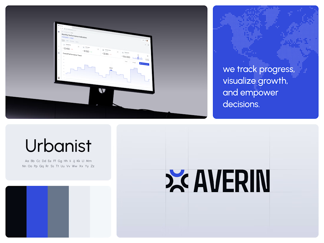
One blue runs from the logo to the chart line.
Revenue, active users, conversion rate and income sit in a row of cards above the trend chart. The cards answer where the numbers stand. The stepped line answers how they got there, holding each period's value until the next, with a tooltip on a dashed guide line for the exact figure.
The identity pairs a four-arc mark with a condensed wordmark, drawn to the same top and bottom lines on the construction grid. The top arc's blue comes back in the slogan tile, the chart line and the main button, so the brand and the product share one accent.
Designed by the Hue & Machine team.
#DashboardDesign #DataVisualization #SaaS #Analytics #AI #WebApp #BrandIdentity #UIDesign #ProductDesign #FigmaDesign



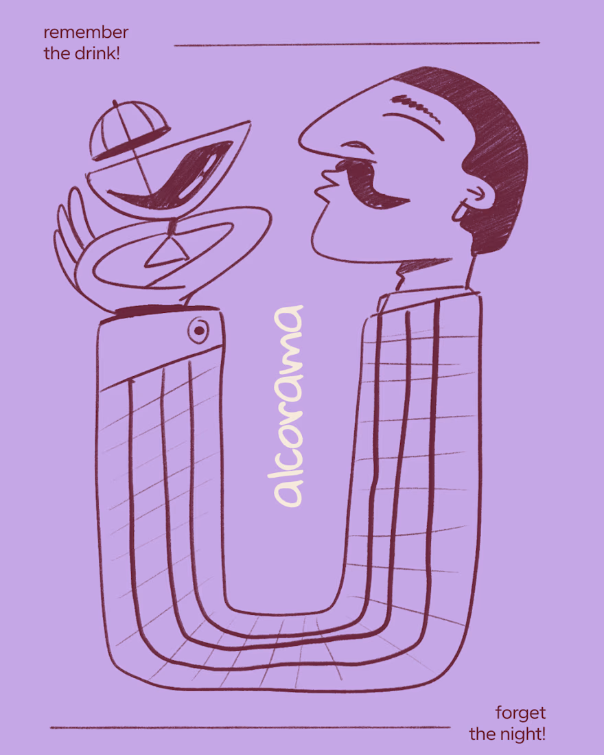
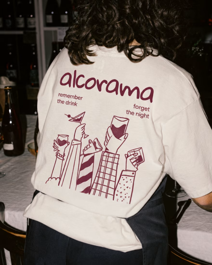
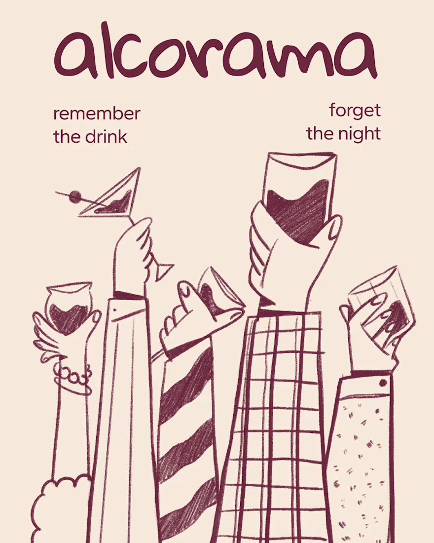
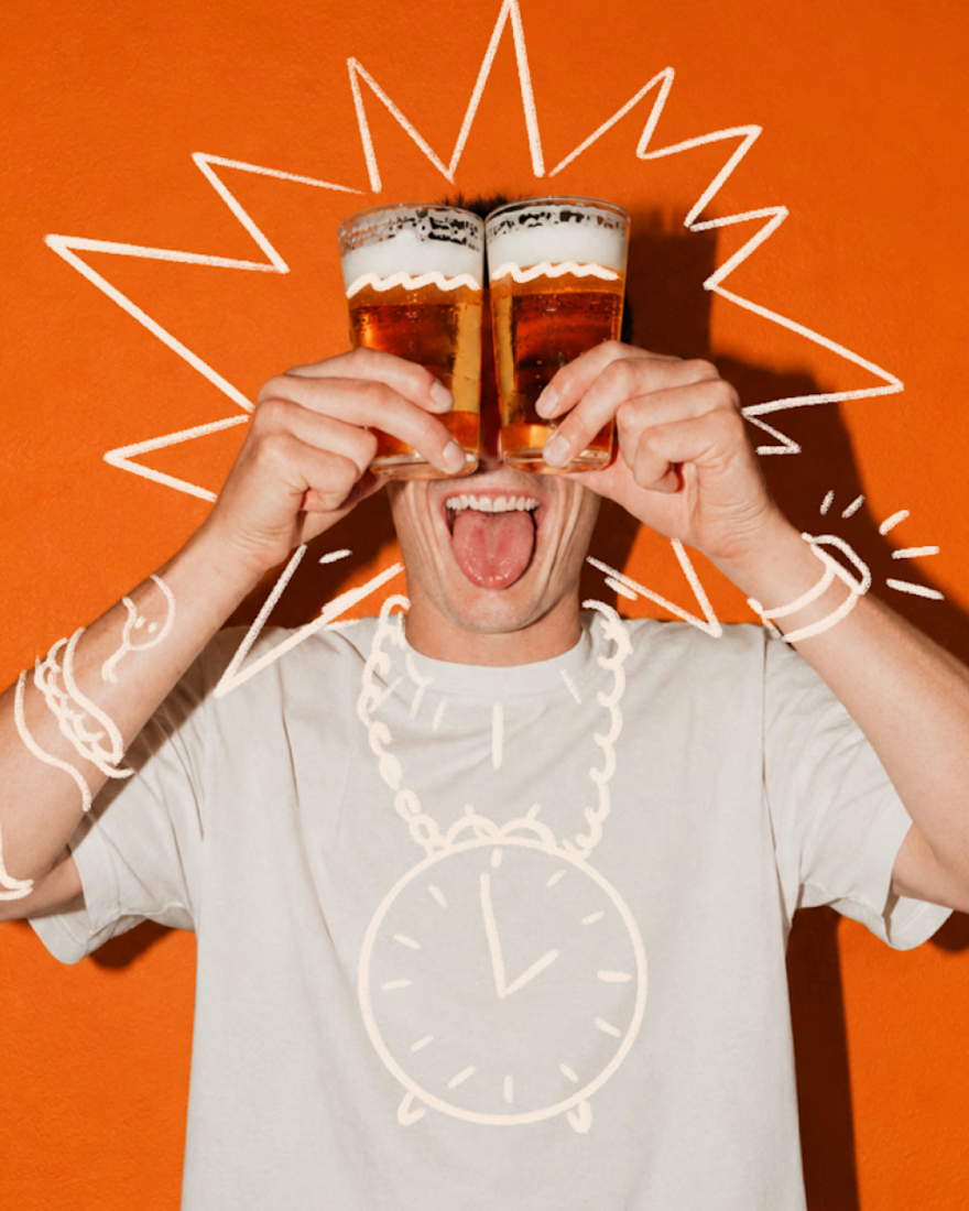
Final direction picked! I love when brands use custom illustration as the main way to communicate with their audience.
Direction discovery should not take more than one week and it should be full of personality! Ready to upgrade your brand?

Amazing work!