The network for creativity
Join 1.25M professional creatives like you
Connect with clients, get discovered, and run your business 100% commission-free
Creatives on Contra have earned over $150M and we are just getting started
Back to feedPost
Taste Test
This morning I found a local bakery website with great branding, but the hero section lacked impact; it just showed a single, isolated, small loaf of bread on a dark background.
I jumped into Framer to see how to elevate it and designed two alternative versions:
Option 1: The Focused Loaf. True to the original concept, but re-engineered for a much stronger visual hierarchy.
Option 2: The Working Station. An immersive, storytelling approach that drops you right onto the baker's table.
Which version do you think works better for a premium bakery? Let me know below! 👇

24 voted
59%
17 voted
41%
41 votes
Closed

Going with option B

Both look nice in my opinion!

Nr.2 This option looks premium,: and you want to eat the bread :

Option A

option B build Familarity

Lovely designs

Option B

Option A


Nice design


Impressive !


A.......
Though I love B

Definitely "A"

Option A
Option B

Perfect

That bread looks delicious! By the way, both designs look great, and we could use them for different purposes. Option 1 feels like a strong, impactful way to introduce a brand or topic. On the other hand, Option 2 allows us to start slow and smooth, letting the idea build up progressively.

Thank you for the insight! I agree, that the first one is straight and the second one builds a story. I keep going back and forth with my decision.


Option A looks good

Option B! But it lacks a header


Option B for me. Clean focus on the product, nothing competing for attention, which is exactly what a premium bakery needs.🔥

Good designer

A one is more better

Would go for option A

The option A has a soul-catching imagery


Both look great!

I think both is attractive

Beautiful

Go with option B
The network for creativity
Join 1.25M professional creatives like you
Connect with clients, get discovered, and run your business 100% commission-free
Creatives on Contra have earned over $150M and we are just getting started





Related posts


Definitely the new one. Seems more fluid and easier to interact with

New case study: the landing page for REVAI, a concept AI sales platform.
The brief I gave myself was structural, not decorative: design a page where every section earns the next one. Hero makes one claim and gets out of the way. The value proposition comes before any feature gets named — because a feature nobody understands yet is just noise. Proof (testimonial, logos) sits right before the final ask, not scattered earlier where it does nothing.
Art direction followed the same logic — high contrast where the page needs to make a claim, quieter and more editorial where it needs to build trust. The layout isn't there to look good in isolation. It's there to move someone from "what is this" to "I trust this" in one scroll.


Love the colors dude! Hell of a work🔥

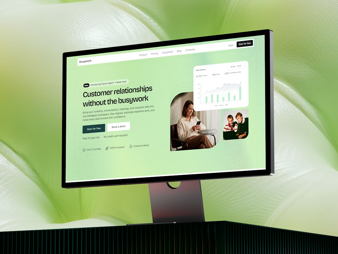
Busywork | SaaS landing page design
Busywork brings customer data, conversations, AI, and workflows together.
The design challenge was therefore less about showing everything the product can do and more about creating a clear narrative around why the product matters.
The result is a concept focused on progressive storytelling, helping visitors move from problem → product → capabilities → value → action.


Outstanding