The network for creativity
Join 1.25M professional creatives like you
Connect with clients, get discovered, and run your business 100% commission-free
Creatives on Contra have earned over $150M and we are just getting started
Back to feedPost

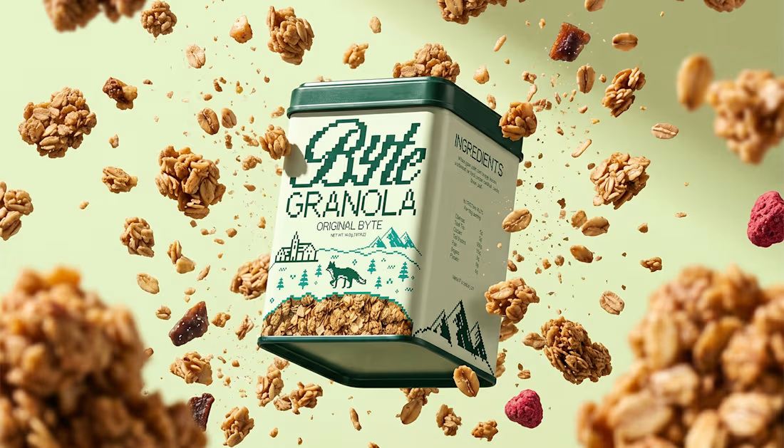
BYTE is an experimental granola brand built around the gaming nostalgia of growing up in the 90s and pixel theme art. The concept revolves around Leo, a fox character who represents the curious, energetic spirit of that era, bringing together food, nostalgia, and pixel culture in a way that feels playful without becoming overly childish.
The BYTE logo is designed around a custom pixel inspired wordmark that brings the visual language of classic 90s video games into the identity. The exaggerated, flowing form of the main wordmark gives it a distinctive personality, while the pixel construction keeps it connected to the digital world. The secondary typography is more structured and geometric, creating contrast and helping the identity feel like a balance between nostalgic gaming culture and a contemporary food brand.
The packaging takes inspiration from classic 16 bit game environments, turning each tin into a small visual world. The front uses a clear hierarchy with the BYTE wordmark, GRANOLA descriptor, flavor name, and a pixelated landscape featuring the fox, mountains, trees, and a small village. A transparent product window at the bottom reveals the actual granola and makes the food itself part of the design.


The network for creativity
Join 1.25M professional creatives like you
Connect with clients, get discovered, and run your business 100% commission-free
Creatives on Contra have earned over $150M and we are just getting started








Related posts

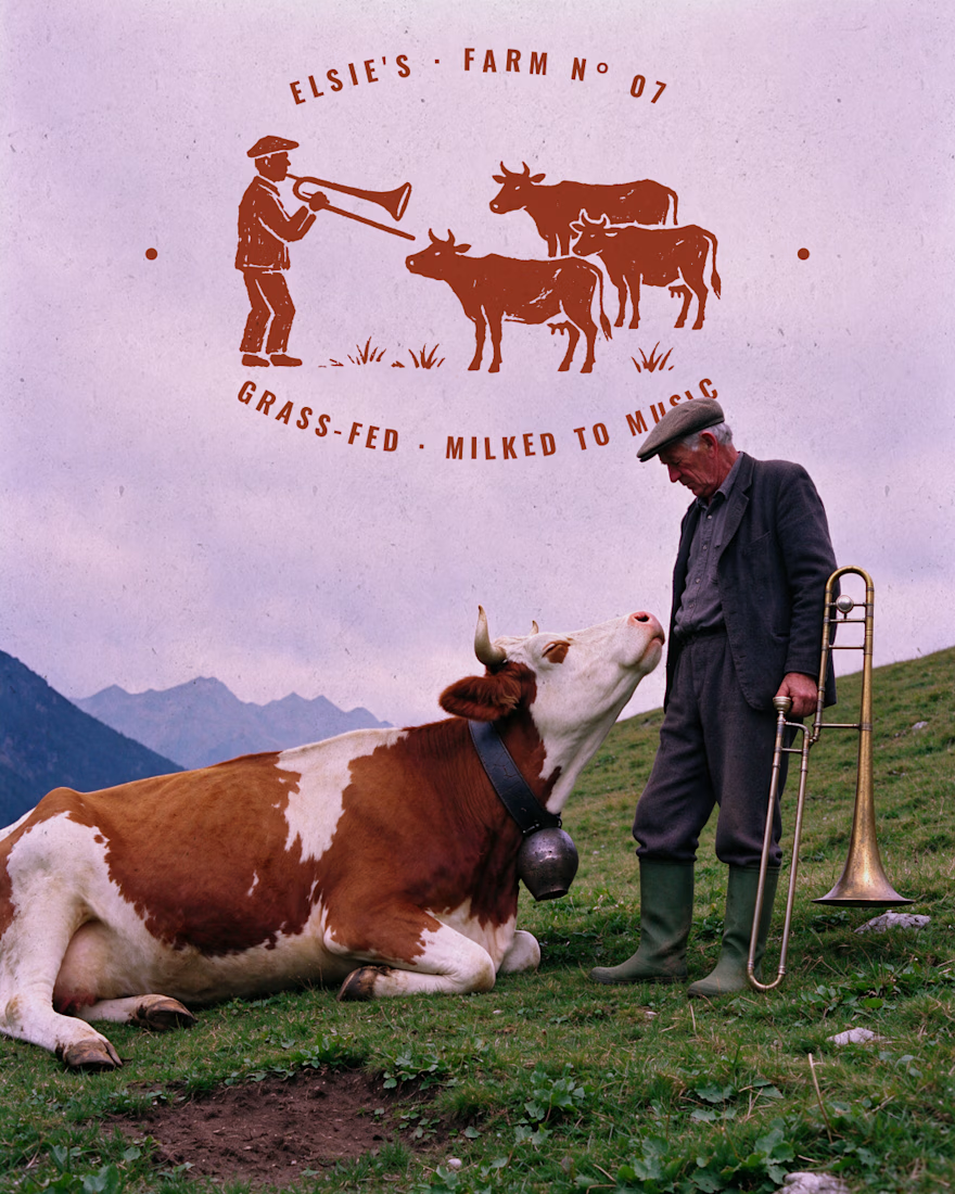
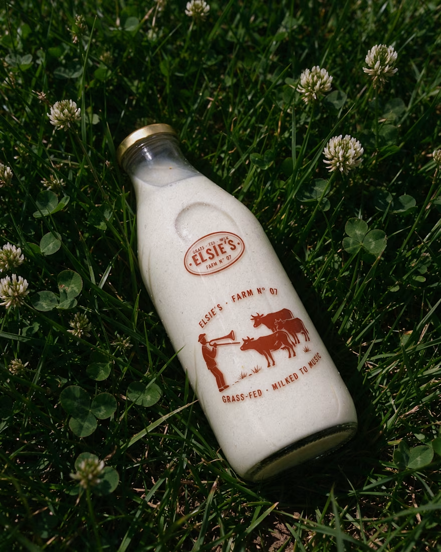
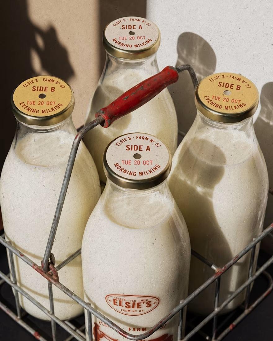
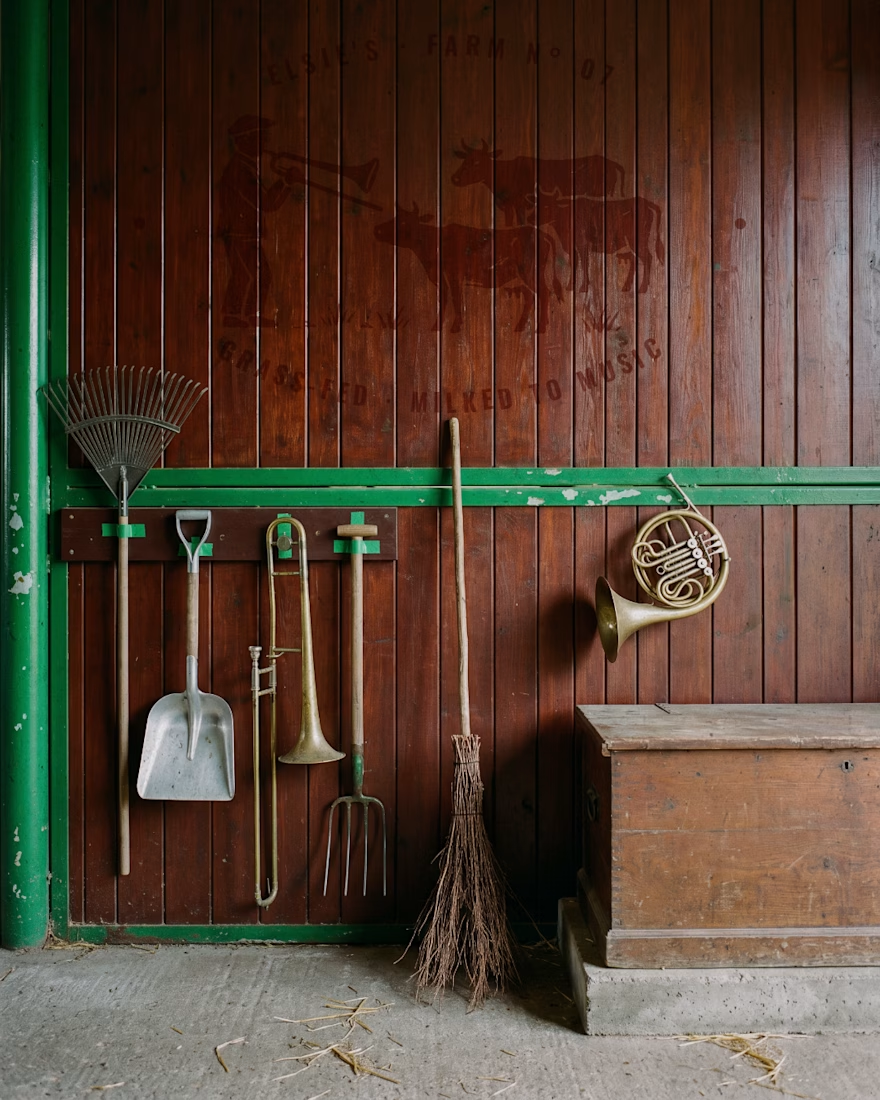
Elsie's: brand identity and packaging for the @designerbriefs weekly challenge (Brief 183). An organic milk brand from very happy cows who love fresh grass and good music.
The logo comes from the brass name plates farmers fixed to their milk cans, with every letter struck by hand. Then came a stamp-style illustration of a farmer playing to his herd, and a returnable glass bottle printed in barn red. All the imagery was made with my Augmented Art Direction process: AI as the tool, art direction and Photoshop retouching to finish every image by hand.
What song would you play to Elsie's cows? 🎺🐄




great work andreu


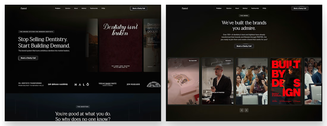
Three weeks into building the Pasted website, after the design was approved, an 11-page document arrived with a whole new vision.
It was beautiful work, and it described a different project at the agreed price.
I asked them to decide: keep the approved scope, or pause and price the new idea separately. On day six, they chose the original. We shipped two weeks later.

Offering to price the new vision as its own phase also lets the client see what the idea costs without it feeling like a no. Was a change-order process already written into your contract, or did you build that path on the spot?

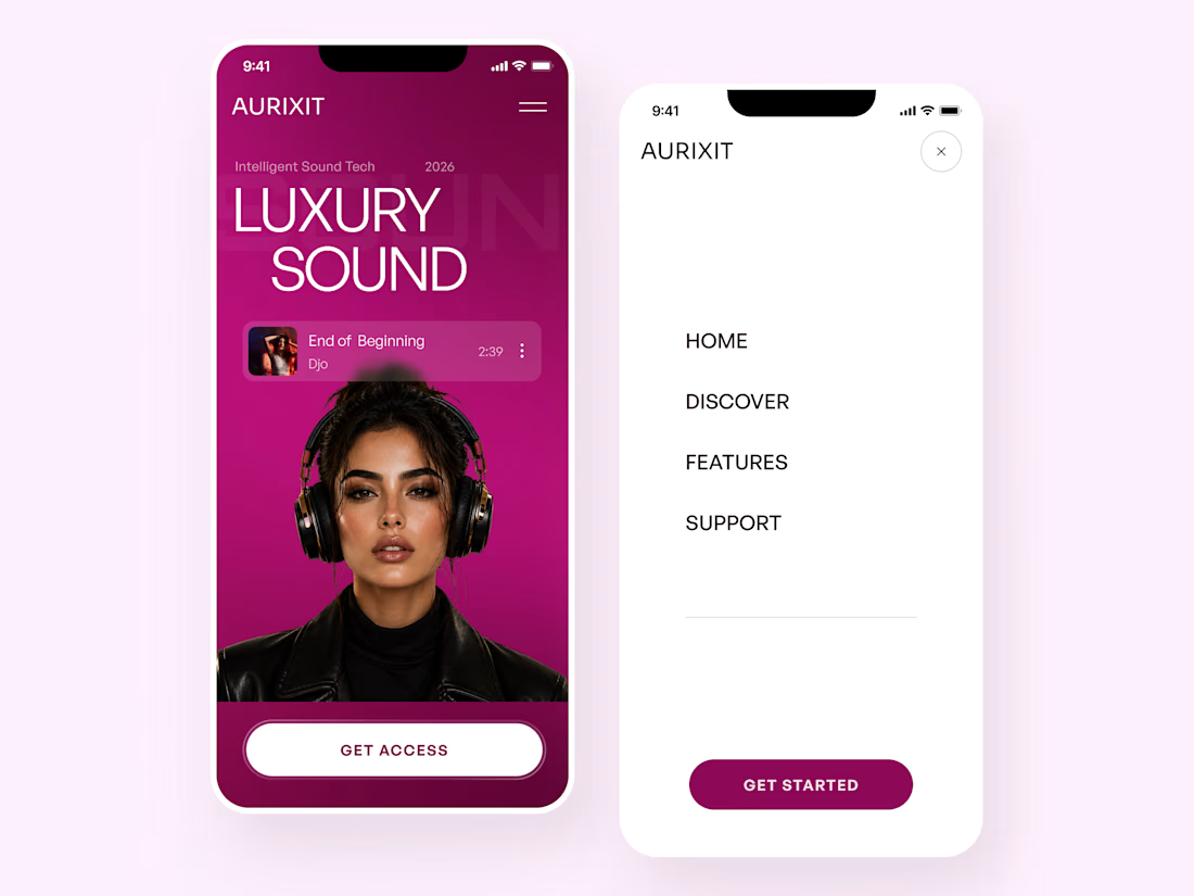
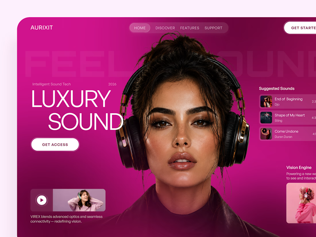
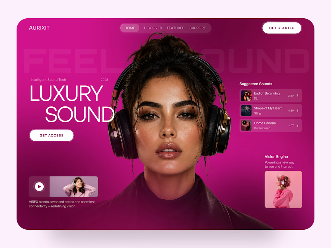
AURIXIT — Luxury Headphones Landing Page 🎧💗
A vibrant landing page concept for a premium audio brand, combining luxury sound, fashion-inspired visuals, and a bold digital experience
The design brings together bright magenta tones, oversized typography, lifestyle photography, and clean UI elements to create a modern, eye-catching aesthetic
Special attention was given to:
• Bold lifestyle-focused hero composition
• Vibrant pink and magenta color palette
• Clean, oversized typography
• Music playlist and suggested tracks
• Premium headphone presentation
• Clear CTA and minimal navigation
• Responsive mobile experience
The result is a fresh, stylish landing page that connects premium audio technology with fashion, music, and personal expression ✨


Magenta with the black headphones really pops. Was the small playlist text on pink tricky for contrast?