The network for creativity
Join 1.25M professional creatives like you
Connect with clients, get discovered, and run your business 100% commission-free
Creatives on Contra have earned over $150M and we are just getting started
Back to feedPost

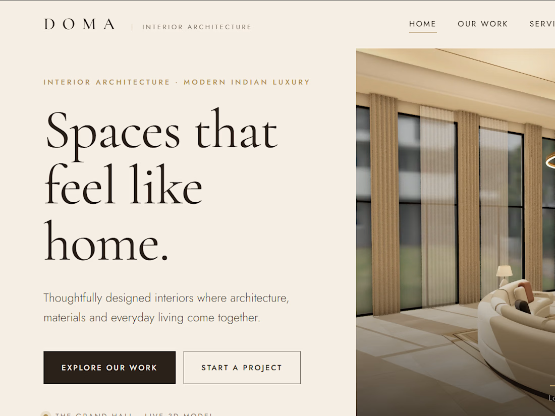
A premium interior design studio website featuring an immersive 3D architectural showcase, interactive room exploration, elegant project presentations.


Great work 🙌
The network for creativity
Join 1.25M professional creatives like you
Connect with clients, get discovered, and run your business 100% commission-free
Creatives on Contra have earned over $150M and we are just getting started





Related posts


Niceee

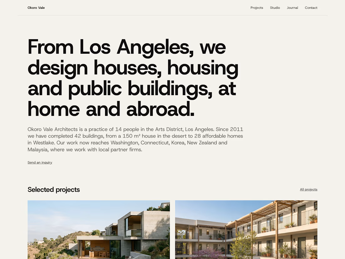
How I designed Parti, my architecture template for Framer, and the phone review that changed its hierarchy.


Your material-page revision gives the phone layout its own reading sequence. The change to thumbnail rows with full-row links seems particularly useful for showing that a material entry opens another page. How did you distinguish those clickable rows from the non-interactive project facts?

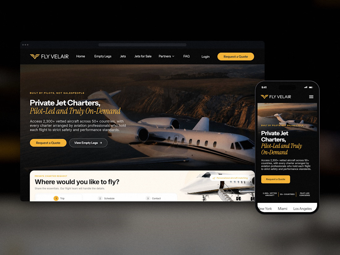
A private aviation website should do more than look expensive. It needs to turn visitors into qualified leads.
For Fly Velair, I designed and developed a complete digital experience built around their private jet charter and aircraft sales business.
The project included a full Framer website, a custom 3-step booking flow integrated with their CRM, CMS-driven aircraft listings, a dedicated Jets for Sale platform, SEO optimization, 10 search-focused articles, and premium print collateral.
Every part of the experience was designed to feel as premium as the service while making it easier for customers to inquire, book, and explore available aircraft.
Full case study below. Would love to hear what you think.


The 10 search-focused articles are the part most people skip, and for charter that long-tail traffic is probably where a lot of the real leads come from. Curious how you split the build, Framer for the main site and Lovable + Supabase for the jets for sale platform?