Parti — An architecture portfolio built around the work

Anurag Kalra


Overview
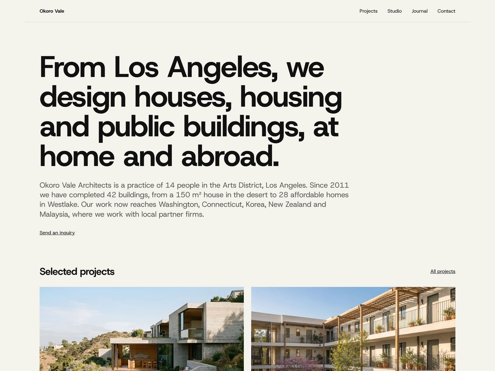
I designed Parti for architecture practices that need to explain how a project came together. The template brings photography, project facts, drawings, site analysis, process, and material choices into one publishing system.
The demo follows Okoro Vale Architects, a fictional practice. Building a coherent studio and project catalogue let me design with specific content throughout the experience.
My role: Product and visual design, content structure, interaction direction, and quality review.
Project: Self-initiated Framer template.
Tools and collaboration: Framer CMS, React code components; AI agents for build support, imagery, and QA.
The opportunity: make room for the explanation
I saw room for a more connected account of the work: what the brief asked for, what the site demanded, and how those constraints informed the design.
I treated that as a design hypothesis. A prospective client should be able to scan a project quickly, then go deeper into the decisions behind it. A studio editor should be able to publish that depth through structured content. The challenge was to support both without making every project page complicated.
A visual system shaped by architectural publishing
I chose “Monograph” as the visual direction: clear typography, generous margins, precise captions, and drawings alongside photographs. A consistent grid and hairline rules give dense information a clear place on the page.
Hierarchy comes from size, weight, tone, and spacing. Project names, locations, and captions each have a defined role. The interface needed to feel natural with both a full-width photograph and a table of project facts.
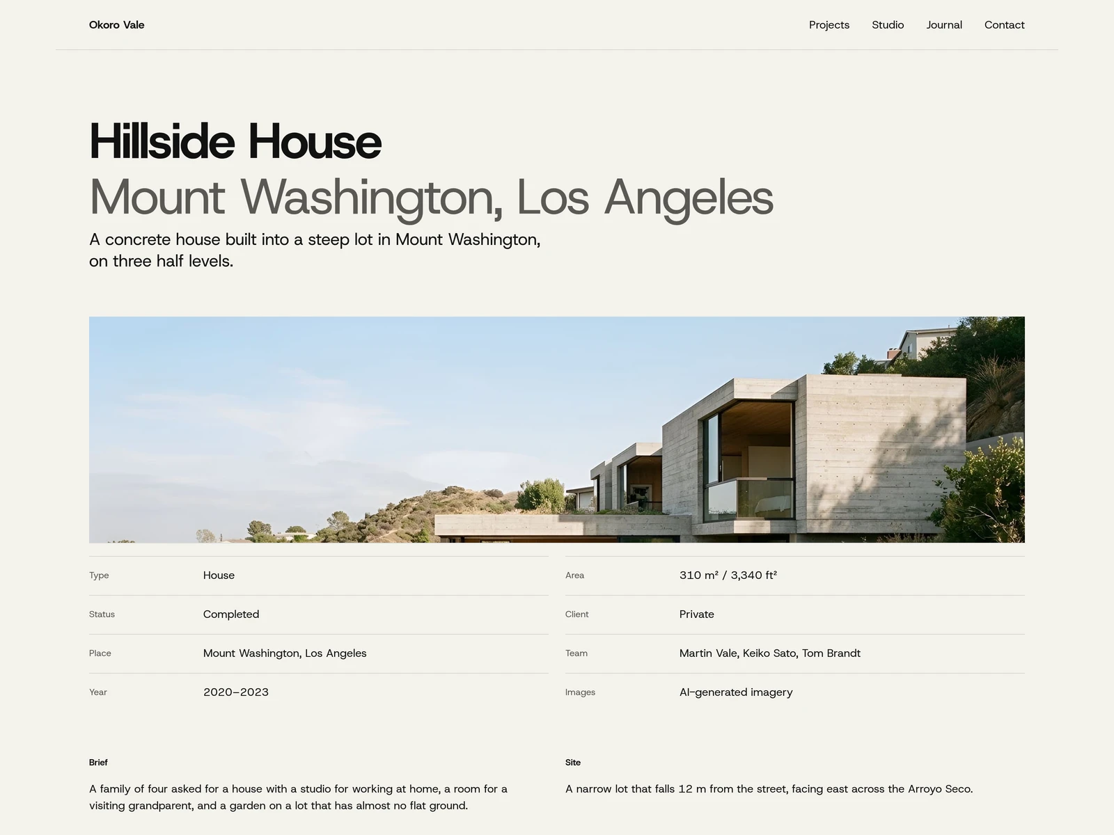
Hillside House: title and location set by weight and tone, lead photograph, and a two-column fact sheet.
Two ways into the same archive
The project index supports two browsing tasks. Grid view offers a visual overview; List view makes it easier to compare names, locations, types, years, and status. Type filters narrow the archive, and list numbering follows the filtered set.
The final direction keeps Grid as the desktop default and List on phone, favoring visual scanning on a wide screen and a compact sequence on a narrow one. Both views lead into the same project content.
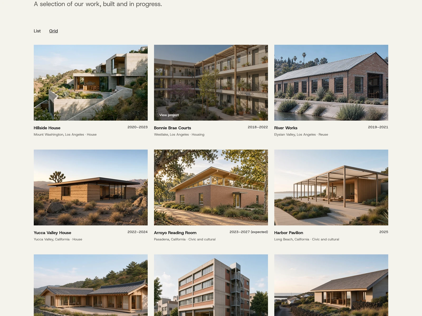
Project index in Grid view, with a List toggle and type filters.
From finished building to design reasoning
Each project starts with a clear introduction and fact sheet. Brief, Site, Approach, and Outcome give the story a repeatable structure. Plans and sections sit alongside photographs, with captions that identify what the visitor is looking at.
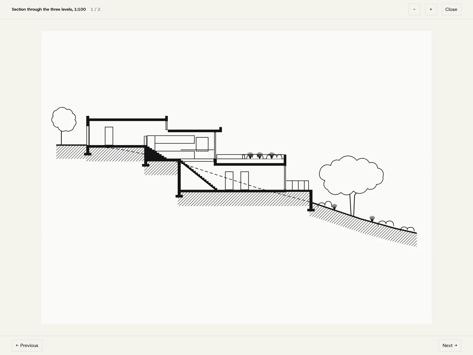
Drawing viewer: a captioned 1:100 section with zoom and previous/next controls.
I extended that structure on Yucca Valley House with three optional sections:
Site layers: Toggleable topography, water-flow, and planting overlays explain the land.
Process: Dated events show how the project developed over time.
Materials: Entries lead to dedicated stories about sourcing, selection, aging, and sustainability.
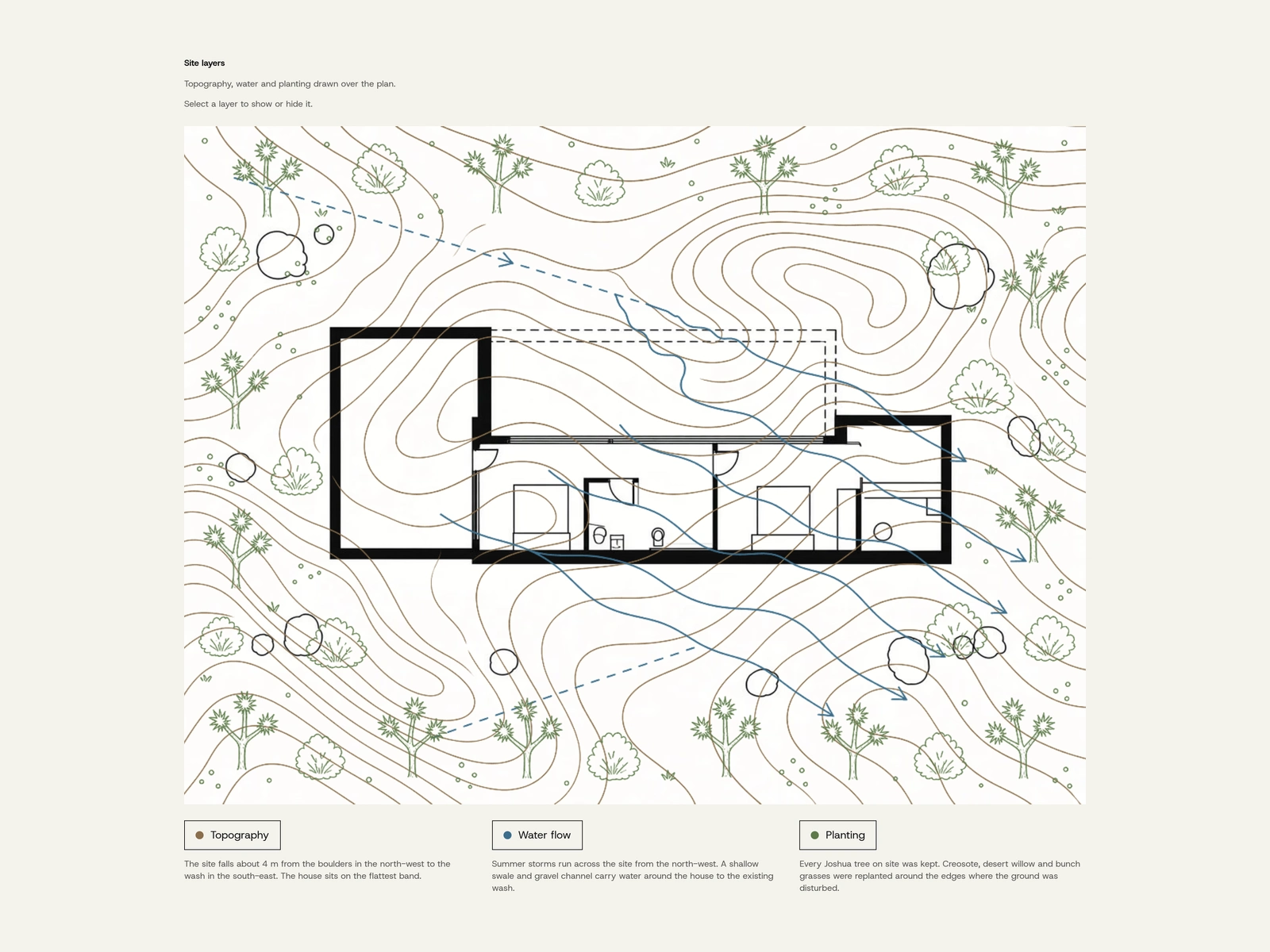
Yucca Valley House site layers: topography, water flow, and planting drawn over the plan.
A project with a shorter story can keep the core layout; a project with more to explain can go deeper.
Designing for the editor
The content system grew from Projects and Journal to five CMS collections, adding Map Layers, Timeline Events, and Materials. Project references connect the new content to the appropriate page, and optional sections hide when their reference fields are empty.
Editors gain a repeatable way to publish richer projects, but they also have more fields and relationships to manage. The guide explains the collections, required and optional content, image guidance, and where custom behavior lives. The enhanced sections are removable so a practice can choose the detail it is prepared to maintain.
Phone review changed the hierarchy
The first material pages looked acceptable on desktop. Reviewing them on an iPhone exposed two problems: section labels were too weak beside the body copy, and material tiles did not clearly communicate that they opened another page.
I revised the page around an editorial reading sequence: project link, headline, short introduction, source, image, and clearly separated sections. On phone, material entries became thumbnail rows with clearer link affordances and a full-row target. A later refinement aligned material detail pages with the project grid and presented sustainability as a labeled fact row.
The lesson was to evaluate the reading sequence on the device. A desktop composition could not tell me whether a phone reader would understand what came next.
Interaction, quality, and handoff
The mobile menu, archive controls, and site-layer buttons needed clear states and keyboard behavior. Documented checks covered menu focus, Escape behavior, control states, responsive layouts, headings, and link geometry.
Review also changed small but consequential details: data-sheet label alignment, phone list rows, navigation states, and material-page hierarchy.
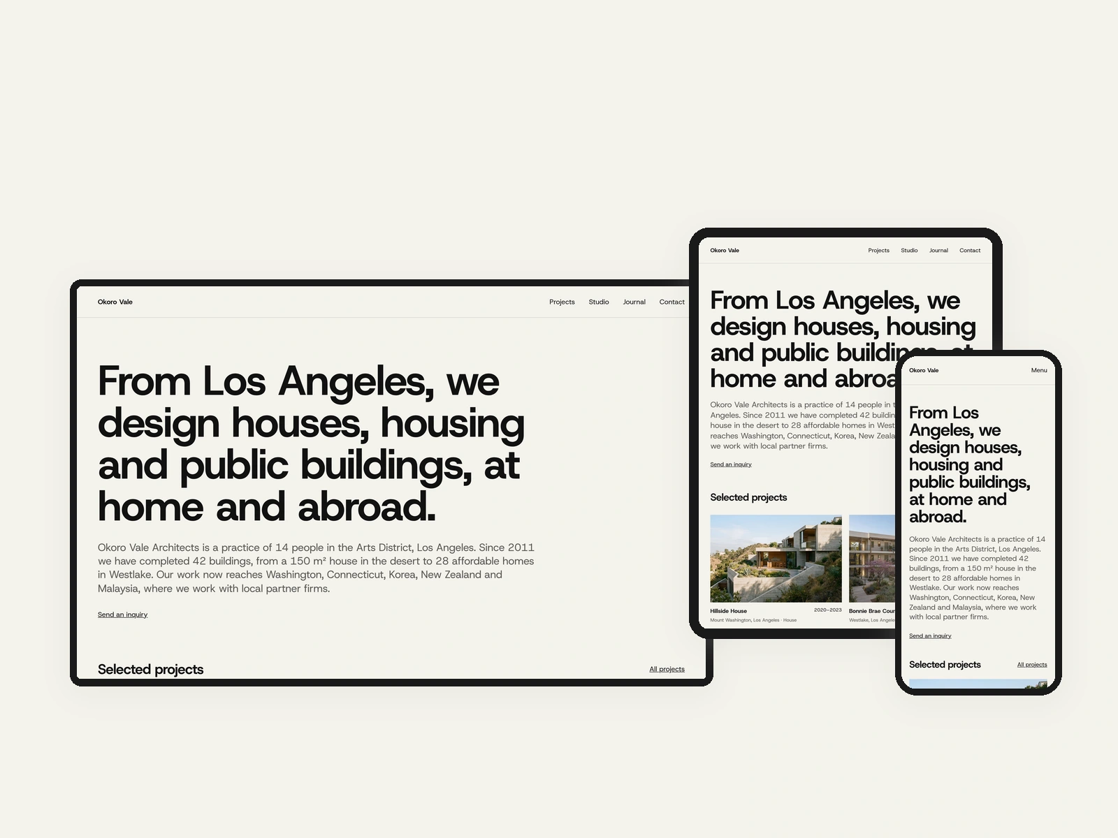
The home page at desktop, tablet, and phone widths.
Outcome
Parti shipped to the Framer Marketplace with a filterable archive, structured project stories, drawing and photo pairings, and optional site, process, and material content.
The project demonstrates how I connect visual design, interaction, content modeling, and implementation review. I directed the briefs, critique, and decisions, with AI agents supporting the build and checks. The fictional studio content and AI-generated imagery are demonstration material.
The next test is with architecture practices: can an editor publish a real project comfortably, and can a prospective client understand the practice’s approach? Those questions would determine whether the added depth earns its maintenance cost.
Like this project
Posted Nov 8, 2026
A Framer Marketplace template for architecture studios: a filterable archive, structured project stories, and optional site, process, and material content.
Likes
0
Views
2