The network for creativity
Join 1.25M professional creatives like you
Connect with clients, get discovered, and run your business 100% commission-free
Creatives on Contra have earned over $150M and we are just getting started
Back to feedPost


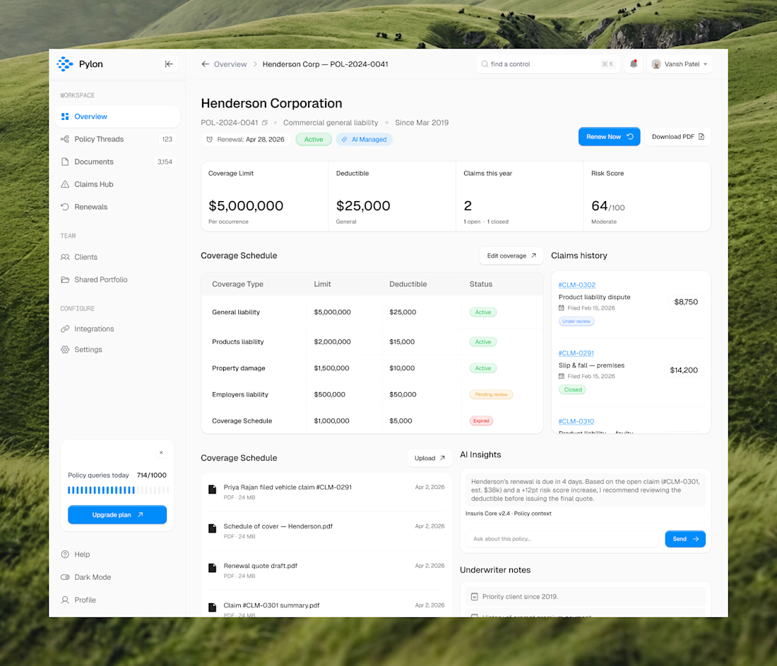
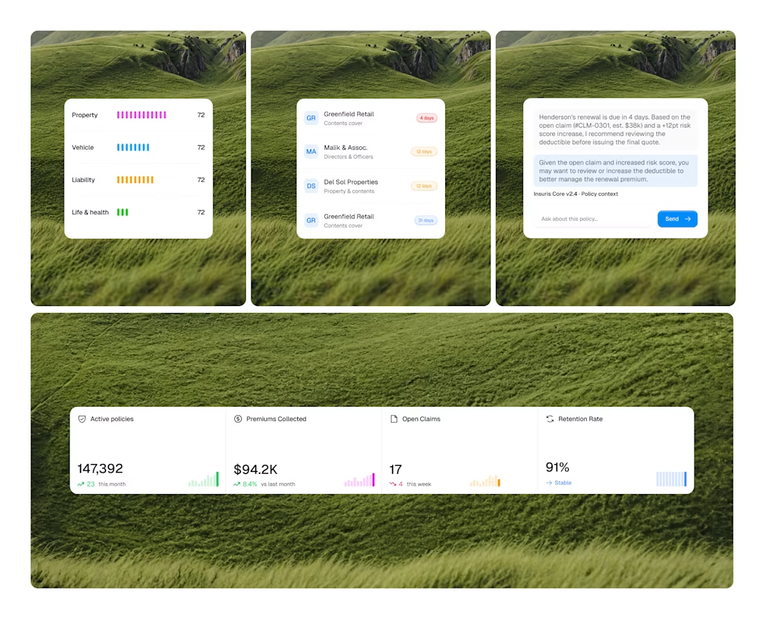
we just wrapped a full redesign, including dashboard, entire application, end to end.
they came to us with cluttered layouts, a SaaS aesthetic that felt heavy and outdated. the kind of ui that makes users feel like they're doing work just to navigate it.
we stripped it back completely with adding more modern visual language, minimal layouts, intentional use of whitespace, a design system that actually scales with the product.
what the client said when they saw it: "you all just changed it and made it so minimal, soothing to the eyes and for greater user experience."
if you are looking for a design partner, dm us or book a call. let's talk about what your product could look like.



Thanks Nagaraj

I like how simple the layout looks
Nice design


looks nice with this grass bg
thanks Andrey. glad you liked it 🙌

ty Bonita 🙌
The network for creativity
Join 1.25M professional creatives like you
Connect with clients, get discovered, and run your business 100% commission-free
Creatives on Contra have earned over $150M and we are just getting started

Challenges
View all


Related posts


“Or similar” leaves a lot to the imagination.
A few billboard designs I made for Sync as part of the rebrand. The campaign centres on a simple promise: the car you see is the car you drive.
I kept that message big and direct, with the cars up close and enough pink to make you look twice.
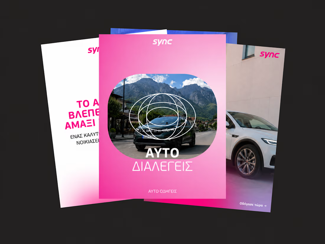
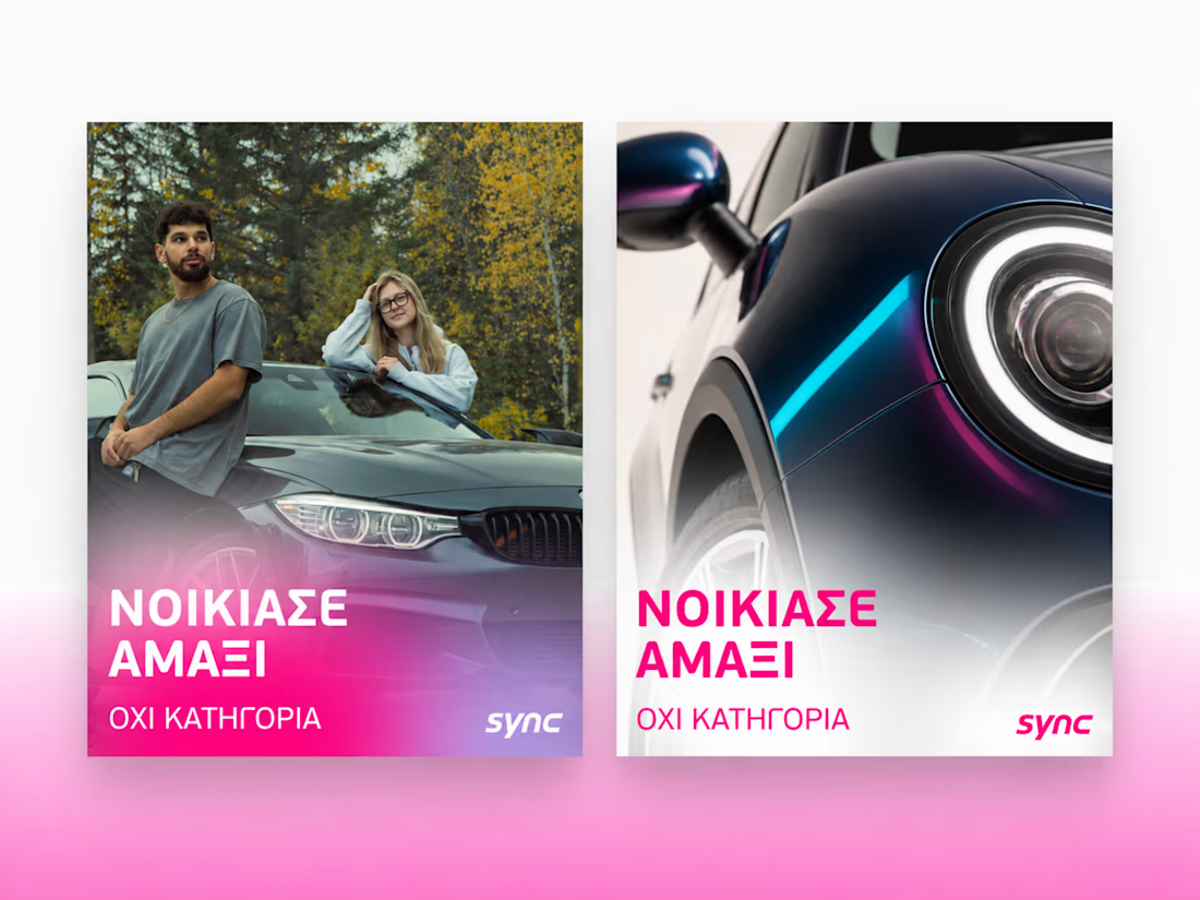
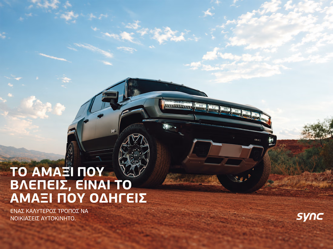
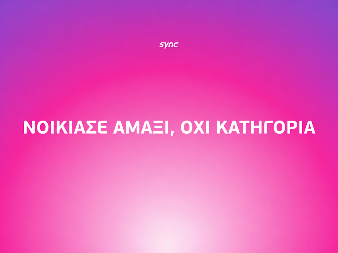

The way the oversized promise carries through the pink palette is really effective—the close-up crops make the car feel immediate without losing the campaign idea.

did some home cleaning - works page is now my homepage
i've lost over 50% of traffic because people dropped off on my previous homepage (about now) that didn't give any value
check it out yourself: https://seb-astian.com

looking great! i love that loading animation.


The low-poly scene already has a strong sense of place, and the 60fps browser target makes the interaction feel ambitious in the best way. I especially like how the restrained palette lets the “Explore the Silo” typography lead the experience.