The network for creativity
Join 1.25M professional creatives like you
Connect with clients, get discovered, and run your business 100% commission-free
Creatives on Contra have earned over $150M and we are just getting started
Back to feedPost
A little peek at Kiera Sullivan, a portfolio template for creatives & founders who want their website to feel playful and full of character.
Had way too much fun working on this one.

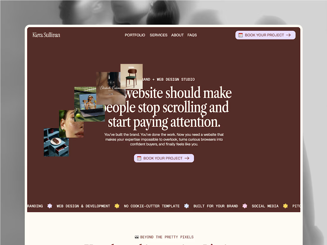


The oversized serif headline and warm brown palette give this a strong editorial feel. I especially like how the collage imagery keeps the hero playful without taking focus from the CTA.
The network for creativity
Join 1.25M professional creatives like you
Connect with clients, get discovered, and run your business 100% commission-free
Creatives on Contra have earned over $150M and we are just getting started

Challenges
View all


Related posts

A portfolio doesn't need more space.
It needs to use space differently.
With OVERLAP, projects don't need their own isolated sections. They can share space, create depth and become part of a larger composition.
It's not about fitting more content on screen.
It's about creating relationships between what you show.
Less separation. More composition.

Love this take. Overlapping projects to create depth vs just stacking sections - way more intentional.


Great interactions & layout! 🙌


Lapse is a free Framer template for AI products. Nine pages: home, about, pricing with a monthly and annual toggle, a CMS blog, contact, legal pages and a 404. It's dark and monochrome, and the only colour is the glow on the buttons.
Free to remix.


Premium design !