The network for creativity
Join 1.25M professional creatives like you
Connect with clients, get discovered, and run your business 100% commission-free
Creatives on Contra have earned over $150M and we are just getting started
Back to feedPost

As a business owner, your product deserves a packaging system that communicates quality, consistency, and value at every touchpoint.
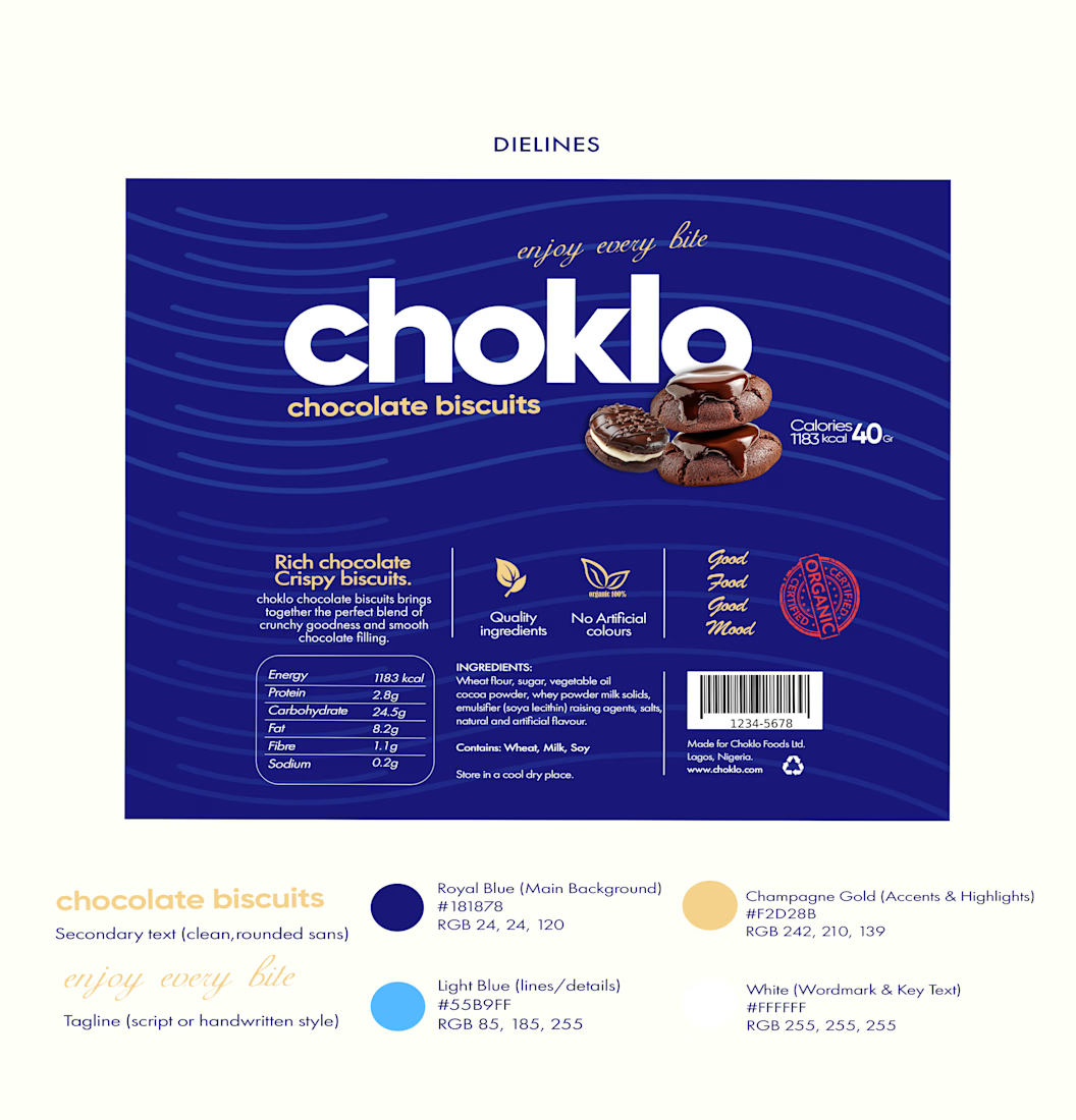
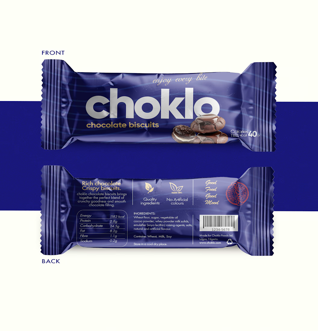
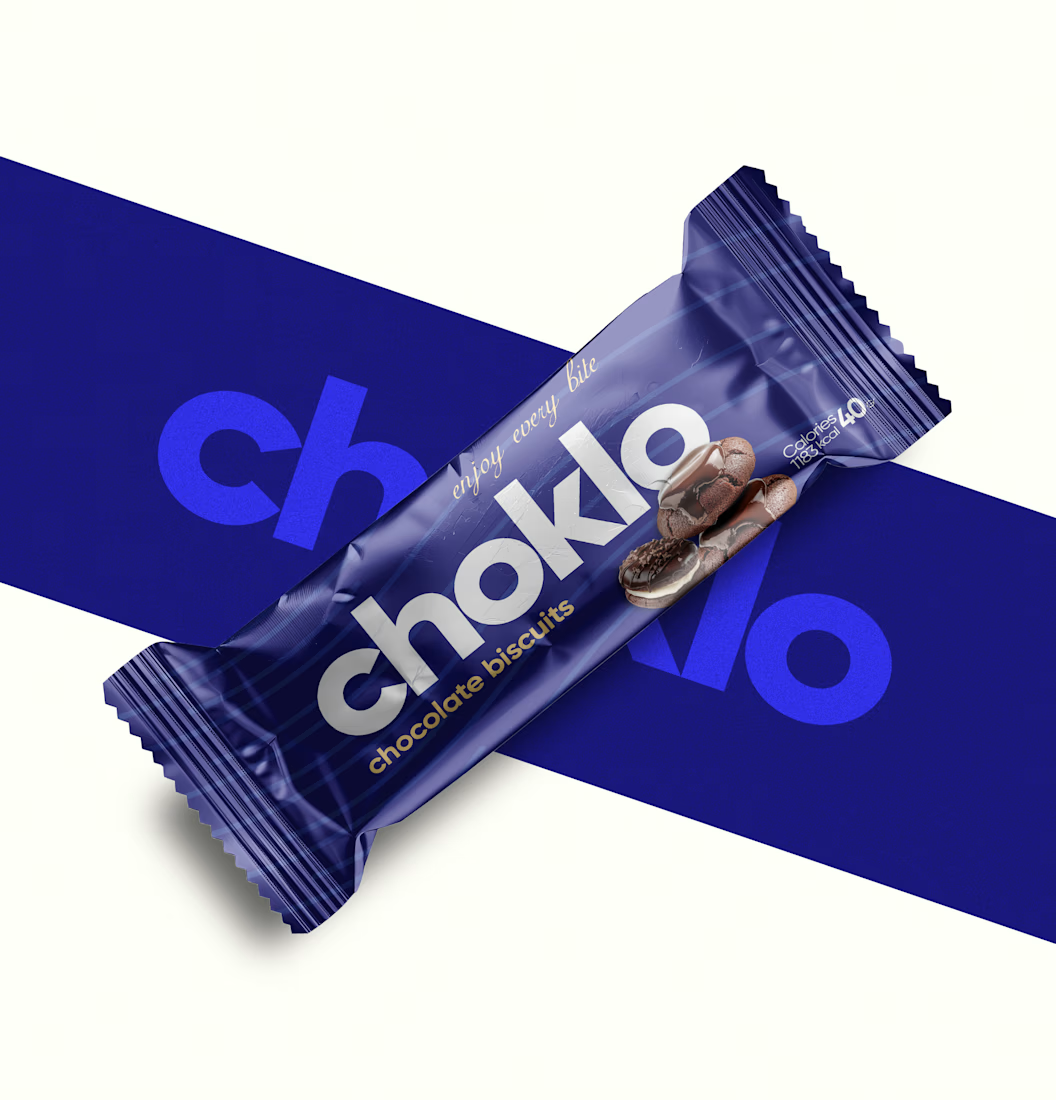
I designed choklo as a premium chocolate biscuit packaging concept built around bold geometric typography, a distinctive royal-blue palette, and a cohesive visual identity.
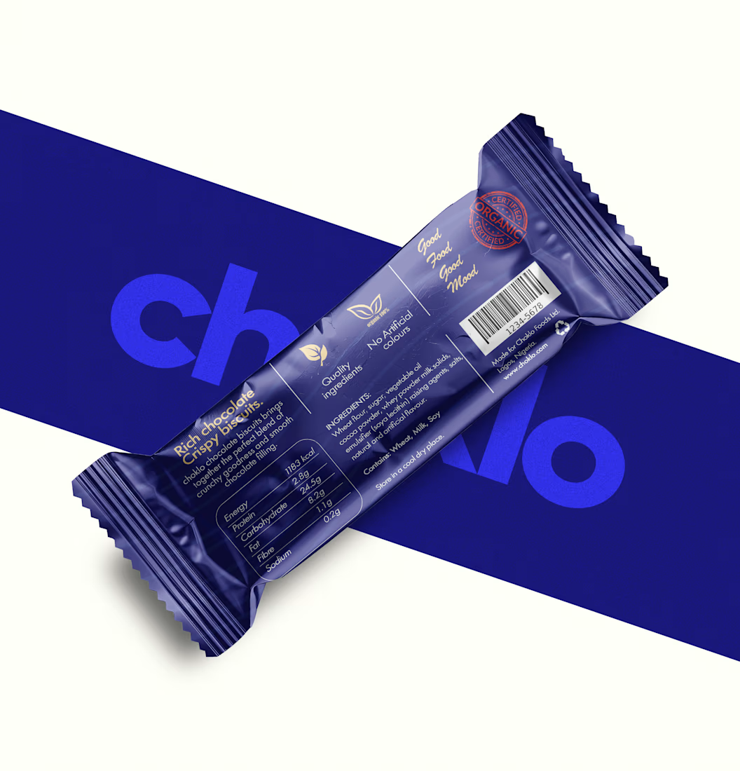
From the front-of-pack presentation to the back-of-pack information layout, every element is designed to work together as one considered system, balancing shelf appeal with functional clarity.
Because premium packaging isn’t just about making a product look expensive. It’s about building a brand that looks credible, feels intentional, and is ready to compete.
Looking to elevate your product with packaging that reflects the value of your brand? Let’s talk.
#PremiumPackaging #PackagingDesign #BrandIdentity #ProductBranding
The network for creativity
Join 1.25M professional creatives like you
Connect with clients, get discovered, and run your business 100% commission-free
Creatives on Contra have earned over $150M and we are just getting started











Related posts

Which background color works better for this bread lineup I am working on to showcase to a client, is it cool blue background on the left, or the warm cream background on the right?
I thought of using blue as it gives a consistent and wholesome feel while matching with the front bread but the yellow one I think looks more appetizing and makes the designs shine.
I’d love to hear what stands out to you. Which one makes the packaging feel more appealing and eye-catching?
2 voted
25%
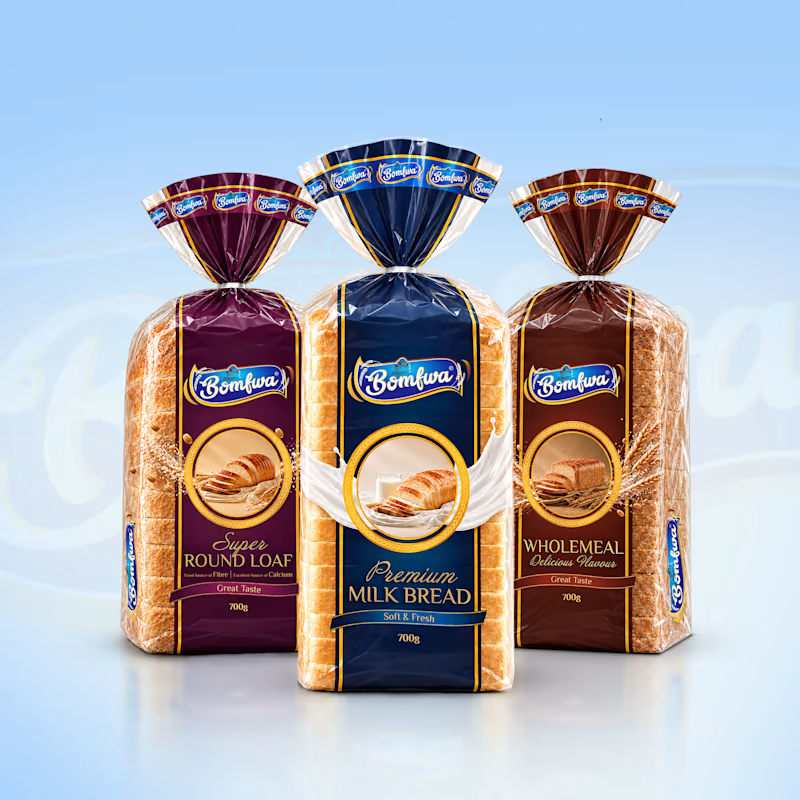
6 voted
75%
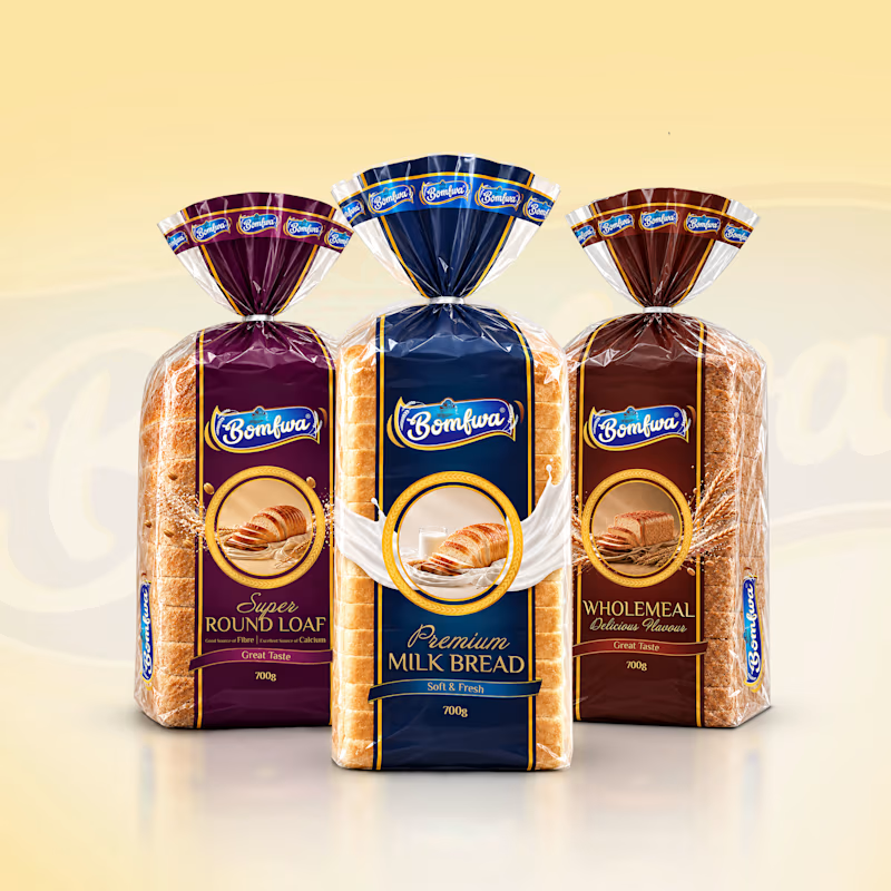
8 votes
Closed


cream for me. the blue makes the milk bread wrapper kinda disappear into the background

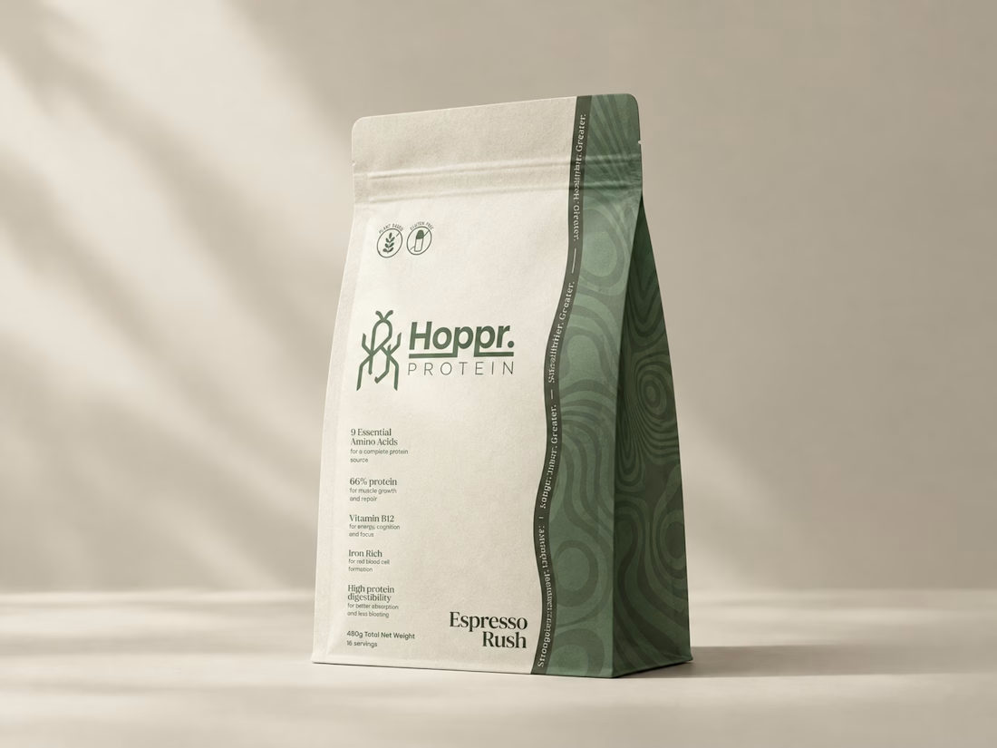
Not every client comes to me for a brand identity and not all my clients are skincare or cosmetic brands.
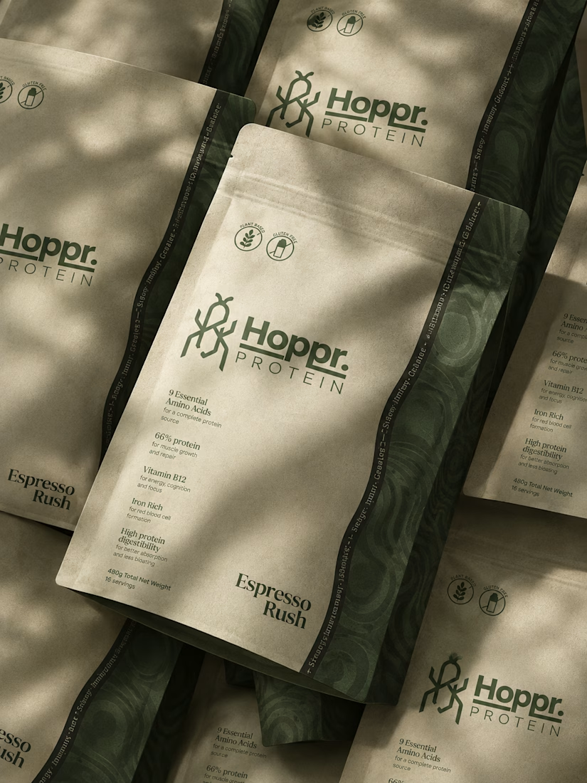
That was the case with Hoppr, a protein powder brand made from crickets. 🦗 YES, CRICKETS!
Sometimes the logo, colors, and visual system are already there and my job is to bring them to life on packaging and see how far I can push them.
I love projects like this because I get to play with typography, layout, and materials while working within an existing identity.
How much freedom do you think a designer should have when working with an established brand?


Great packaging work, nice job

A refreshing color palette inspired by each flavor, paired with bold yet minimal typography, creates strong shelf presence while maintaining a natural and premium feel.


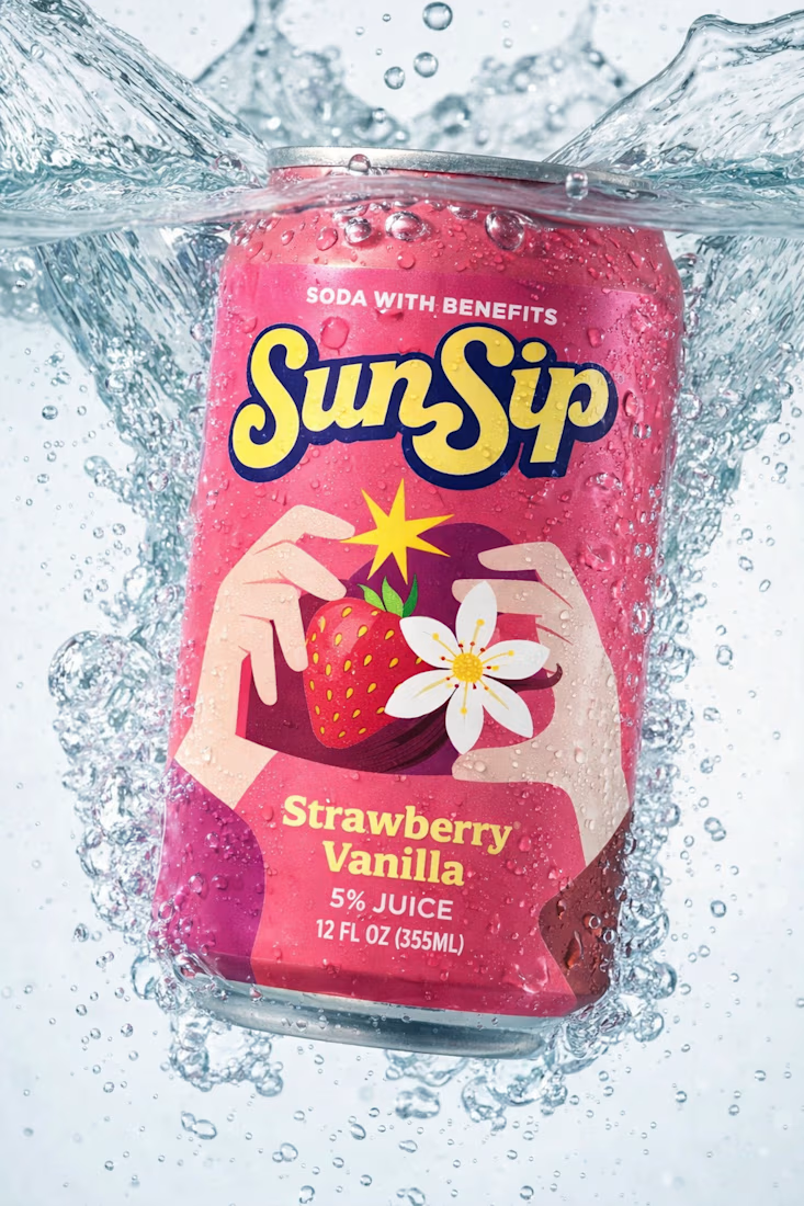

Flavor-led palettes are such a smart system for soda packaging, Umar. The SunSip strawberry can reads bright and playful while that bold minimal type keeps it feeling premium rather than loud.