The network for creativity
Join 1.25M professional creatives like you
Connect with clients, get discovered, and run your business 100% commission-free
Creatives on Contra have earned over $150M and we are just getting started
Back to feedPost


Visual identity revision for a psychology and management consulting firm



Love the icon!💯

Strong logo concept across different channels! I love how you chose the perfect mockups to showcase the brand. 👏

The icon feels calm enough for the psychology side but the mockups still give it some backbone for the consulting work. What did the old identity get wrong that pushed the revision?


So nice

Love the color palette and type treatment!


Great use of a mockup for the logo! It creates an amazing design showcase.

Really nice type choices

The stacked blocks are a smart metaphor for a psychology plus management firm: each layer reads as its own piece, but together they hold one shape. The coral against the cool concrete keeps it warm without feeling clinical. Did the revision start from the old logo or from scratch?

The abstract figures feel right for a psychology practice, human without getting literal. Did you rebuild the mark from scratch for this revision or evolve the original?

handsome works! anyway did you use any ai to generate mockups on that? or you did manual
Just photoshop 😉
any tips for beginner on contra? 😀
Take a Skillshare course in Photoshop I'd say haha

Love how seamlessly the brand elements align with the core message. Highly professional and visually captivating work from start to finish!

Psychology plus management consulting is a tricky mix to capture visually. This feels calm and trustworthy without getting boring, nice revision

Amazing work

Love the color palette and the direction!

love the brand applicationnn and the colors most crazyyy

Beautifully refined identity — the balance of calm, trust, and modern professionalism really comes through. 🔥

The lapel pin is the best proof a small mark can get. The four rounded shapes reading as both people and a cluster of thoughts fits a psychology and management firm without a single brain icon. What did the identity look like before the revision?

The four inward-facing figures in that teal mark read as people coming together, which suits a firm that blends psychology with management work. Did you test how the icon holds up at favicon size without the APS wordmark next to it?
The network for creativity
Join 1.25M professional creatives like you
Connect with clients, get discovered, and run your business 100% commission-free
Creatives on Contra have earned over $150M and we are just getting started





Related posts


Ever signed for a pack of pasta? Soon you will.
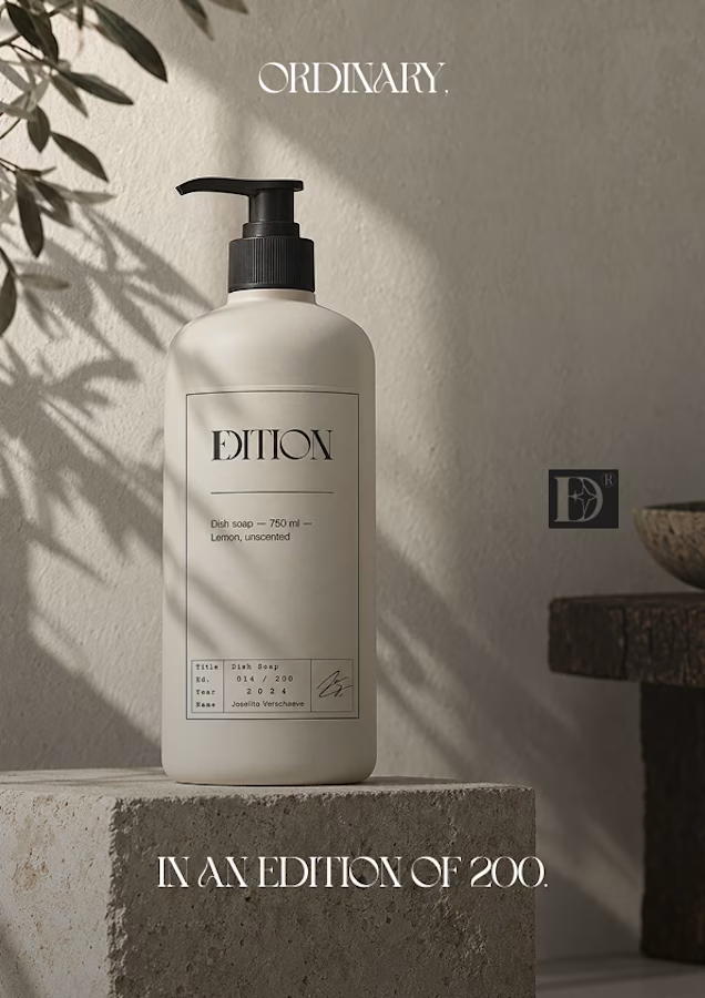
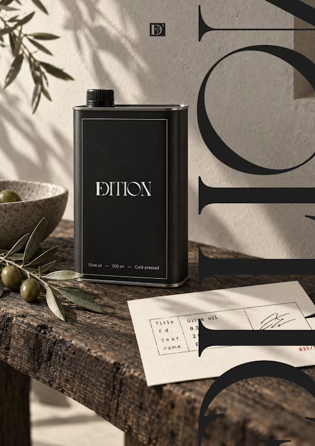
EDITION is a brand where nothing is decorative and everything is numbered.
Case study landing very soon.


A fresh identity for Flankman, a US-based industrial intelligence company.
The idea was to bring together two different worlds: the credibility of traditional finance and the character of contemporary editorial design.
Really enjoyed exploring this one and giving a traditionally corporate industry a more distinctive visual personality.
Brand identity by Katlan.co ©


