The network for creativity
Join 1.25M professional creatives like you
Connect with clients, get discovered, and run your business 100% commission-free
Creatives on Contra have earned over $150M and we are just getting started
Back to feedPost

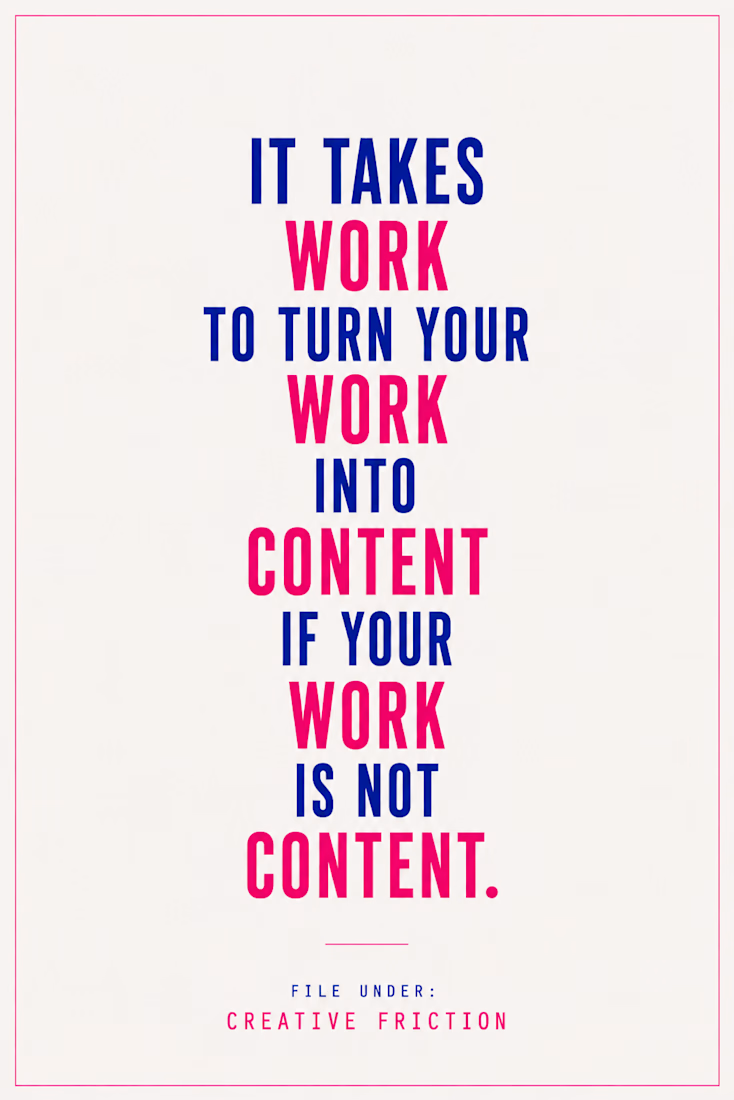
One thing I've been noticing lately is that a lot of creative advice assumes your work should become content.
If you're a podcaster or YouTuber, that makes sense.
☞ But what if your work is the work?
Today, one of my favorite things I saw on Contra wasn't a finished project.
It wasn't a viral post.
It wasn't even something that made it into the final website.
It was an unused section from a web design project.
And I loved it.
It made me realize how much effort creatives spend trying to translate their work into formats that perform on social media.
Sometimes I wonder if the problem isn't the work.
☞ Maybe it's the platform.
Maybe not everything needs to become a reel, a carousel, or a talking-head video.
Maybe sometimes the right move is finding places where people already appreciate the thing you make.
☞ No translation required.
I'm curious if other creatives have experienced this too.
𝓈𓂃✍︎
The network for creativity
Join 1.25M professional creatives like you
Connect with clients, get discovered, and run your business 100% commission-free
Creatives on Contra have earned over $150M and we are just getting started





Related posts

on Saturday i got to speak on social media & content strategy at my first IRL event 🥹
i'm still processing all the emotions but it was amazing to speak at The Retreat by FWDHer.
in my session i talked to the women founders about building a content strategy you can actually sustain.
we went through an exercise to help them ideate content ideas by starting with a "thesis" that helps ground their useful content & then commit to a repeatable practice rhythm
then we moved on to how to execute that useful content using different production levels in mind:
🌱high effort: think an edited video or designed carousel)
🌱medium effort: think a one-take video, repurposed video, picture carousel/photo dump or text or graphic photo + caption)
🌱low effort: think photo with caption, short text post or simple story)
your content shouldn't be built on high-effort posts alone. a mix of effort levels and repurposing is what keeps it sustainable.
the takeaway i left them with: you don't need to post every day. you need one idea, three ways to use it (teach, prove, invite), and a rhythm you can return to when the week gets busy.
this was my first time speaking/teaching like this IRL, and it reinforced what i believe about content: it works best as a practice, not a pressure. 🌻
if you're planning a retreat, workshop, or event and want a speaker on social media & content strategy, i'd love to talk.
and if you're a founder or brand that needs a strategist to build a content practice you can actually sustain, you can book time with me here: https://contra.com/s/m6ZFFBev-the-consult-a-single-strategy-session


Collage

not sure “brand designer” is surviving my current job description
AI has expanded what I can actually do myself so much over the past year.
strategy + identity + web + product + image and illustration libraries + creative direction...
“creative director” makes it sound like I’m not the one actually making everything either.
so... are we all having a bit of a job title identity crisis or just me? 😭