The network for creativity
Join 1.25M professional creatives like you
Connect with clients, get discovered, and run your business 100% commission-free
Creatives on Contra have earned over $150M and we are just getting started
Back to feedPost
AI & Tech YouTube Thumbnail - Designed for Maximum Views
I designed this thumbnail for an AI / Tech YouTube channel to compete with big channels like Think Media, MrBeast-style tech, etc.
Design Strategy:
Futuristic look with neon blue, electric purple, and dark background for AI feeling
Huge bold text: "AI WILL REPLACE YOU?!" or "This AI is INSANE!" (Curiosity gap)
Shocked / excited facial expression + AI robot / ChatGPT logo visual
Glowing effects, arrows, and icons to make it pop in YouTube feed
Optimized for mobile - text readable even on small phone screen
Why it works: Tech viewers click on fear + curiosity + new technology. This design uses all 3.
Perfect for: AI channels, Tech reviews, ChatGPT tutorials, Make money with AI, Tech news
Tools: Canva Pro, Photoshop, Adobe Photoshop, Illustrator
Skills: High-CTR Thumbnail Strategy, Tech Branding, YouTube Growth
Delivery: 24h delivery + 2 free revisions + Source file
I help AI & Tech YouTubers go from 0 to 100K views with thumbnails that the algorithm loves. Let's make your channel blow up!


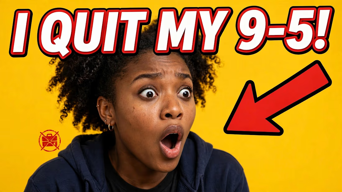

The dark-background rule is the one I'd want numbers on before committing to it. A big share of the audience is browsing in dark mode, where a dark thumbnail sits against a dark UI and loses its outer edge entirely, whereas the yellow one here keeps its shape in both themes. Do...

Great catch Artur! You are 100% right.
The yellow "I QUIT MY 9-5" is intentionally high-value (luminance) to pop against YouTube's dark UI - that's for Finance/Make Money niche where retention is low and you need instant pattern interrupt.
The neon-on-dark AI thumbnail is...
Thanks Artur! Exactly — that's why I use the 3px white stroke. Dark thumbs disappear on YouTube Dark Mode (90% of viewers), yellow keeps its edge in both light + dark.
The network for creativity
Join 1.25M professional creatives like you
Connect with clients, get discovered, and run your business 100% commission-free
Creatives on Contra have earned over $150M and we are just getting started







Related posts

So, what is ROSI?
A few cans.
Five colours.
One very simple fish.
A ridiculously large wordmark.
And hopefully proof that everyday products don’t have to look everyday.


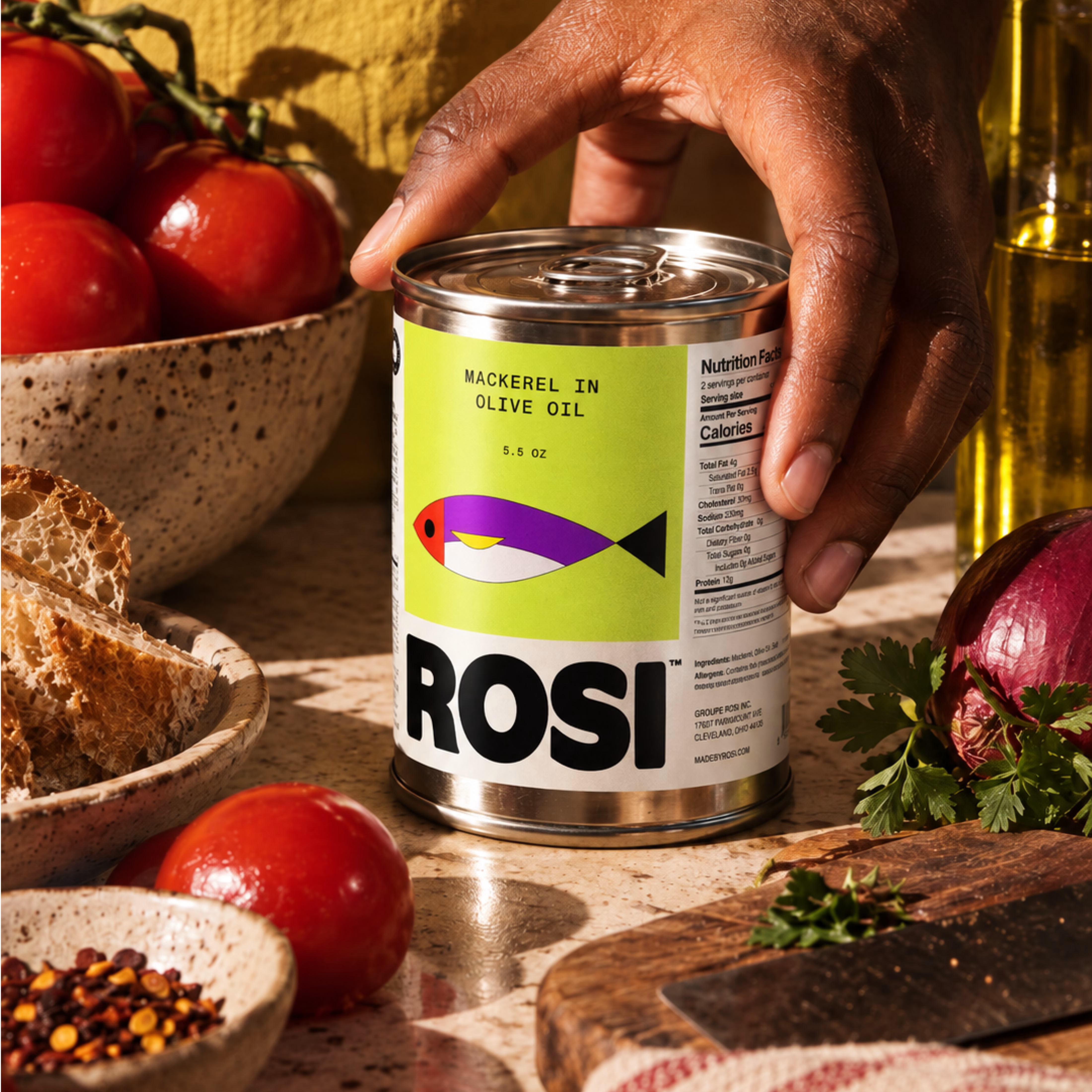
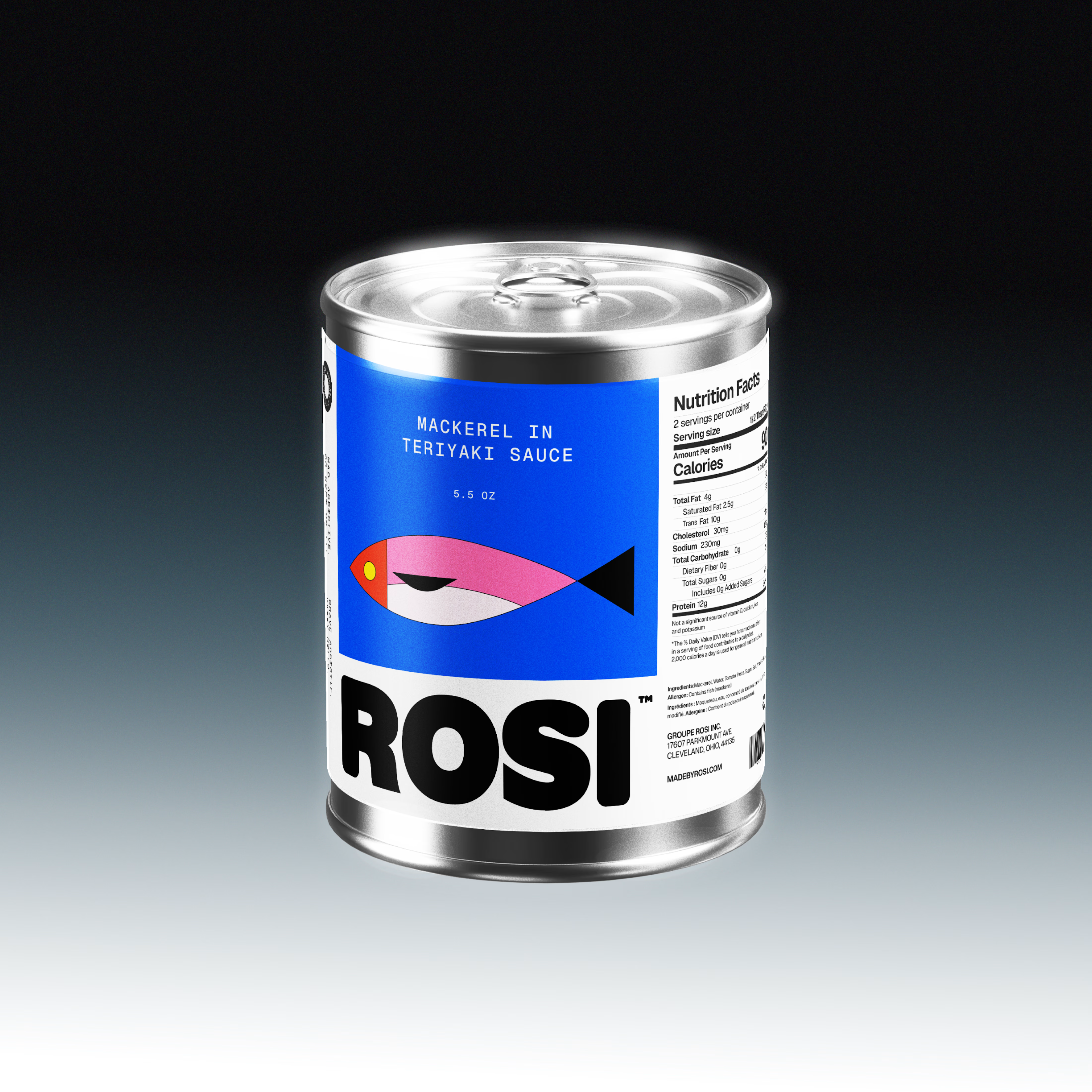
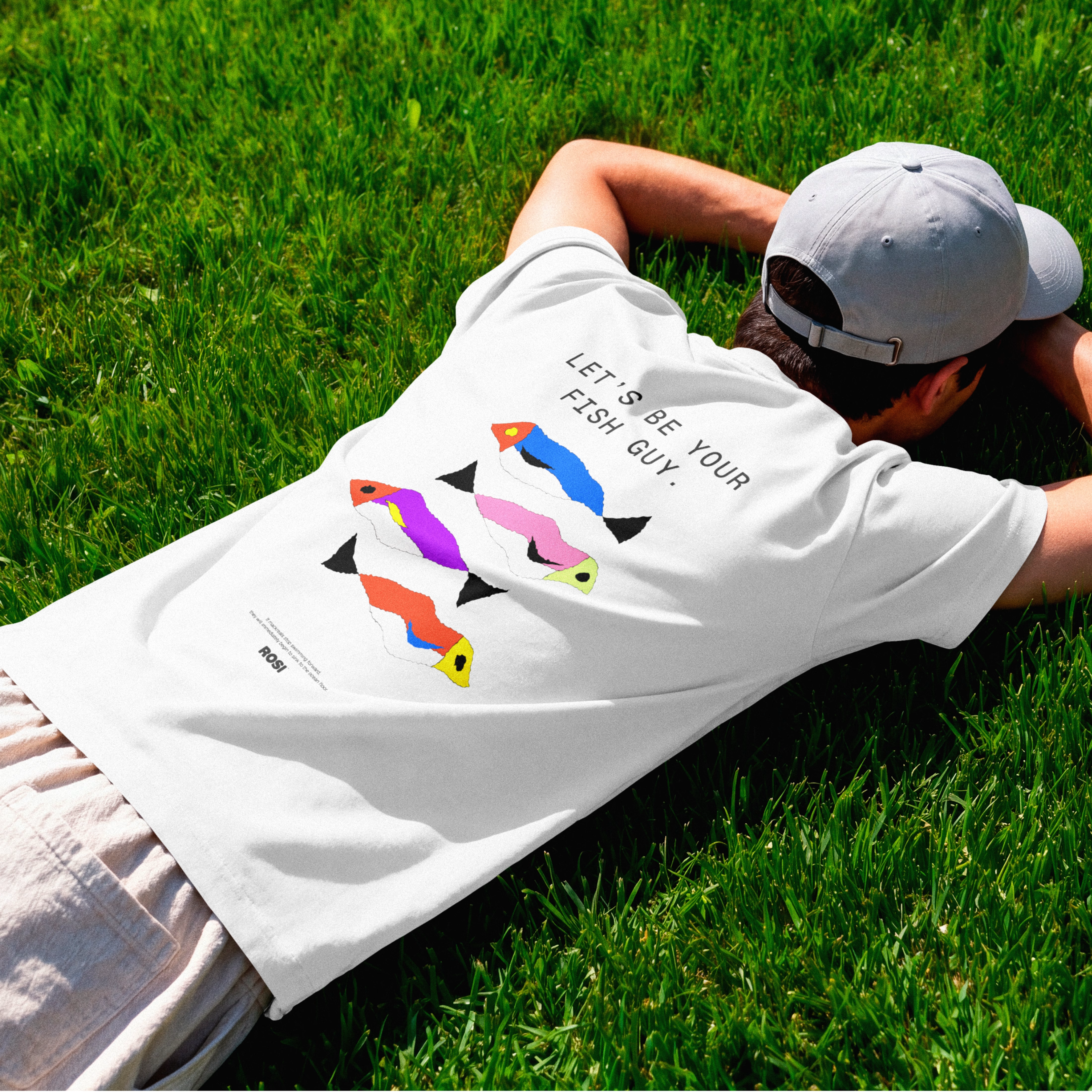

The ridiculously large wordmark is the entire personality, tinned fish has never strutted like this. Proof that confidence is a design decision, not a budget line.

What if Google Maps had been designed in the 1920s? 👀
For the #revival challenge, I reimagined Google Maps through the visual language of Soviet Constructivism.
Routes become bold diagonals, turns become oversized arrows, and ETA and distance become strong typographic statements. Navigation stops feeling like a quiet interface and starts feeling like a piece of graphic propaganda telling you exactly where to go.
Such a fun exercise in taking something extremely familiar and asking how differently it could have been designed in another time.
Your turn!
What modern product would you send back in time, and to which era? 👀

Curious whether the diagonals fought you at phone size — Constructivist posters were built for one long look from across a room, while a nav screen only gets half-second glances from someone already moving. For your question: airline safety cards, sent back to 1960s Swiss...

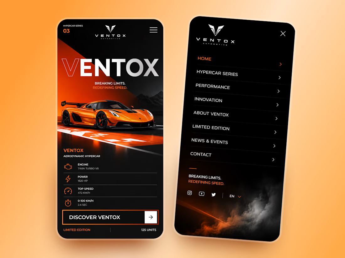
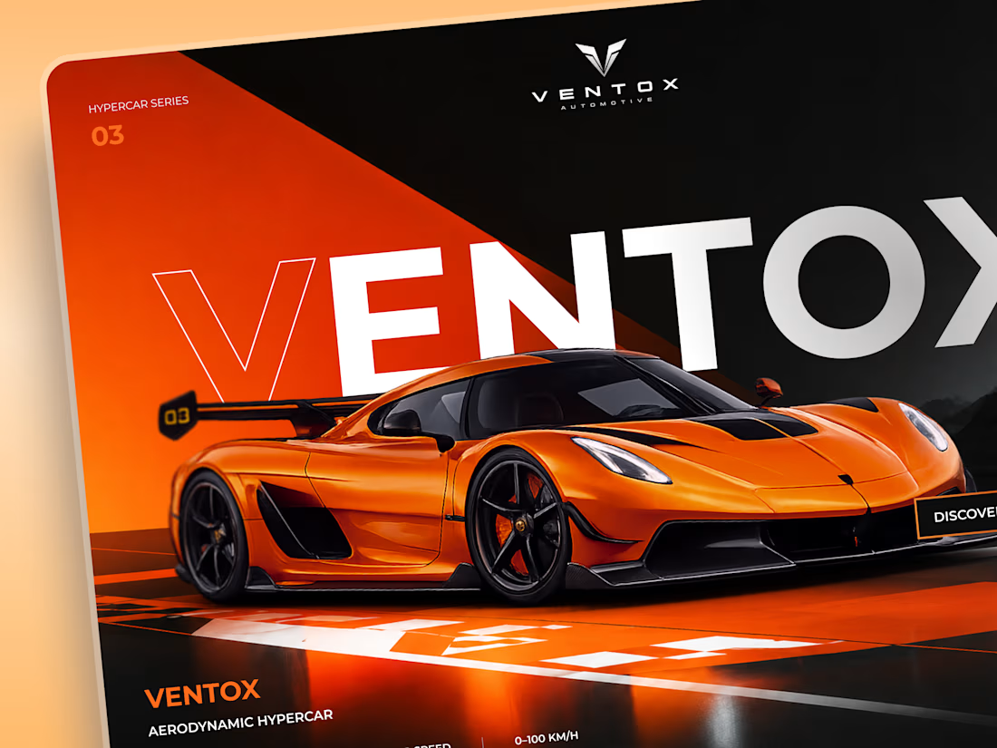
Ventox — Hypercar Landing Page 🏎️🔥
Ventox is a high-performance automotive landing page concept built around speed, exclusivity, and bold visual storytelling.
The design combines a striking orange hypercar, oversized typography, and a dramatic black-and-orange palette to create an immersive digital experience.
Special attention was given to:
A cinematic hero composition that puts the hypercar in the spotlight.
Oversized typography that reinforces the brand's identity.
Sharp geometric shapes and high-contrast colors inspired by speed.
Performance specifications presented in a clean, structured layout.
A prominent CTA that directs attention to the vehicle.
Responsive mobile layouts with simplified content and intuitive navigation.
The result is a bold automotive experience that brings together premium aesthetics, performance-focused storytelling, and clear navigation.
Looking to create a distinctive website for your automotive or luxury brand? Let's build something extraordinary. ⚡