The network for creativity
Join 1.25M professional creatives like you
Connect with clients, get discovered, and run your business 100% commission-free
Creatives on Contra have earned over $150M and we are just getting started
Back to feedPost

I'm definitely going for option B. It's so vibrant and modern giving the brand this luxurious feel and it's so colourful. It would definitely catch the eye of any visitor

I’d go with Option A. It feels more distinctive and editorial, while still keeping the coaching brand approachable. The darker contrast also gives the design more personality and makes the visual hierarchy stronger.
The network for creativity
Join 1.25M professional creatives like you
Connect with clients, get discovered, and run your business 100% commission-free
Creatives on Contra have earned over $150M and we are just getting started




Related posts


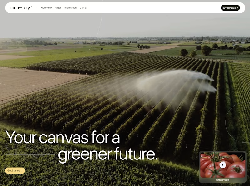
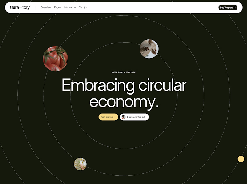
You only get to keep one. Which stays?
The circular layout has a bit of playfulness to it. The landscape gives you a much bigger sense of place.
I can see a case for both. Curious where you land.


93 voted
78%
27 voted
22%
120 votes
Closed

I'd keep the landscape one honestly, that sense of scale feels right for anything talking about sustainability at an industry level. Did the client push back on the crop at all, or were they on board with circular from the start?

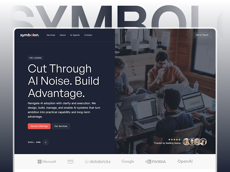
Which mockup would you choose?

6 voted
25%

18 voted
75%
24 votes
Closed

Custom Figma showcases design better for sure! 👍

Which WANDER logo would you choose?
A travel brand doesn’t just need a logo —
it needs a visual identity that makes you want to explore.
So I explored 2 different directions for the same brand
Bold & Minimal
Vote in the poll.
And Tell me what made you choose it in the comments.
#LogoDesign #BrandIdentity #GraphicDesign #LogoInspiration #VisualIdentity

11 voted
92%

1 voted
8%

12 votes
Closed

Minimal for me. The W drawn as a winding mountain path is doing double duty, letterform and route in one, exactly what a travel brand wants. Bold is clean but the swoosh W tells a little story before you read a single word.