The network for creativity
Join 1.25M professional creatives like you
Connect with clients, get discovered, and run your business 100% commission-free
Creatives on Contra have earned over $150M and we are just getting started
Back to feedPost
Taste Test

Which mockup would you choose?


6 voted
25%
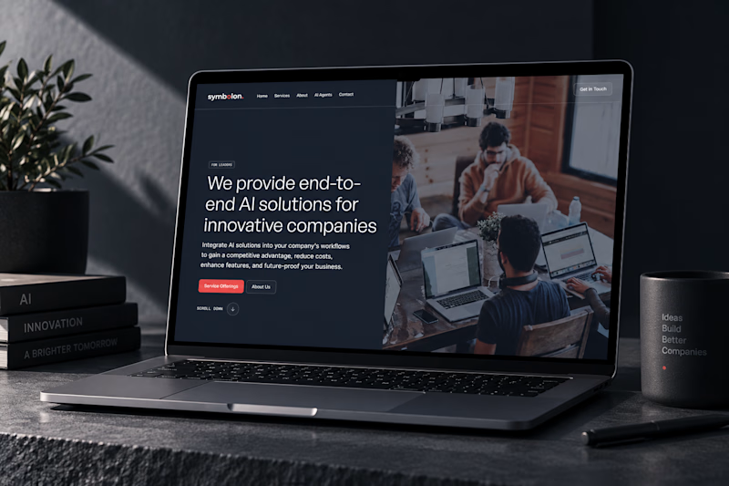
18 voted
75%
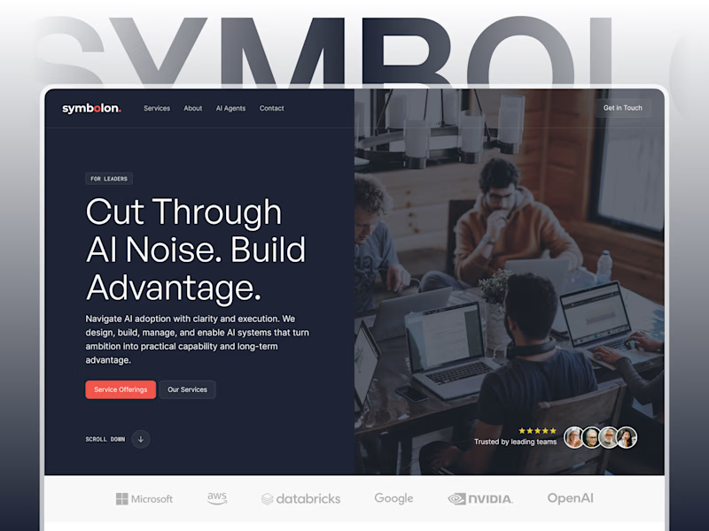
24 votes
Closed


i'd pick the custom figma mock. the chatgpt one looks flat
Exactly! The extra control in Figma really shows.

Custom Figma for me. It has more depth and gives the presentation a clearer sense of craft.
Yea exactly. AI brought the vibe, but Figma brought the depth.

custom figma
Thanks for your input! Custom Figma seems to be the clear favorite 😄

Custom Figma
Another vote for Figma, AI is getting nervous now 😄

AI for me. It feels more polished and gives the mockup a stronger visual presence without distracting from the work. Curious what made you lean toward this one?
I liked the AI one too, but I think the environment gives it a slight unfair advantage. Figma showcases the design itself better 😄 but let's see what the others think.


Option 1 for overall layout clarity, but pairing Figma’s design control with Framer’s interactive web deployment usually delivers the strongest conversion results.
Yup agreed.

Thanks for the input, 67% are leaning toward the Figma one, guess I know which one to choose now.😊

Custom Figma showcases design better for sure! 👍
Yup, I'm also leaning towards the Figma one.
Figma is taking a very comfortable lead here 😄


Clean design !
The network for creativity
Join 1.25M professional creatives like you
Connect with clients, get discovered, and run your business 100% commission-free
Creatives on Contra have earned over $150M and we are just getting started






Related posts


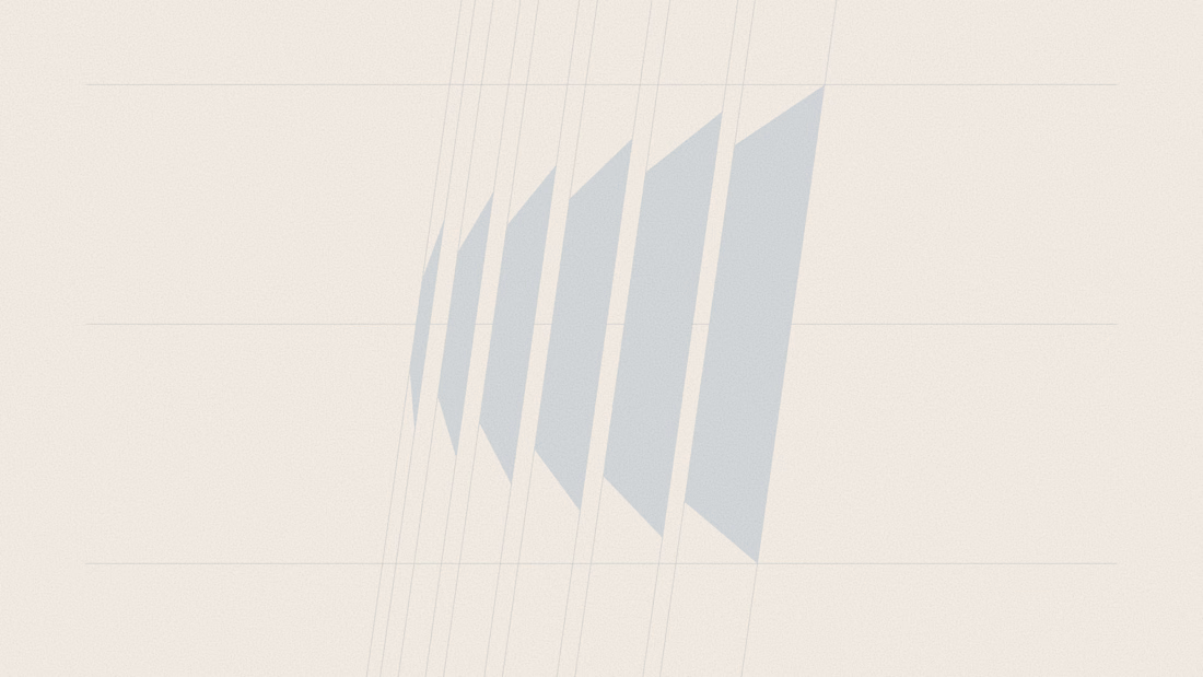
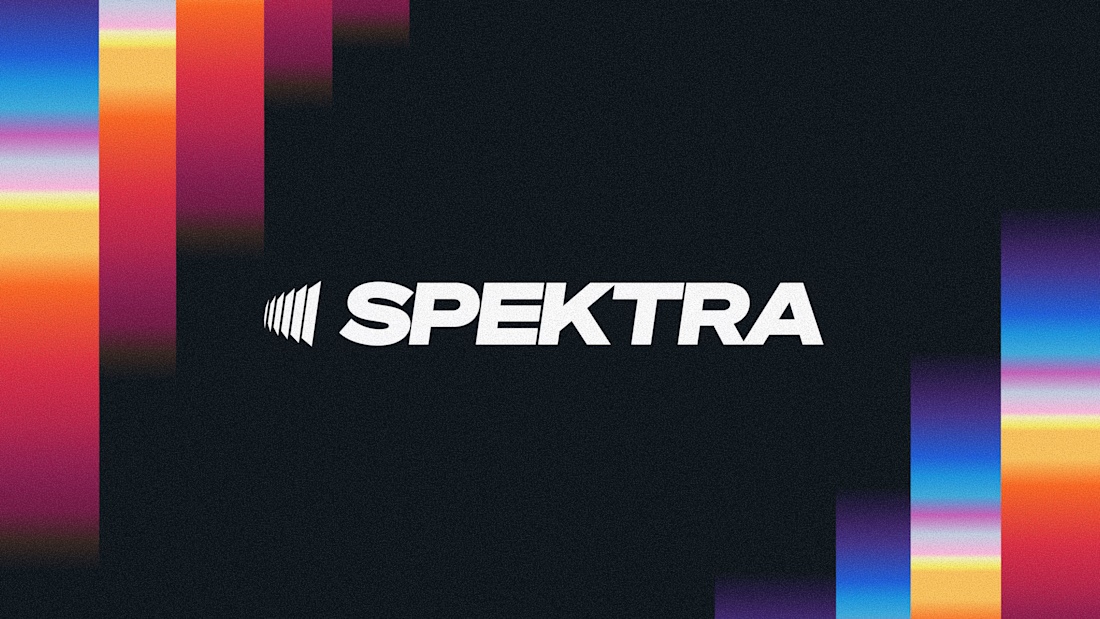
A closer look at the Spektra logo I designed.
The mark fans out from a narrow point, while the wordmark leans forward. together, they give it a sense of movement without needing much detail.
There’s a lot of color in the wider identity, so the logo holds its own in plain white. Simple geometry with enough weight to stand up to everything around it.

This is fire, Daniel
The logo conveys the story


the cuff turns a full 360 and the metal goes translucent. seedance 2.5 for video and scrubbed by scroll position with a custom component.

This looks amazing

2 Achievements 🏆 On Same Day ... !!!
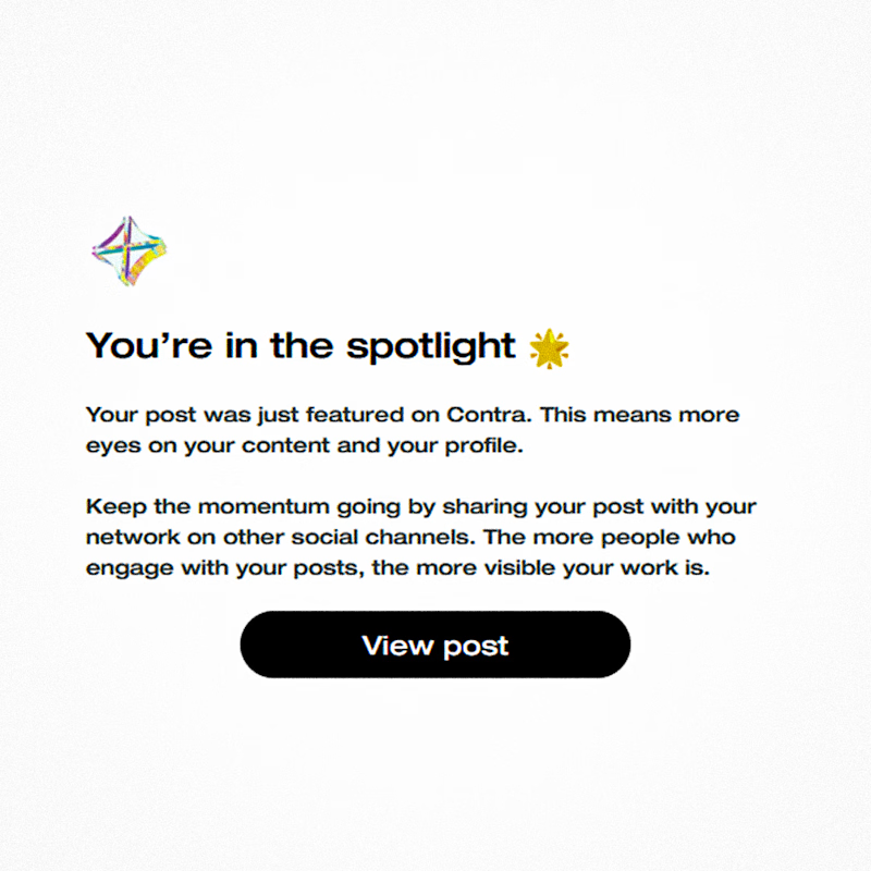
⚡I'm in the spotlight. My Post was Featured on Contra
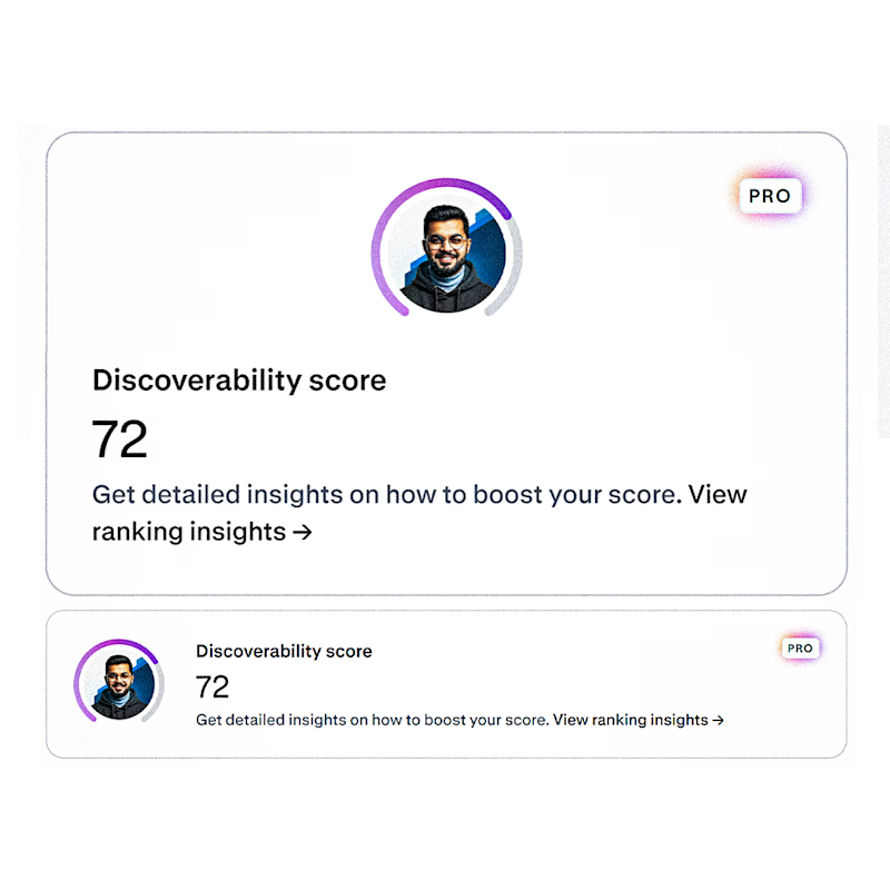
⚡I Just Got 72 Discovery Score
Which one do you think more worth celebratingggg....!!! ✨💡🌟

16 voted
89%
2 voted
11%
18 votes
Closed

72 Discovery Score is no small thing either 👀
Both deserve the celebration fr!